Accordion
API Reference
Overview
Accordion consists of panes arranged into layout rows and cols. Each pane, or accordion item, features body and header and can be fully expanded and collapsed by clicking its header. You can place text or any component into each pane. The component inherits from layout.
Initialization
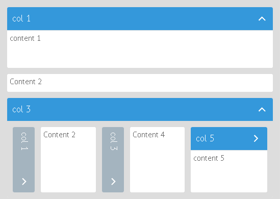
Accordion with three panes
webix.ui({
    view:"accordion",
    multi:true,
    cols:[ //or rows
        { header:"col 1", body:"content 1" },
        { header:"col 2", body:"content 2" },
        { header:"col 3", body:"content 3" }
    ]
});
Note that view name can be omitted (view:"accordion"). If you place an array of objects with body and header into a row or a column, the view will be automatically recognized as accordion.
webix.ui({
    multi:true,
    cols:[ //or rows
        { header:"col 1", body:"content 1" },
        { header:"col 2", body:"content 2" },
        { header:"col 3", body:"content 3" }
    ]
});
Related sample: Complex Accordion
Comments:
- In essence, each row/column is a UI-related accordionitem component. However, the direct initialization isn't compulsory. You can just enumerate its properties in a row (column) as shown above.
- Moreover, you can omit the view:"accordion" line as well. The component will be drawn anyway as soon as you divide a row/column into header and body parts.
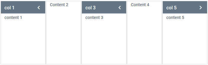
- There can be rows/ cols without headers as well. It goes without saying that they are non-collapsable.
Related sample: Horizontal Accordion
webix.ui({
    cols:[ //or rows
        { header:"col 1", body:"content 1" },
        { header:"col 2", body:"content 2" }
    ]
});
Related sample: Layout with Headers
Working with Accordion
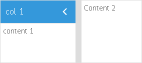
Accordions differ by their possibility to show and hide panes at the same time. There's a special multi parameter to set the necessary mode.
- multi:true - all panels can be expanded as well as collapsed at a time;
- multi:false (default) - only one panel can be (and must be) visible at a time;
- multi:"mixed" - all panels can be expanded at a time, but you cannot close them all. One panel remains visible.
Dark Theme
You can redefine the default style of Accordion by applying the dark theme via the css:"webix_dark" configuration option within the Material or Mini skin:
webix.ui({
    view:"accordion",
    multi:true,
    css:"webix_dark",     cols:[ //or rows
        { header:"col 1", body:"content 1" },
        { header:"col 2", body:"content 2" }
    ]
});
Related sample: Dark Accordion
Related Articles
- Setting Borders to the Components
- Adding Headers to Components
- Sizing Components
- Resizing Components
- Layout
- Multiview
- Scrollview
- Carousel
- Accordion CSS Image Map
If you have not checked yet, be sure to visit site of our main product Webix javascript ui framework and page of accordion tabs product.