Checkbox
API Reference
Overview
Checkbox allows a user to make choice between two opposite states for an option: enabled and disabled.
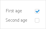
In the above image the "First Age" option is enabled and the "Second age" option is disabled.
Initialization
Checkbox Initialization
{ view:"checkbox", id:"field_a", label:"Second age", value:1}
Related sample: Check Box ('checkbox')
Main properties
- label (string) - text label of a control. It can be customized by:
- labelAlign (string) - label alignment towards its container. Possible values are "left" and "right". In any way, it's placed left to the control;
- labelWidth (number) - width of the label container;
- labelRight (string) - set the text of right-hand label. Only checkbox features this functionality;
- value (boolean) - defines whether the checkbox is selected by default or not (0 for false, 1 for true);
- align (string)- positions button with relation to a parent view;
- checkValue (string) - value of the checkbox in the checked state (1 by default);
- uncheckValue (string) - value of the checkbox in the unchecked state (0 by default);
Webix Checkbox control is based on standard HTML checkbox, but all the skins use either a Font Awesome or Material Design icon to render it. To switch to a standard HTML checkbox, use the customCheckbox property:
{ view:"checkbox", customCheckbox:false}