Settings for Scatter Chart
Scatter chart presents a set of points which are displayed based on two coordinates (data values) - one for the X-axis and another one for the Y-axis - provided in a data set.
Custom Initialization
- value (string) - an item template for Y axis
- xValue (string) - an item template for xAxis
- data /url (string) - the data source
- item (object) - an object property that contains settings for each point in the graph:
- alpha (number) - (number from 0 to 1) the marker opacity (by default, 1)
- borderColor (string,function) - the color of the point border
- borderWidth (number) - the width of the border (for square points)
- color (string, function) - the color of the points as a hex code or a function
- eventRadius (number) - the radius of the virtual circle the events of which will fire for items within
- shadow (boolean) - if true, adds a shadow to a point. False by default
- radius (number) - the radius of the point.
- type - (string) - the shape of a marker ( by default, 'r'). The predefined values are:
- 's' - square
- 't' - triangle
- 'd' - diamond
- 'r' - round.
- disableItems (boolean) - if true, forbids items rendering on the chart, false by default
- disableLines (boolean) - if true, forbids connecting points with lines, true by default
- shape (boolean) - if true, draws a shape out of data points connected by lines, false by default. Works in tandem with the disableLines:false option.
Style Presets
Presets simplify chart initialization and contain item settings. They are defined by the preset property and can be of the following types:
- square - green squares with borders
- diamond - wine red diamond-shaped points
- simple - green dots without borders
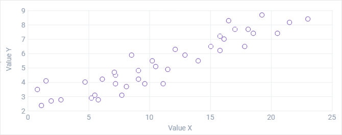
- plot - transparent points with purple borders (in the image above)
- round - semi-transparent blue round points.
Related sample: Scatter Chart: Style Presets
Scatter Chart Series
Chart series allow presenting different graphs within one and the same chart. The graphs differ in color. Settings for the graphs form objects that are placed into the series array.
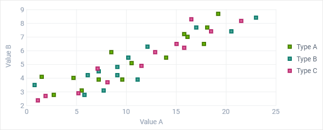
Related sample: Scatter Chart: Several Graphs in One Chart
See the common rules of series definition here.
With chart series, legend should be used to distinguish between graph values. At the same time, legend markers become clickable and allow you to show and hide dedicated graphs.
Scatter Chart Types
By default, Scatter chart renders just points presenting data items. However, you can also render various graphs in Scatter Chart by connecting points by lines, and even draw shapes out of lines.
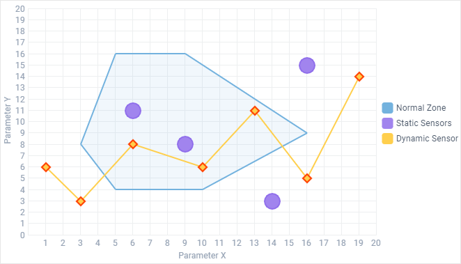
Related sample: Scatter Chart: Points, Shapes and Lines
Lines
You can connect points of the Scatter chart by lines.
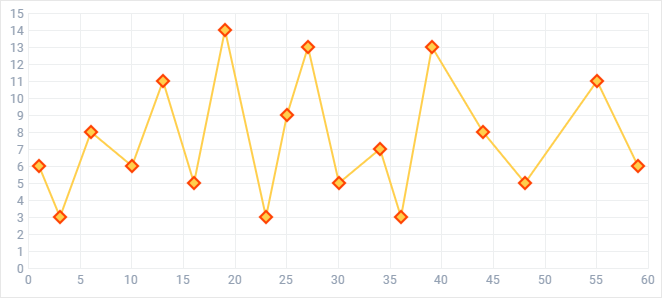
Points will be connected in the order provided by the dataset (by the y-coordinate). For the above example the data set is the following:
var scatter_dataset = [
  { "a":1,  "d":6 },
  { "a":3,  "d":3 },
  { "a":6,  "d":8 },
  { "a":10, "d":6 },
  { "a":13, "d":11 },
  { "a":16, "d":5 },
  { "a":19, "d":14 }
];
In order to render lines in the Scatter Chart:
- enable rendering of lines by specifying the disableLines:false property
- optionally, define the color of the line and its width in the line object:
webix.ui({
    view:"chart",
    type:"scatter",
    xValue: "#a#",
    // scales config
    series:[
        //line
        {
           shape:false,
           value:"#d#",
           disableItems:false,
           disableLines:false,
           item:{
                color: "#ffcf4d",
                borderColor:"#ff4000",
                type: "d",
                radius:5
           },
           line:{
                color:"#ffcf4d",
                width:2
           }
         }
     ],
     data:scatter_dataset
});
Shapes
A shape presents a set of points connected by lines, where the last point is connected to the first one.
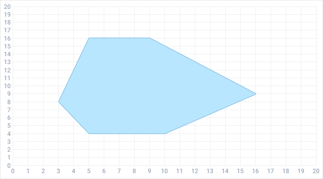
The order of connection is defined by the data set (by the y-coordinate). The data set given below is used to render the shape:
var scatter_dataset = [
  { "a":5,  "b":4 },
  { "a":3,  "b":8 },
  { "a":5,  "b":16 },
  { "a":9,  "b":16 },
  { "a":16, "b":9 },
  { "a":10, "b":4 }
];
To create a shape graph on a chart, you should use several series configuration options:
- shape - (boolean) mandatory, enables shape creation
- disableLines - (boolean) mandatory, set to true to enable lines rendering
- fill - (string) optional, the color of the shape filling
- disableItems - (boolean) optional, if true, removes points
webix.ui({
    view:"chart",
    type:"scatter",
    xValue: "#a#",
    // scales config
    series:[
        //area
        {
          value:"#b#",
          shape:true,
          disableItems:true,
          disableLines:false,
          line:{
             color:"#73b2de",
             width:2
          },
          fill:"#73b2de"
        }],
    data:scatter_dataset
});