Beginner
Selection
Built-in Selection
Single-Item Selection
To enable selection, you should include the select property into the component constructor and set its value to true (or 1).
webix.ui({
    view:"dataview",
    select:1, // enables the select mode
    //config
});
Related sample: Selection in Dataview
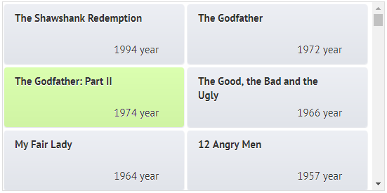
The items will be selected on a mouse click.
Selection of Multiple Items
- To enable selection of several items clicked in succession with the Ctrl key pressed, you should switch the component to the multiselect mode.
- To enable multiselection by clicking items (or tapping them on touch devices), you should additionally switch to "touch" variation of multiselection.
DataView, List and Tree Multiselection
"Ctrl"+click multiselection
webix.ui({
    view:"list",
    select:"multiselect",
    // config
});
"Touch" multiselection
webix.ui({
    view:"list",
    select:"multiselect",
    multiselect:"touch"
    // config
});
Datatable and Treetable Multiselection
"Ctrl"+click multiselection
webix.ui({
    view:"datatable",
    multiselect:true,
    select:"cell", // multiple selection of cells
    // config
});
"Touch" multiselection
webix.ui({
    view:"datatable",
    multiselect:"touch",
    select:'cell',
    // config
});
Moreover, components that present hierarchical data (Tree and treetable) feature the level multiselection pattern. If set, it allows multiple selection of items within one and the same tree branch, the items belonging to one and the same hierarchy level.
webix.ui({
    view:"tree",
    select:true,
    multiselect:"level", // in addition to the enabled selection
    // tree config

});
Related sample: Multiline Selection
Datatable and treetable feature more selection modes that are described in the datatable documentation.
Selection methods
You can select items with the help of selection methods triggered by various events;
- the select(IDs, [non_modal, continue]) function selects the specified items. Check selection API for details.
If you don't pass any parameter into the function, all items will be selected.
You can select the first and the last items from the dataset without specifying their IDs. In this case, you should additionally apply the first() and last() methods to the component.
$$("datalist").select($$("datalist").getFirstId();) // selects the first data item in the list

$$("dataview").select(4); // the cell containing item with ID = 4 will be selected
$$("dataview").select([2,3,4]); // the items with IDs equal to 2, 3 and 4
- selectAll() - the function equal to select(); with no parameters and highlights all the items at once;
- unselect() and unselectAll() - the functions work similar to the above mentioned ones and unselect items according to the same principles;
- isSelected(id) - the function checks whether the item with this ID is selected. Returns true or false;
- getSelectedId() - the function doesn't take any parameters. It returns the ID of a selected item or an array of IDs in case of the multiselect mode.
Keyboard navigation
Keyboard navigation can be used for a component with enabled selection.
webix.ui({
    view:"list",
    select:true,
    navigation:true
});
Related sample: Datatable: Keyboard Navigation
Note than not all data components support navigation by default. Then the KeysNavigation module should be added manually.
webix.ui({
    view:"dataview",
    id:"dataview1",
    select:true,
    navigation:true
});

webix.extend($$("dataview1"), webix.KeysNavigation);
The code above adds navigation only to this instance of a DataView, still it's possible to provide the functionality for all DataViews in the app.
For more details, refer to the Component Extending article.