Toggle Button
API Reference
Overview
A two-state button that can be not only clicked but also pressed. Hence, it has two states - pressed and unpressed (initial), which makes it look like Checkbox that also has two states (checked and unchecked).
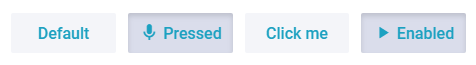
Toggle values can be defined separately for each state.
Initialization
{
    view:"toggle", type:"icon", name:"s4",
    offIcon:"pause",  onIcon:"play",
    offLabel:"Disabled", onLabel:"Enabled"
}
Related sample: Toggle Button ('toggle')
Main properties
- name - (string) a read-only property, defining the toggle's name. It should be unique within a page;
- label - (string) a text on the button body, one and the same for pressed and unpressed states;
- onLabel - (string) a text label on the button in the pressed state;
- offLabel - (string) a text label on the button in the unpressed state;
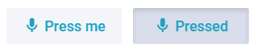
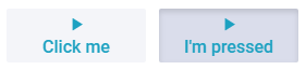
- icon - (string) an icon for pressed and unpressed toggle states;
- onIcon - (string) an icon for a pressed toggle;
- offIcon - (string) an icon for an unpressed toggle.
The default icons are taken either from the Font Awesome or Material Design collections, depending on the used skin. You can also apply custom icons.
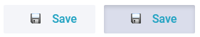
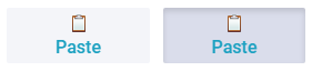
Toggle Types
The Toggle type is defined by the type property. If it isn't defined, a standard button is displayed. For image toggles there exist the following types:
- icon for a standard button with an icon;
- iconTop for an icon and a label below it;
- image for an image with a left-hand label;
- imageTop for a picture and a label below it.
Types coincide with those of a standard button. Check their look and feel in the image below:
type:"icon" |
 |
type:"iconTop" |
 |
type:"image" |
 |
type:"imageTop" |
 |
Related sample: Toggle Image Button ('toggle')