Data Visualization in Kanban Board
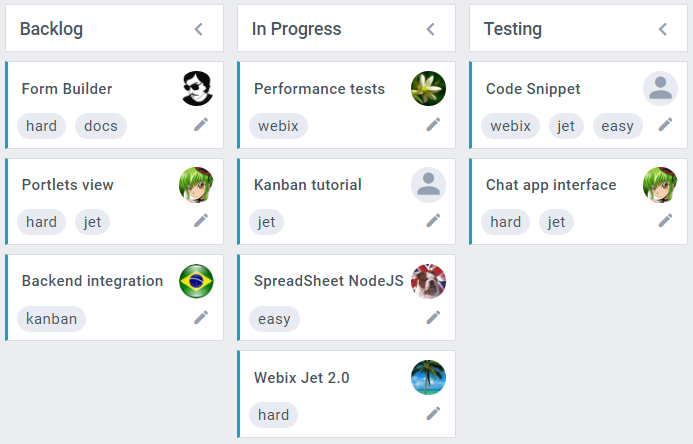
Default Look and Feel of Cards
Each Kanban card shows rich contents depending on the card item data:
//item data
{
    text:"Some card", status:"work", user_id:1,
    tags:[1, 2],
    comments:[ { user_id:"1", text:"Hello world"} ]
}
- card text;
- tags, if tags are defined;
- the edit icon;
- user avatar, if a card is assigned (user_id) and there is an image in the user data, or a user icon otherwise;
- the comments icon, if comments are defined;
- the attachment icon, if attachments are defined.
Related sample: Default Editor
Customization Options for Cards
You can place different HTML-elements onto cards of the Kanban Board.
Each KanbanList allows configuring dimensions and templates of its items. It is implemented in the type of KanbanList.
1. Define a type for KanbanList views with a set of templates:
webix.type(webix.ui.kanbanlist,{
    name:"cards",   // type name        icons:[
        { icon:"mdi mdi-comment" },
        { icon:"mdi mdi-pencil" }
    ],
    // template for item body
    // show item image and text
    templateBody:function(obj){
        var html = "";
        if (obj.image)
            html += "<img class='image' src='imgs/" + obj.image + "'/>";
        html += "<div>" + obj.text + "</div>";
        return html;
    }
});
2. Create a Kanban board and apply "cards" type for lists:
webix.ui({
    view:"kanban",
    cols:[
        {
            header:"Backlog",
            body:{
                view:"kanbanlist",
                status:"new",
                type:"cards"  // set type                 }
        },
        ...
    ]
});
You can set the following properties in the type:
- 'width' - the width of a list item ('auto' or a fixed number in pixels);
- 'height' - the height of a list item ('auto' or a fixed number in pixels);
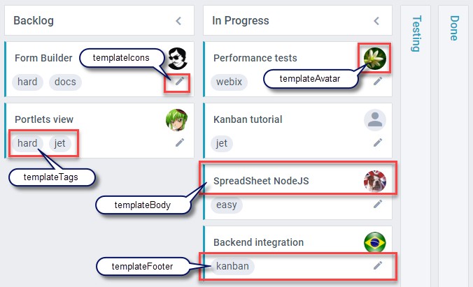
- 'template' - data template that defines inner html for each item. The default definition of this property applies many other templates: icons, text, avatar;
- 'templateBody' - the template for the main content of items. It is applied in the main 'template' and displays the item text by default;
- 'templateFooter' - the template for content below the item body (it is applied in the main 'template' and displays the item tags and icons);
- 'icons' - the array of icons used in Kanban;
- 'templateIcons' - the template for icons representation (is applied in the 'templateFooter');
- 'templateTags' - the template for tags representation (is applied in the 'templateFooter');
- 'templateAttachments' - the template for the displaying the thumbnail of the first image among card attachments on the card
- 'templateAvatar' - the template for an item avatar (the photo of an assignee or an icon for assignees without a photo).
A template can be specified either as a string or as a function. Below you will find the description of all available templates.
Main templates
Width and height of an item
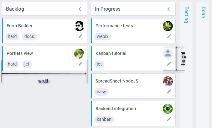
width
Specifies the width of cards in a KanbanList. By default, all lists equally separate the width of a Kanban board, and the width of cards is "auto":
{
    width:"auto"
}
You can set a fixed width for a KanbanList:
webix.type(webix.ui.kanbanlist,{
    name:"cards",
    width:200
    ...
});
If there is space not taken by KanbanLists, the right side of Kanban will remain empty. If the space available for Kanban is not enough for all lists, you can wrap Kanban into ScrollView.
Related sample: KanbanList width
You can read more about KanbanList here.
height
Specifies the height of an item in the list.
{
    height:"auto"
}
The 'height' property as well as 'width' can be defined as a fixed value.
template
Defines the inner HTML for each card. The default definition of this property applies other templates: icons, text, avatar.
template:function(obj, common){
    let kanban = webix.$$(common.master);

    var color = kanban.getColors().exists(obj.color) ?
        kanban.getColors().getItem(obj.color).color : obj.color;
    var avatar = "<div class='webix_kanban_user_avatar' webix_icon_id='$avatar'>"+
        common.templateAvatar(obj,common,kanban) + "</div>";
    var body = "<div class='webix_kanban_body'>" +
        common.templateBody(obj,common,kanban) + avatar + "</div>";
    var attachments = kanban.config.attachments ?
        common.templateAttachments(obj,common,kanban) : "";
    var footer = "<div class='webix_kanban_footer'>" +
        common.templateFooter(obj,common,kanban) + "</div>";
    return "<div class='webix_kanban_list_content'"+
        (color ? " style='border-left-color:" + color + "'" : "") + ">"
        + attachments+body+footer+"</div>";
}
When you redefine the main template, the result is fully up to you. Do not forget to pass the kanban object to the templates you need (e.g. templateAvatar(obj,common,kanban)).
templateBody
Defines the main content of items. By default, it displays the card title (text).
webix.type(webix.ui.kanbanlist,{
    name:"cards",
    // displays images and text property in item content
    templateBody:function(obj,common){
        var html = "";
        if (obj.image)
            html += "<img class='image' src='imgs/" + obj.image + "'/>";
        html += "<div>" + obj.text + "</div>";
        return html;
    },
    ...
});
icons
Sets an array of icons for Kanban Board.
You need to specify icons array in the type for Kanban Lists. In the definition of each icon you can set the following properties:
- id - the icon ID;
- icon - the name of an icon;
- tooltip - the title for an icon element;
- show - the function that takes an item object as a parameter, returns true/false and shows/hides an icon for a certain item;
- template - the text that will be displayed next to the icon;
- click - the onClick event handler for the icon.
<link rel="stylesheet" type="text/css"
    href="https://cdn.jsdelivr.net/npm/@mdi/font@5.8.55/css/materialdesignicons.css">

webix.type(webix.ui.kanbanlist,{
    name:"cards",
    icons:[
        {
            id:"comments",
            tooltip:"Comments",
            icon:"mdi mdi-comment",
            show:function(obj){
                return !!obj.comments
            },
            template:"#comments.length#",
            click:function(e,id){
                // your code here
                var item = this.getItem(id);
            }
        },
        {
            id:"edit",
            icon:"mdi mdi-pencil",
            tooltip:"Edit Task",
            click:function(e,id){
                // your code here
                var item = $$("myBoard").getItem(id);
            }
        }
    ]
});
templateIcons
Defines how the icons look.
templateIcons:function(obj,common){
    var icons = [], icon = null, id, html, text;
    for (var i = 0; i < common.icons.length; i++){
        icon = common.icons[i];
        if(!icon.show || icon.show(obj)){
            id = icon.id || icon.icon;
            html = '<span webix_icon_id="' + id + '" class="webix_kanban_footer_icon">';
            html += '<span class="'+(icon.icon || icon) + ' webix_icon"></span>';
            if(icon.template){
                text = webix.template(icon.template)(obj);
                html += '<span class="webix_kanban_icon_text">' + text + '</span>';
            }
            html += '</span>';
            icons.push(html);
        }
    }
    return '<div class="webix_kanban_icons">' + icons.join(" ") + '</div>';
}
templateTags
Defines tags representation.
templateTags:function(obj,common,kanban){
var html = '';
if (obj.tags){
for (var i = 0; i < obj.tags.length; i++){
html += '<span class="webix_kanban_tag">' + obj.tags[i] + '</span>';
}
}
return '<div class="webix_kanban_tags">'+(html || " ") + '</div>';
}
Note that in Kanban 6.1 tagDelimiter has been moved out of the common configuration to kanban.config.delimiter.
templateFooter
Defines the content below the item body, displays the item tags and icons.
templateFooter:function(obj,common,kanban){
    var tags = common.templateTags(obj,common,kanban);
    return (tags ? tags : " ") + common.templateIcons(obj,common,kanban);
}
templateAttachments
If there are images attached to a card, the first image will be displayed on the card. This is the default template:
templateAttachments: function(obj){
    let html = "";
    if(webix.isArray(obj.attachments)){
        for (let i in obj.attachments){
            let v = obj.attachments[i];
            let type = (typeof v.link === "string" && v.link) ? v.link.split(".").pop() : "";
            if (isImage(type)){
                html += "<img class='webix_kanban_attachment' src='"+v.link+"'/>";
                break;
            }
        }
    }
    return html;
}
templateAvatar
Specifies the item avatar.
templateAvatar:function(obj){
    if (obj.personId){
        return '<img class="avatar" src="imgs/'+obj.personId+'.jpg" />';
    }
    return "<span class='webix_icon mdi mdi-account'></span>";
}
If you have not checked yet, be sure to visit site of our main product Webix mvc library and page of javascript kanban product.