Intermediate
Creating Message Boxes
Webix UI library helps the app communicate with users with the help of messages that can warn about error, log events, display variable values, etc.
Info Message Box
An info message is non-modal. It is displayed in the top right corner of the window and doesn't prevent the work of the parent app as modal message boxes do.
Initialization
A basic message is created with the help of the webix.message() function that takes a message text as a parameter (in the short form).
webix.message("All is correct");
You can also use an extended form to initialize a message. It contains an object with the parameters listed below:
- text - (string) mandatory, the text to show. This parameter may include an HTML string that allows rendering an icon in the message
- type - (string) optional, the type of a message box: "info", "success", "debug", or "error"
- expire - (number) optional, the expire interval for a message in milliseconds, 4000 by default, -1 for not hiding the message
- id - (id) optional, the id of a message box.
// extended initialization
webix.message({
    text:"Form data are Invalid",
    type:"error",
    expire: 10000,
    id:"message1"
});
The following example shows how to add an icon into the content of a message:
webix.message({
  text:"<span class='webix_icon webix_spin wxi-sync'></span>Loading...",
  type:"info",
  expire:-1
});
Message types
Message boxes can be of the following types:
- info (default, white background)
- success (green background)
- error (red background)
- debug (yellow background) - messages of this type are shown in the Webix debug version when typical code errors occur.
The "info" type is set by default, while the "error", "success" and "debug" types are defined through the extended form of initialization:
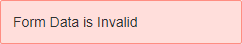
webix.message({type:"error", text:"Form data are Invalid"});
| Message | Image |
|---|---|
| Default (type:"info") |
|
| Error (type:"error") |
|
| Debug (type:"debug") |
|
| Success (type:"success") |
|

Related sample: Validation with a Complex Rule
Expire interval
By default, Webix Message disappears either on mouse clicking somewhere on its area, or in 4000 milliseconds after appearing.
To change the expire interval or cancel it, use the expire parameter:
webix.message({
    type:"error",
    text:"Form data are Invalid",
    expire:10000
    // expire:-1   for canceling the expire period
})
If you cancel the expire period, such a message will disappear only on a mouse click.
Hiding messages
Message boxes can also be hidden using API:
var message = webix.message("Hi!");
webix.message.hide(message);

// or via the message id
webix.message("Hi!","info",-1,"hi");
webix.message.hide("hi");
Styling Message Boxes
You can redefine the style of any message box through CSS. The name of a CSS class corresponding to a particular type of a message box is kept as webix_[type]. You can specify your own styling for a message box itself, as well as for its inner and outer borders:
/* message box + inner border */
.webix_mystyle div{
    background-color:#cdb4e4;
    border: 1px solid #676d71;
    color:#484444
}
/* outer border */
.webix_mystyle {
    background-color: #7e59bd;
    border: 1px solid #7e59bd;
    box-shadow: 0 0 10px #000
}
To apply the redefined style to the message box, specify its name in the box configuration using the type property:
webix.message({
    type:"mystyle",
    text:"Some message"
});
Global settings
webix.message provides the following global settings that are applied to all message instances:
- webix.message.expire (number) - expiration time in ms (4000 by default).
webix.message.expire = 2000; // messages expire in 2 seconds
- webix.message.position (string) - manages the vertical positon of messages and order of their appearance. "top" by default.
// messages appear in the right bottom corner
webix.message.position = "bottom";
Related sample: Message: Global Settings
The position setting takes the following values:
- "top" - messages are added one below another in the top right corner of the screen
- "left" - messages are added one below another in the top left corner of the screen
- "bottom" - messages are added one above another in the bottom right corner of the screen.
If you want to specify custom horizontal or vertical position use CSS.
Modal Message Boxes
Modal message boxes resemble UI-related modal Window. They do not prevent the workflow on the parent app. However they add a modal overlay over the UI, which stays there until the user clicks a button in the box or the box is hidden with hide API.
Message boxes contain some text and buttons ("OK", "Cancel", etc).
There are four types of modal message boxes:
- webix.alert() - an alert box with one button
- webix.confirm() - a confirmation box with two buttons to agree or cancel
- webix.modalbox() - a modal message box with any number of buttons
- webix.prompt() - a modal message box with two buttons (submit and cancel) and an input.
The boxes share some common properties, namely:
- id - the ID of the box
- title - text of the header
- text - text of the window body
- ok - text of the "ok" button (only for a confirmation and alert box)
- cancel - text of the "cancel" button (only for a confirmation box)
- type - the type of a modal message box to show a warning or an error ("alert-warning" or "alert-error" for a modalbox and an alert box, "confirm-warning" or "confirm-error" for a confirm box, "prompt-warning" or "prompt-error" for a prompt)
- width - the width of a message box
- height - the height of a message box
- container - the HTML container of the box (optional)
- callback - the callback function that will be executed when the box is closed
- css - class name that can be used for modalbox styling.
Please note that created boxes don't prevent the workflow on the application parent window.
webix.alert
The text of the button of an alert box is defined as the value of the ok parameter.
Short form
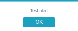
webix.alert("Test alert");
Extended form
webix.alert({
    title:"Custom title",
    ok:"Custom text",
    text:"Warning"
});
webix.alert() returns a promise that is resolved when a user clicks the button. The then() receives the alert result status (true).
webix.alert({
    title:"Custom title",
    ok:"Custom text",
    text:"Result: yes",
    type:"alert-warning"
}).then(function(result){
    // some action when the alert window is closed
});
webix.confirm
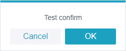
confirm message boxes have two buttons: "OK" and "Cancel".
Short form
webix.confirm("Test confirm");
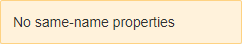
The text on the buttons can be changed with the same-name properties.
Extended form
webix.confirm({
    title:"Custom title",
    ok:"Yes",
    cancel:"No",
    text:"Test confirm"
});
Related sample: Confirm Message
webix.confirm() returns a promise.
- The promise resolves if a user clicks OK. For handling this action, use the then() method that receives the result status (true).
- The promise rejects when the user clicks Cancel. For handling this action, use the fail() function.
webix.confirm("Test confirm").then(function(result){
      webix.message("OK");
  }).fail(function(){
    webix.message("Cancel");
});
webix.modalbox
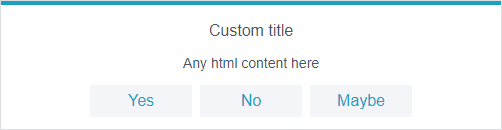
Webix modalbox resembles alert and confirm boxes, but with some differences:
- its text can include any HTML content
- it can have any number of buttons (you must set their labels in the buttons array in the modalbox config).
webix.modalbox({
    title:"Custom title",
    buttons:["Yes", "No", "Maybe"],
    text:"Any html content here",
    width:500
});
Modalboxes can be initialized in two forms: the short and the extended forms.
The short form:
webix.modalbox("Custom title","alert-error");
The extended form:
webix.modalbox({
    title:"Title",
    buttons:["Yes", "No", "Maybe"],
    text:"Some text",
    width:500
});
webix.modalbox() returns a promise. The promise resolves if the user clicks a button. For handling these actions, use the then() method that receives the result status (index of a button).
webix.modalbox({
    title:"Question",
    buttons:["Yes", "No", "Maybe"],
    text:"Do you love JS?",
    width:500
}).then(function(result){
        switch(result){
            case "0":
            webix.message("Good!");
                break;
            case "1":
            webix.message("Why?..");
                break;
            case "2":
            webix.message("Come back later");
        }
    }
);
webix.prompt
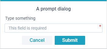
In addition to the common config shared with the alert and confirm message boxes, Webix prompt has an optional input property. It's an object that contains the following fields:
- value - input value
- required - if true, the input must not be empty to submit its value
- placeholder - placeholder text in the input.
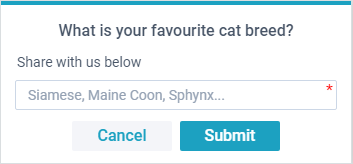
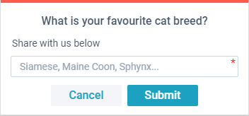
webix.prompt({
  title: "What is your favourite cat breed?",
  text: "Share with us below",
  ok: "Submit",
  cancel: "Cancel",
  input: {
    required:true,
    placeholder:"Siamese, Maine Coon, Sphynx...",
  }
});
webix.prompt() returns a promise that follows the common rules:
- promise is rejected in case of cancelling the dialog ("Cancel" is pressed)
- promise is resolved with an input value if "OK" is pressed
- if input is marked as required, input value must not be empty to be submittable.
webix.prompt({
  title: "What is your favourite cat breed?",
  text: "Share with us below",
  ok: "Submit",
  cancel: "Cancel",
  input: {
    required:true,
    placeholder:"Siamese, Maine Coon, Sphynx...",
  },
  width:350,
}).then(function(result){
  webix.alert({
    text: "Ooh, " + result + " cats are so cute!"
  });
}).fail(function(){
  webix.alert({
    type: "alert-error",
    text: "Cancelled"
  });
});
Container
You can initialize a modal box inside a container. The box will be positioned in the center of the container, and the modal overlay will cover only the container:
webix.ui({
    view:"window",
    id:"window1",
    width:600, height:400,
    head:"Window",
    body:"Container for the confirm box"
}).show();

webix.confirm({
    title:"Confirm",
    text:"Any html content here",
    container:$$("window1").$view
});
Related sample: Modalbox: Container
Subtypes of Modal Boxes
There are 2 subtypes of each modal box for showing a warning or an error.
Alert modal box
- "alert-warning"
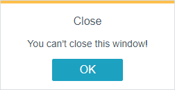
webix.alert({
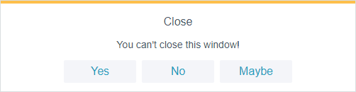
title: "Close",
text: "You can't close this window!",
type:"alert-warning"
});
- "alert-error"
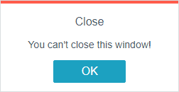
webix.alert({
    title: "Close",
    text: "You can't close this window!",
    type:"alert-error"
});
Confirm modal box
- "confirm-warning"
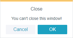
webix.confirm({
    title: "Close",
    text: "You can't close this window!",
    type:"confirm-warning"
});
- "confirm-error"
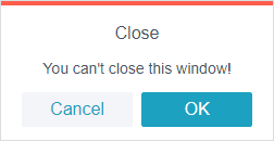
webix.confirm({
    title: "Close",
    text: "You can't close this window!",
    type:"confirm-error"
});
Modalbox
The modal message box may use the same types that are applied to alert message boxes. For example:
webix.modalbox({
    title: "Close",
    text: "You can't close this window!",
    buttons:["Yes","No","Maybe"],
    width:500,
    type:"alert-warning"
});
Prompt
Webix prompt can use the same types as alert message box does:
webix.prompt({
  title: "What is your favourite cat breed?",
  text: "Share with us below",
  type: "prompt-error"
});
Hiding a modal box
Alert, confirm and modal boxes are closed when the a user clicks the button. You can also close an alert box using the modalbox API:
For these needs you should define the id for a modal box to pass it to the .hide() method afterwards:
webix.alert({ title:"Test alert", type:"alert-warning", id:"1" });
webix.modalbox.hide("1");
Additionally, you can hide all modal boxes by:
webix.modalbox.hideAll();
Keyboard Interaction
Keyboard functionality for modal boxes is controlled by the webix.message.keyboard property that is initially set to true.
By default, modal boxes block keyboard events of the page. Users can use only the following keys that set a modal box value and close it:
- "space" and "enter" for accepting
- "escape" for rejecting.
To disable the above mentioned keys and enable standard keyboard events, you should set the keyboard property to false:
webix.message.keyboard = false;
webix.modalbox({/* ... */})
From now on, the user gets a possibility to use full keyboard, for instance, for typing values into inputs inside modal boxes.
Back to top