Advanced
Keyboard Events. Focusing. Navigation
Each time you create a component on the page, even a single one, the UIManager module is initialized (though indirectly). Its main tasks are:
- to watch what component is currently focused
- to set and remove focusing
- to assign keyboard events to the focused component
- memorizing the component's outer scheme.
Focus Control
Focusing Methods
Webix controls (e.g. Button, Text, etc), Form and Toolbar feature two opposite methods - focus() and blur() - that allow setting/removing focus.
$$("toolbar").focus();  // the toolbar is focused
$$("toolbar").blur();   // the toolbar is no longer in focus

$$("form").focus();     //the first focusable element in the form is focused
When using the focus() method either with a form or with a toolbar, you can pass the name of the needed control. In this case focus will be set to this control rather than to the whole form/toolbar:
$$("form").focus("text1");
// a text input with name "text1" in this form is focused
The UI Manager module has methods that take the ID of the needed widget as an argument:
- getFocus() - returns the view object that is currently focused
- setFocus(id) - sets focus on the specified widget
- hasFocus(id) - checks whether the widget is focused and returns true or false correspondingly
- canFocus(id) - checks whether the widget can be focused. Invisible (hidden) views and their items as well as disabled views cannot be focused.
You can use setFocus() to set focus to a data component and then call the select() method of the component to mark the focus visually:
Focusing widget with "books" ID
webix.ui({ id:"books", view:"list" });
webix.UIManager.setFocus("books"); //to set focus
$$("books").select($$("books").getFirstId()) //to mark focusing visually
Focusing Events
Every Webix component features a pair of focusing events onFocus and onBlur:
$$("datatable1").attachEvent("onFocus", function(current_view, prev_view){
    //current_view is the DataTable in question
});

$$("datatable1").attachEvent("onBlur", function(prev_view){
    //prev_view is the DataTable in question
});
In addition, Webix onFocusChange (global event) is triggered each time focus is shifted from one component to another. The following code retrieves the ID of the view that is currently focused and logs it to the console:
webix.attachEvent("onFocusChange", function(current_view, prev_view) {
    console.log("focused: " + (!current_view ? "null" : current_view.config.id));
});
Built-in Keyboard Events
Widgets that are in focus at the moment listen to the following keys:
- Tab, Tab+Shift - moves focus to the next/previous clickable element/input within the widget, or goes to the next/previous widget in the tab order.
For Global tab navigation see the related info.
Windows and message boxes
- The Esc key closes a non-modal window
- The Esc, Space and Enter keys are enabled by default for modal message boxes.
Data widgets
Hotkeys for navigation in data widgets like datatable and list are enabled by default via the navigation property set to true:
Data widgets respond to arrow keys in the following way:
- up/left - the previous item is selected
- right/down - the next item is selected
- page up - the item with the index "current index+10" is selected
- page down - the item with the index "current index-10" is selected
- home - the first item is selected
- end - the last item is selected.
Hierarchical data widgets - Tree, Treetable, Grouplist - have specific behavior for the "right", "left" and "enter" keys:
- left - closes the selected branch
- right - opens the selected branch
- Enter - toggles the selected branch (works for Tree and Treetable).
If no item is selected at the moment, the first visible item gets selection.
Editors of data widgets react on the following keys:
- Esc - to close without saving data changes
- Enter - to close with data changes saved.
Comboboxes
Comboboxes include combo, richselect, multiselect, multicombo, datepicker, daterangepicker and colorpicker widgets. They listen to the following keys:
- up/left - selects the previous value in the related popup. In case of the "up" key the popup is not shown while the "left" key triggers popup opening
- right/down - selects the next value while opening the related popup
- Enter - shows/hides the related suggest list while setting the selected value
- Esc - hides the related suggest list while setting the selected value.
Tabbar and Radio
Only the first tab/radiobutton is included into the tab order. To navigate within a control use the following keys:
- up/left - selects the next tab or radiobutton
- down/right - selects the previous tab or radiobutton.
Counter, Slider and RangeSlider
The hotkeys are enabled if the input area or slider handle is in focus:
- up/right - increases the control's value by the current step
- down/left - decreases the control's value by the current step.
Carousel
Carousel buttons are in the tab order. In addition, carousel icons respond to the following keys if focused:
- left - selects the next icon and shows the related view
- right - selects the previous icon and shows the related view.
Calendar
- up/left - the previous date is selected
- right/down - the next date is selected
- page up - the same date in the previous month is selected
- page down - the same date in the next month is selected
- home - the first date in month is selected
- end - the last date in month is selected
- Tab - moves across clickable elements of the calendar (buttons, icons).
If no date is selected at the moment, the first date of month is selected.
If calendar shows a time selection view, "left" and "right" arrows are used to change hours while "up" and "down" arrows change minutes.
Colorboard
- up/down - selects the above/below cell
- left/right - selects the cell to the left/right
- home - selects the first cell
- end - selects the last cell.
If no cell is selected at the moment, the first visible cell gets selection.
Toggle and Checkbox
- The Enter key is used to change state of the control.
Color Select
- Tab - moves the focus across the sliders (2 dots) and input
- up/left/page up - moves the active slider left or up
- right/down/page down - moves the active slider left or down
- home - moves the active slider to the initial position (leftmost top)
- end - moves the active slider to the rightmost top position.
Note that if Color Select is used as a suggest for an input then:
- up/left/down/right - moves the slider within the square area (saturation/lightness area);
- page up/page down - moves the slider on the hue slider (color line).
Attaching Custom Hotkeys
Hotkeys for Controls
You can define a custom hotkey that will trigger its onClick event. The key name (e.g. "enter" or "space") is specified by the hotkey property:
{ view:"button", click: doOnClick, hotkey: "enter" }
Related sample: Hotkeys for Buttons
The doOnClick function will fire either on pressing "enter" or on mouse clicking.
Key combinations joined by + or - sign are as well possible:
{ view:"button", click: doOnClick, hotkey: "enter-shift" }
Note that such functionality will work with simple controls like buttons and inputs, and will not with multiple-choice ones.
Defining Custom Hotkeys
The addHotKey function is called from the UIManager object and has two obligatory parameters - key name and event handler. Key combinations joined by + or - sign are as well possible.
You can make hot keys global, which means that they will trigger the function regardless of the component. The one in focus will be subject to hot key actions.
webix.UIManager.addHotKey("Ctrl+V", function() {
  webix.message("Ctrl+V for any");
});
At the same time, you can specify any instance of a Webix component that should react on this or that hot key by passing its ID into the function as a third parameter.
In case you want all the view instances react on the specified hot key, state the view name instead of ID:
//hot keys for the component with "details" ID
webix.UIManager.addHotKey("Ctrl+Enter", function() {
    console.log("Ctrl+Enter for details");
    return false;
}, $$("details")); // for "details" list only


//hot keys for all list instances on the page.
webix.UIManager.addHotKey("Ctrl+Space", function() {
    console.log("Ctrl+Space is detected for list");
}, "list");
Related sample: Basic Use of Editors
Removing Hotkeys
The removeHotKey function is used to remove a hotkey. It takes the key name as an obligatory parameter
//adding a hotkey
webix.UIManager.addHotKey("Ctrl+Space", function() { ... }, "list");

//removing all hotkeys under the name
webix.UIManager.removeHotKey("Ctrl+Space");
You can also specify the hotkey handler as the second parameter to remove only a particular hotkey:
//removing the hotkey with the specified handler
webix.UIManager.removeHotKey("up", my_function);
It's also possible to remove a hotkey from a specific view. For this, you need to specify the view ID as the third parameter.
To remove the hot key from all the view instances, pass the view name instead of ID:
//removes a hotkey from the view with the "details" ID
webix.UIManager.removeHotKey("up", null, $$("details"));

//remove hot keys from all list instances on the page
webix.UIManager.removeHotKey("up", null, "list");
Attaching Keyboard events
- onKeyPress (code, ctrl flag, shift flag, native event) - takes key codes to perform actions on pressing the specified key/keys
- onEditKeyPress (code, ctrl flag, shift flag, native event) - has the same functionality as the event above, but the event can be applied to an opened editor
- onTimedKeyPress - fires with delay and starts function execution only when a user stops typing.
In the code below the "Enter" key opens "details" accordion item. Before this, you check that it is not combined with either Ctrl, Shift or Alt key:
"Enter" key in action
$$("books").attachEvent("onKeyPress", function(code, e) {
    if (code === 13 && !e.ctrlKey && !e.shiftKey && !e.altKey) {
        $$("details").getParentView().expand("details");
    return false;
    }
});
These events require that a developer should know key codes used by UI Manager. Here they are:
Key Codes
- "enter": 13,
- "tab": 9,
- "esc": 27,
- "escape": 27,
- "up": 38,
- "down": 40,
- "left": 37,
- "right": 39,
- "pgdown": 34,
- "pagedown": 34,
- "pgup": 33,
- "pageup": 33,
- "end": 35,
- "home": 36,
- "delete": 46,
- "backspace": 8,
- "space": 32,
- "meta": 91,
- "win": 91,
- "mac": 91
- "multiply": 106
- "add": 107
- "subtract": 109
- "decimal": 110
- "divide": 111
- "scrollock":145
- "pausebreak":19
- "numlock":144
- "shift":16
- "capslock":20
Global Tab Navigation
Tab/focus Order Logic
You can move through your app with the Tab and Shift+Tab keys. All widgets and their clickable areas are in the tab order.
If you tab to a widget, its active area is focused. It can be the selected item, active tab or radiobutton, or the whole widget like text or button. If a data component does not have visible selection, the first visible item is focused.
Also, all clickable areas of a component (buttons, icons, text fields) are in the tab order as well.
The UIManager allows getting the next/previous widget in tab order:
- getNext(id) - gets the next view
- getPrev(id) - gets the previous view
- getTop(id) - gets the parent view to all the components.
All these methods take the necessary view id as an argument.
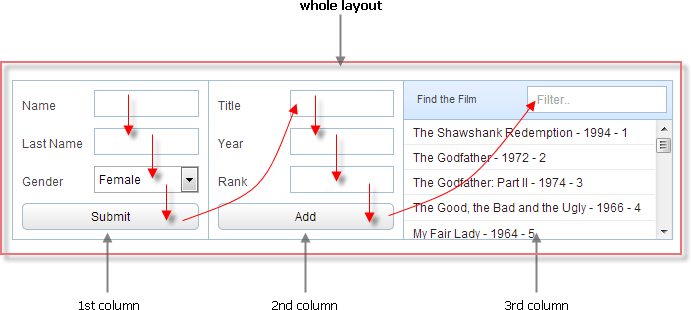
Let's consider the picture above and see how these methods will work for a text input field (its ID is "year").
var prev = webix.UIManager.getPrev($$("year")); //returns "title" input field object
var next = webix.UIManager.getNext($$("year")); //returns "rank" input field object
var top = webix.UIManager.getTop($$("year")); //returns "layout" object