Advanced Configuration of Popup Selectors
Combo, richselect, multiselect and multicombo controls can be highly customized because they are comprised of the following components:
- Webix text input that can be either editable (for combos) or non-editable (for selects);
- Webix list from which templating and loading rules, item sizes and look-and-feel are taken;
- Webix popup from which popup size and behavior are taken.
The combination of list and popup is called suggest list (described in detail separately). Here we will have a look at extra configuration possibilities of suggest-based controls.
Advanced Configuration
Normally, we define select options as array or data source:
Short notation
{ view:"combo", options:[..data..] }
//or
{ view:"combo", options:"mydata.php"}
A suggest list of a default type will be attached. It will feature default template, size and filtering (for editable inputs). If you need to customize these things, you should use the extended configuration.
Extended notation
{ view:"combo", options:{
    view:"suggest", // optional
    filter:function(item, value){ ...},
    body:{ // list configuration
        view:"list", // optional
        data:[..data..],
        template:"#value#",
        yCount:7
    }
}}
Related sample: Advanced Options for Select Controls ('combo' and 'richselect')
As you can see, options attribute can be used as object that houses suggest configuration and list settings in its body.
Changing Option Template
Option data may contain any properties instead of (in addition to) default id-value pairs (still, id attribute is mandatory).
{ view:"combo",
  value:2,
  options:{
        body: {
          template:"#name#"
        },
        data:[
         { id:1, name:"Banana" },
         { id:2, name:"Papaya" }
        ]
  }
}
Extra text or HTML can be added:
{ view:"combo",
  value:2,
  options:{
        body: {
           template:"Extra #value#"
        },
        data:[
          { id:1, value:"Banana" },
          { id:2, value:"Papaya" }
        ]
  }
}
Changing Filtering Pattern
When a custom template is used for a combo box filtering should be redefined as well, since by default combo popup is filtered by value property.
Options attribute houses configuration of a suggest list in use while its body attribute houses a popup list:
view:"combo", value:1, options:{
    filter:function(item, value){
        if(item.name.toString().toLowerCase().indexOf(value.toLowerCase())===0)
             return true;
        return false;
    },
    body:{
        template:"#name#",
        data:[
           { id:1, name:"Banana"},
           { id:2, name:"Papaya"}
        ]
    }
}
Filtering is applied only in case the suggest list is combined with editable inputs - combo and multicombo.
Server-Side Options
The easiest way to load options from server is to set a link to the necessary script right in the options attribute:
view:"richselect", value:"2", options: "server/data.json"
For extra customization, see below how to define options dynamically.
Getting Popup and List objects
The controls feature special API to work with their parts:
var popup = richselect.getPopup(); //popup object
var list = richselect.getPopup().getList(); // list object
Defining Options Dynamically
Defining options data through the control:
Options can be redefined like any other property:
combo.define("options", [ {id:1, value:"Apple"}, {id:2, value:"Banana"} ]);
combo.refresh();
Parsing options into a popup list
Options are parsed to popup list under Webix data loading rules:
var list = $$("combo1").getPopup().getList();
var new_options = [
      { id:1, name:"Germany"},
      { id:2, name:"Great Britain"}
];
list.clearAll();
list.parse(new_options);
Options can be loaded by Ajax as well:
webix.ajax().get("server/data.php", function(text, data){
    var options = data.json();

    var list = $$("combo1").getPopup().getList();
    list.clearAll();
    list.parse(new_options);
});
Loading options into a popup list
Options are loaded to popup list under Webix data loading rules:
var list = $$("richselect2").getPopup().getList();
list.clearAll();
list.load("server/data.json");
Syncing Options with a DataCollection
Options list can be synchronized with either other component data or Datacollection data:
// pushes the specified data into richselect popup
$$("my_richselect").getPopup().getList().sync($$("list1"));
Related sample: Get Popup View
Data syncing is described in the related article.
Attaching Events within a Suggest List
You can attach functions to list under the common Events Handling pattern:
view:"combo", value:1, options:{
    body:{
        data:[
           { id:1, value:"Banana"},
           { id:2, value:"Papaya"},
           { id:3, value:"Apple"}
        ],
        on:{
           'onItemClick':function(id){
               webix.message("Clicked: "+this.getItem(id).value);
            }
        }
   }
}
Still, to catch changes in the combo/richselect, it's better to use the related onChange event.
Sizing and Positioning
The dimensions of a popup list as well as its position in relation to a master control can be customized via suggest/options configuration object.
view:"combo", options:{
    fitMaster:false,
    body:{
        yCount:7
    }
}
Read more about it in the corresponding documentation article.
Changing Suggest Type
Be careful while experimenting with this feature - suggest lists differ in functionality.
By default, multiple-choice controls, e.g. multiselect use a checksuggest for storing options:
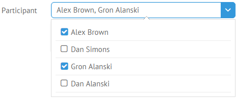
{ view:"multiselect", options:[
    { id:1, value:"Alex Brown" },
    { id:2, value:"Dan Simons" }
]}
If you want to use a multisuggest for these needs, use extended configuration and specify view name:
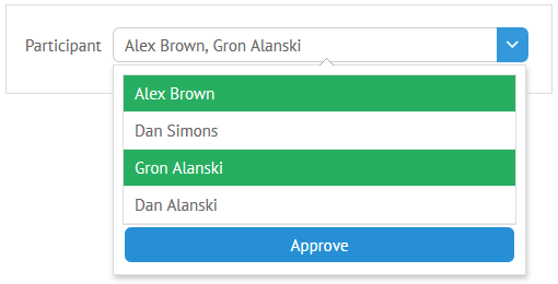
{ view:"multiselect",  options:{
    button:true,
    buttonText:"Approve", //"Select" by default
    view:"multisuggest",
    data:[
        { id:1, value:"Alex Brown" },
        { id:2, value:"Dan Simons" }
    ]
}}
Related sample: Multi-select Input
Read more about advanced suggest lists.
Back to top