Text
API Reference
Overview
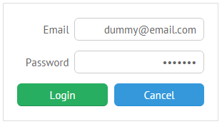
UI-related text control is a one-line input field with a label.
Initialization
{view:"text", value:"dummy@email.com", label:"Email", inputAlign:"right",
    labelAlign:"right"},
{view:"text", type:"password", value:"123pass", label:"Password", inputAlign:"right",
    labelAlign:"right"}
Related sample: Text Input ('text')
Main properties:
- value (string, number) - the initial value for a text field, can be editable or readonly on your choice.
- label (string) - the text label of a control. It can be customized by:
- labelAlign (string) - the label alignment towards its container. Possible values are "left" and "right". In any way, it's placed to the left of the control;
- labelWidth (number) - the width of the label container;
- labelPosition (string) - defines the label position related to the input field. There are two possible values: "left" (the default one) and "top".
- inputAlign (string) - the input alignment towards its container. Possible values are "left", "right" and "center". An input is left-aligned by default.
- type (string)- the type of a text field can be "password", "email", "url", "number" and "text" by default. Type is vital for HTML5 input data validation.
- placeholder (string) - the initial text in the text field disappears as you start typing in it.
- suggest (array, string) - a collection of suggest values, or the ID of an attached suggest list with these values.
- pattern (object, string) - a formatting pattern applied to a text input, if set as an object, contains two properties:
- mask - a string that includes "#" signs for input characters (can be restricted by the allow parameter) and pattern symbols, such as hyphens, dots, spaces, etc.;
- allow - a set of characters that are allowed for entering into the field regardless of their position.
- format (string) - a number format applied to a text input. See the details below.
Using HTML Attributes
At the same time, "text" properties can be set via the attributes object containing properties that coincide with HTML input tag properties. The object is used for HTML5 data validation.
- attributes (object)
- maxlength (number) - the maximum quantity of symbols that can be typed into the text field;
- required (boolean) - indicates whether this field must be filled before the form can be submitted. False by default;
- title (string) - a tooltip displayed on mouseover.
The same functionality is true for Textarea and Multitext.
Setting Number Format
The functionality is available in the PRO edition only.
You can set a custom format for entering number values into input fields with the help of the format property of the Text view.
There are wide possibilities of setting a number format. You can:
- define a delimiter for groups of digits and set a delimiter that will separate the decimal part in the float numbers according to the rules of the local language
- set any optional separator for numbers
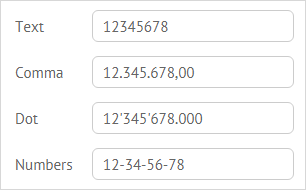
{ view:"text", value:'12345678', name:"b", label:"Comma", format:"1.111,00" },
{ view:"text", value:'12345678', name:"c", label:"Dot", format:"1'111.000" },
{ view:"text", value:'12345678', name:"d", label:"Numbers", format:"1-11" }
- use the necessary currency symbol
{ view:"text", value:'1234', name:"e", label:"Price", format:"$1'111" }
- specify a custom format by setting the format property as an object with two attributes:
- parse - the function that handles a real value kept by the control
- edit - the function that handles a value that will be rendered
{ view:"text", value:'12345678', name:"f", label:"Phone", format:{
    parse: function(a){ return a.replace(/[^0-9]*/g,""); },
    edit: function(a){
        function chunk(a, n){
            return a.length > n ? (a.substr(0,n) + "-" + chunk(a.substr(n), n)): a;
        }
        return (a.length ? "+": "") + chunk(a, 3);
    },
}}
Related sample: Text Input with Number Format
Locale-dependent number formatting
You can apply the number format depending on the set locale.
- First of all, define the number format for a text input, since it doesn't have any by default:
var numberFormat = {
  edit : function(v){ return webix.Number.format(v, webix.i18n); },
  parse : function(v){ return webix.Number.parse(v, webix.i18n); }
};

webix.ui({
  rows:[
    {view:"text", label:"Count", id:"itext", value:12323234.44, format:numberFormat}
  ]
});
- Then use webix.i18n.setLocale to apply the necessary locale to the number format of the text input:
window.switchLocale = function(locale) {
  webix.i18n.setLocale(locale);
  $$("itext").refresh();
}
Related sample: Locale-Dependent Number Format for Text Input