Available only in PRO Edition
DateRangePicker
Since 4.0
The control is available only in Webix Pro edition.
API Reference
Overview
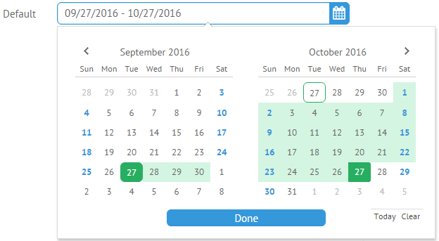
DateRangePicker is used in a combination with a UI-related DateRange that is initialized on clicking the control. It allows choosing a date range and, optionally, time in the calendar for their further usage.
Related sample: DateRange Picker
Initialization
You can initialize a DataRangePicker in the following way:
{
    view:"daterangepicker", name:"default", width:500, label:"Default",
        value:{start: new Date(), end: webix.Date.add(new Date(), 1, "month")}
}
Main Properties
- label (string) - text label of a control. It can be customized by:
- labelAlign (string) - label alignment towards its container. Possible values are "left" and "right". In any way, it's placed left to the control;
- labelWidth (number) - width of the label container;
- value (object) - initial value to display in the control input field;
- placeholder (string) - defines placeholder for DateRangePicker input. The control should be initialized without an initial value;
- timepicker (boolean) - enables a clock for time selection (false by default);
- stringResult (boolean) - sets the data type of value returned by getValue()/get Values() methods. If true, it returns date as string. By default the property is false and the method returns an object which contains two date objects for the start and end dates of the range, correspondingly;
- format (string) - sets a date format to display in the DateRangePicker field. By default it is "%Y-%m-%d".
Customizing Popup of DateRangePicker
You can customize the DateRangePicker popup by using the suggest property which links suggest date range with the input.
It is an object where you should place the DateRangeSuggest view and the body object with the desired DateRange properties:
{
    view:"daterangepicker",
    name:"custom",
    width:500,
    label:"Custom",
    suggest:{
        view:"daterangesuggest",
        // daterangesuggest properties
        body:{
            // daterange properties
            calendarCount:1,
            icons:false,
            timepicker:true
        }
    }
}
Time Selector
You can set a particular time for the start and end dates of the range by clicking the clock below the calendars' grids. Note that the time selector will appear when you will select the necessary date in a calendar.
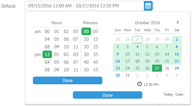
To enable the time selector, you should set the timepicker property with the true value in the DateRangePicker configuration:
{
    view:"daterangepicker",
    name:"default",
    width:500,
    label:"Default",
    timepicker:true
}