DatePicker
API Reference
Overview
Datepicker is used in a combination with UI-related Calendar that is initialized on clicking the control. It allows choosing a date and, optionally, time in the calendar for their further usage.
Related sample: Date Picker ('datepicker')
Initialization
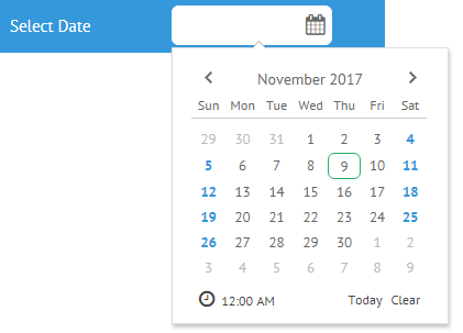
To initialize DatePicker on a page, make use of the code below:
{
    view: "datepicker",
    value: new Date(2017,10,9),
    label: "Select Date",
    timepicker: true
}
Main properties
- label (string) - the text label of a control. It can be customized by:
- labelAlign (string) - the label alignment towards its container. Possible values are "left" and "right". In any way, it's placed left to the control;
- labelWidth (number) - the width of the label container;
- value (string, object) - defines the initial value of the control;
- placeholder (string) - defines a placeholder for the datepicker input. The control should be initialized without an initial value;
- timepicker (boolean) - enables a clock for time selection (false by default);
- stringResult (boolean) - sets the data type of the value returned by the getValue()/get Values() methods. If true, returns a date as a string. By default, the property is false and the method returns a date object;
- format (string) - sets a date format to display in the datepicker field. By default it is "%Y-%m-%d".
- type (string) - (optional) sets the datepicker type:
- "time" - configures a datepicker for time selection only (uses webix.i18n.timeFormat as a formatting pattern)
- "month" - configures a datepicker to display a calendar in the "month" mode
- "year" - configures a datepicker to display a calendar in the "year" mode
- multiselect (boolean,string) - enables multiselect in a datepicker. Can be set to the "touch" value to switch multiple selection on touch devices.
Selecting Multiple Dates
The Datepicker widget provides the possibility to select multiple dates in a calendar at once. To enable this feature, set the multiselect property to true:
webix.ui({
    view:"datepicker",
    value:"2016-1-14, 2016-1-16, 2016-1-18",
    multiselect:true
});
To select several dates at a time, use the CTRL+mouse click combination.
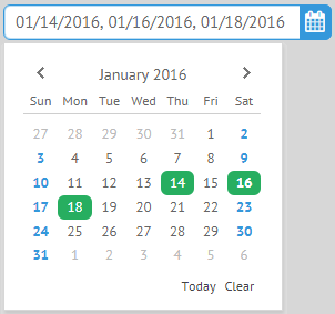
The widget also supports multiple selection on touch devices. To enable this mode, you need to set the multiselect property to the "touch" value:
webix.ui({
     view:"datepicker",
     value:"2016-1-14, 2016-1-16, 2016-1-18",
     multiselect:"touch",
     stringResult:true
});
Related sample: Multiselect in the Calendar
"Month" and "Year" Calendar Modes
Datepicker calendar can be shown in the month or year mode. To set one of these modes, use the type property with either "month" or "year" value:
Month mode
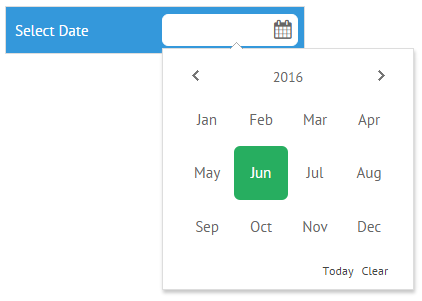
webix.ui({
    view:"toolbar",
    elements:[
        {view:"datepicker",align:"right",label:"Select Date",type:"month"}
    ]
});
Year mode
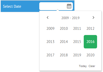
webix.ui({
    view:"toolbar",
    elements:[
        {view:"datepicker",align:"right",label:"Select Date",type:"year"}
    ]
});
Time Selector
If you need to select time (hours and minutes) only, use the datepicker with "time" type:
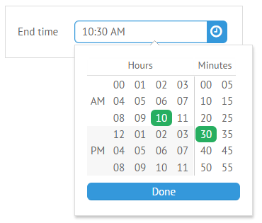
{ view:"datepicker",type:"time",stringResult:true }
Dates are formatted according to the Date Formatting Methods.
Disabling Date and Time Slots
To limit the ability of a user to pick date and time periods, you should access the calendar object that lies in the datepicker popup and apply the needed configuration to it:
{
    view:"datepicker",
    suggest:{
        type:"calendar",
        body:{
            minDate:new Date(),
            maxDate:"2016-05-07"
        }
    }
}
More about Disabling Dates in Calendar
More about Advanced Popup Configuration in Popup Selectors
Back to top