Label
API Reference
Overview
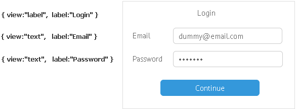
UI-related label is a non-scrollable placeholder for plain text. Like other components it features a specific label property that sets a text value.
Initialization
{ view:"label", label: "Label", inputWidth:100, align:"center"}
Main properties
- label - (string) defines text of the label control;
- inputWidth - (number) defines the width of the control;
- align - (string) positions the label with relation to the parent view.
The Label control can be used to render any user HTML or icons (both default and custom):
{ view:"label", label:"<span class='myCss'>My Label</span>"},
{ view:"label", label:"<span class='webix_icon fas fa-user'></span> My Label" }