Property Sheet
API Reference
Overview
Property sheet is a list of properties. UI-related property sheet inherits from view.
Initialization
{ view:"property", id:"sets", width:300,
    elements:[
       { label:"Layout", type:"label"},
       { label:"Data url", type:"text", id:"url"},
       { label:"Data type", type:"select", options:["json","xml","csv"], id:"type"},
       { label:"Use JSONP", type:"checkbox", id:"jsonp"}
    ]
};
Related sample: Property Sheet: Basic Initialization
The elements with the label type get header CSS. If there's no type, the element is non-styled and non-editable.
Property Sheet Values
The elements of a property sheet can be treated together, you can get and set their values just like you do it with form and HTMLform.
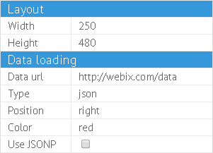
$$("sets").setValues({
    width:250,
    height:480,
    url:"http://Webix.com/data",
    type:"json"
});

var values = $$("sets").getValues();
Complex Values
Property sheet can take complex values in the complexData mode:
webix.ui({
    view:"property",
    id:"sets",
    complexData:true,
    elements:[
        { label:"Width", type:"text", id:"layout.width" },
        { label:"Height", type:"text", id:"layout.height"}
    ]
});

$$("sets").setValues({
    layout:{
        width:250,
        height:480
    }
});
Related sample: Property Sheet: Data with Complex Properties
The names of property elements should be concatenated from the data names within the values.
Editing Data in Elements
Each element features a built-in editor specified by the type property. Possible values coincide with editor types and include:
- color - an editor for colors, a colorboard appears on editing;
- text - a standard editor for text values;
- password - a text editor for passwords;
- select - for selection among several text values with the help of an HTML 'select' control;
- combo - for selection among several values with the help of Webix combo control. Input is editable;
- richselect - for selection among several values with the help of Webix richselect control. Input is non-editable;
- checkbox - for two-state values.
Select editors features options in their configuration that can be defined in the following ways:
- DataCollection
- any data component
- URL with the path to the data file
- array with id-value objects
[{ id:1, value:"one"}, ...] - array with values
["one", "two"] - associative array
{ 1: "one", 2: "two"} - function / proxy
{
    view:"property",
    id:"sets",
    elements:[
        { type:"select", options: ["json","xml","csv"]},
        { type:"select", options: [
            {id:1, value:"json"},
            {id:2, value:"xml"},
            {id:3, value:"csv"}
        ]},
        { type:"select", options:"grid_id" },
        { type:"select", options:data_collection }
    ]
}
Regardless of the way you set options, they will be stored in a DataCollection and can be accessed and modified via the element configuration object:
$$("sets").config.elements[10].collection.add({ value:"New" });
Customizing Editor Collection
You can register your own editors type for the elements with the help of the registerType method. While registering a new element type, you should specify its appearance and behavior.
'Toggle' editor for two-state values
$$("sets").registerType("toggle",{
    template:function(value, config){
        return "<input type='button' class='webix_toggle_button_custom' value='"+
          value+"' style='margin:0px; width:95%; height:20px; font-size:12px; '>";
    },
    click:{
        webix_toggle_button_custom:function(e, id){
            var data = this.getItem(id);
            if (data.options[0] == data.value)
                data.value = data.options[1];
            else
                data.value = data.options[0];

            this.editStop();
            this.refresh(id);
            this.callEvent("onCheck",[id, data.value]);
        }
    },
    editor:"inline-text"
});
And then use it:
webix.ui({
    view:"property", id:"sets", elements:[
        { label:"Data type", type:"toggle", options:["json","xml"], id:"type"}
    ]
});
Related sample: Property Sheet: Custom Editors
Using Custom Popup Editors
Popup editors are based on Webix popup window and can be registered with either default or custom logic:
Default Popup
//including the editor into the property sheet
webix.ui({
    view:"property", id:"sets", elements:[
        { label:"Color front",  type:"popup", popup:"myColorF", id:"colorF" },
        ...
    ]
});

//defining its appearance
webix.ui({
    id:"myColorF",
    view:"popup",
    body:{ view:"textarea", width:300, height:100 }
});

//registering the new type
prop.registerType("popup",{
    editor:"popup"
});
Custom Popup
// standard popup editors is extended with new functions
webix.editors["popup-ra"] = webix.extend({
    focus:function(){ },
    getValue:function(node){
        return this.getInputNode(node).data.edit;
    },
    setValue:function(node, value){
        this.getPopup(node).show(node);

        this.getInputNode(node).data.edit = value;
        this.getInputNode(node).refresh();
    }
}, webix.editors["popup"]);

//new type is registered
prop.registerType("popup-ra",{
    editor:"popup-ra"
});
Related sample: Property Sheet: Custom Editors
Related Articles
- Data Object Operations
- Sizing Components
- Resizing
- Redefinition of the Components
- Property Sheet CSS Image Map
If you have not checked yet, be sure to visit site of our main product Webix ui library and page of property list editor product.