Intermediate
Working with Dates
Dates with UI Components
Loading and Formatting
Dates are loaded to components according to common data loading rules.
Either in the database or in data files dates can be stored in two ways: as DateTime objects or as strings.
- DateTime objects should be formatted for adequate presentation. Otherwise, the output will be like "Tue Nov 30 2010 00:00:00 GMT+0200";
- Strings can be either shown in the way they are stored or converted to objects and then formatted.
Only DateTime objects defined with the new Date(); method are subject to formatting, since it presupposes the "to-string" conversion. Strings should be converted beforehand.
Pre-Formatting: String-to-Object Conversion
There exist two methods of string-to-date conversion:
- Built-in (map property). Datatable Only.
Conversion is provided by the map property used for the column instead of the column ID. The same as ID, a map refers to the necessary data item and allows for format specification:
webix.ui({
    view:"datatable",
    columns: [
        { map:"(date)#enddate#",editor:"date",header:"End date", width:120}
    ],
    data: [
        {id:"1", startdate:"2013-09-26", enddate:"2011-05-15"},
        {..}
    ]
})
- Custom (using webix.Date object functions).
Applicable to all data management components including datatable.
Here we create the necessary conversion pattern and then define it as a scheme for the loaded data.
var my_format = webix.Date.strToDate("%Y-%m-%d");
// hyphen-separated values are interpreted as year-month-date object

webix.ui({
    view:"datatable",
    // config
    scheme:{
        $init:function(obj){
            obj.startdate = my_format(obj.start);
        }
    }
})
Related sample: Converting Strings to Dates
Now we've got DateTime objects ready to formatting.
Defining Formatting Methods
There are two objects in the library that handle dates - webix.Date and webix.i18n. Both of them contain date formatting and processing logic, while the latter is responsible for date (as well as number and price) localization.
webix.i18n
Localization means locales implementation, where a locale is a collection of formatting methods and patterns for a certain area. They are defined separately and later applied to the necessary data. By default, if you format dates with the i18n object, all the dates and numbers will be formatted according to North American region rules.
Date and Number localization are described in the related article.
webix.Date
The Date object allows formatting dates regardless of locales with the help of the dateToStr method. It requires format specification in its argument.
{
    header:"m/d/Y",
    sort:"date",
    id:"start",
    format:webix.Date.dateToStr("%m/%d/%y")
}
The datatable column here shows the stored date in the "month number/day number/two-digit year" format.
Possible format specifiers are listed in the related article.
Applying Formatting Methods
Only Datatable has the format property for its columns, while other components require a specific function template.
Formatting Datatable Data
webix.ui({
    view:"datatable", columns:{
    [
        { header:"WeekDay", id:"start", format:webix.i18n.longdateFormatStr},
        {...}
    ]}
});
Formatting Other Component's Data
// format is specified by locale
webix.ui({
    view:"list",
    template:function(obj){
        return webix.i18n.longDateFormatStr(obj.start);
    }
});

// format is specified separately
var myformat = webix.Date.dateToStr("%m/%d/%y");

webix.ui({
    view:"list",
    template:function(obj){
        return myformat(obj.start);
    }
});
Editing
Dates within components are edited with the help of the dedicated editor (see Data Editors for details).
Requirements for Date editing:
- a component should be editable;
- the type of editor should be defined. Here we need "date";
- editValue (data item subject to editing) should be specified (excluding datatable). The thing is that components may have more than one data item in a cell;
- optionally editaction is defined (click by default).
See the details on the listed options in the API reference of the EditAbility mixin.
In the example below an editor is used as a datepicker to call a UI calendar on the defined edit action to pick the necessary date:
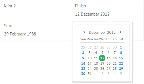
webix.ui({
    view:"dataview",
    // config
    editable:true,
    editor:"date",
    editValue:"start", // refers to the data item
    data:[
        { text:"Joint 2", start:new Date(2011,1,14)},{...}
    ]
});
Related sample: Dataview Formatting
When working with the server side, initialize a dataProcessor for the component and the changes will be automatically saved back to the server.
Sorting
Though dates are presented as strings, they are sorted as date objects. So before sorting don't forget to convert dates to DateTime objects in case they are stored as strings (see above).
Sorting can be applied in two directions: "asc" (ascending) and "desc" (descending).
Built-in Sorting
Datatable only. Datatable features the dedicated sort property for its columns.
Custom Sorting
Applicable to all components. Here we make use of the sort function that needs:
- the template of the data item subject to sorting;
- the sorting direction;
- the sorting mode ("int", "date", "string", "string_strict", "text", "server", "raw" or a custom one).
HTML Button Triggers Sorting
<input type='button' value='Sort "Asc"'
    onclick='grid.sort("#start#", "asc", "date");'>
Related sample: Using Date Templates
Dates Input in Forms
Form fields that require date input from users should be supplied with a calendar for user convenience.
There exists a special datepicker control, that looks like a normal text field with a calendar icon.
When you click it, a popup calendar appears. On selecting the necessary date, click somewhere outside the popup and the date will be shown in the text field. By default, date is shown formatted as "%Y-%m-%d" and stored as a DateTime object.
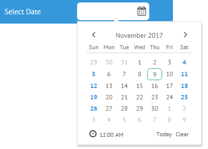
Related sample: Date Picker in Calendar
Customization
The calendar can be customized within the webix.editors object as well as localized according to common rules.
The default date for the control to show as well as the default date of the popup calendar is the current one. The pattern can be changed by setting the necessary value in the datepicker constructor:
{
    view:"datepicker",
    value:new Date(2011,1,12)
}
Default formatting can be changed as well. Formatting rules are described above and applied to the control as a value of its format property.
{
    view:"datepicker",
    format: webix.Date.dateToStr("%d/%m/%y")
}
Related sample: Date Picker in Calendar
If a form is bound to a component, it loads dates in the format specified by the formatting pattern of this component. For example, if a custom format is defined for a datepicker, a form will get the format from it.
Back to top