Custom X-Axis Formation
Sometimes you need to create a detailed scale, especially when you work with dates.
Related sample: Bar Chart: Custom xAxis
Here you work with dates and sales per date stored in JSON dataset. Note that dates are stored as strings.
var dates_dataset = [
    { id:1, sales:20, date:"05.01.2012", color: "#ee4339"},
    { id:2, sales:55, date:"10.01.2012", color: "#ee9336"},
    { id:3, sales:40, date:"15.01.2012", color: "#eed236"},
    ...
];
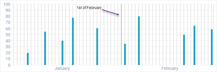
Sales are represented by y-Axis values, while dates form the timeline on the x-Axis, each unit representing a day of month. The quantity of units per month should be equal to the real quantity of days in this or that month, which isn't a static value.
In this case, the look of the x-Axis can be totally customized using the following properties: template, lineColor, value and units.
Units
The object properties set the first and the last unit for the scale as well as specify a step between neighboring units.
units:{
    start:new Date(2012,0,1), //starting from the 1st of January
    end:new Date(2012,1,29), //finishing on the 29th of February
    next:function(d){
        return  webix.Date.add(d, 1, "day", true);
    }
}
Step is set by the add function that takes date object, number of units to add and the unit name as parameters.
Template
Template defines a text label for an axis. A normal chart scale features one label below an axis, but here we need to underwrite each month of the timeline.
The function below allows placing the right label under the 15th day of each month:
template:function(obj){
    return obj.$unit.getDate()==15?webix.Date.dateToStr("%F")(obj.$unit):""
}
The function gets day number from the Date object of each unit. If it equals to 15, the date is parsed to string and formatted to output the full name of the month. Otherwise, the unit receives no label.
LineColor
Line color within x-Axis object defines the color of vertical scale units.
For example, we can make the line for the first day of February darker than the others.
lineColor:function(obj){
    return (obj.$unit && (obj.$unit.valueOf() == (new Date(2019,1,1)).valueOf())) ? "#737373" : "#cfcfcf";
}
The function defines the value of each unit. If it is equal to the 1st of February, it returns dark gray (#737373). Otherwise, the color is light gray.
Value
Value is the function that converts data items that come from a database into unit values. It allows comparing data items with chart units.
The example below shows the case of date units and string values in data source. A string property is taken from the data item (obj.date) and turned to Date object formatted under the "day_number.month_number.full_year" pattern.
value:function(obj){
    console.log(webix.Date.strToDate("%d.%m.%Y")(obj.date))
    return webix.Date.strToDate("%d.%m.%Y")(obj.date);
}
Values are not displayed right in the chart, but shown with the help of the tooltip. It is rather helpful when a big number of units should be displayed in the chart.
Related sample: Bar Chart: Custom xAxis
Back to top