Menu
API Reference
Overview
UI-related pull-down Menu inherits from list and lets users select the necessary item from the list of grouped items (sub-menus). Each element of a submenu can start its own sub-menu.
A dynamic Submenu becomes visible only when you put a mouse pointer over the corresponding item of the main menu (on 'onMouseOver' event) and hides as soon as you remove mouse pointer ("onMouseOut").
Initialization
Menu object is stored in the data property.
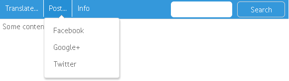
webix.ui({
view:"menu",
id:"my_menu",
subMenuPos:"right",
layout:"y",
data:[ //menu data
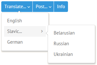
{ value:"Translate...", submenu:["English", "Slavic...", "German"]},
{ $template:"Separator" },
{ value:"Post...", submenu:[ "Facebook", "Google+", "Twitter" ]}
],
type:{
subsign:true,
height:50
}
});
Submenu configuration may include:
- subMenuPos (string) - sets position of pull-down sub-menus that will appear on mouse over;
- submenuConfig (object) - sets common configuration for all the sub-menus in this menu regardless of their nesting level;
- layout (string) - sets the arrangement of menu items: x (default) for a horizontal menu, y for a vertical one;
- $template (string) - flag that indicates a separator between groups of menu items. Possible types are as follows:
- "Separator" - a gray separating line;
- "Spacer" - an empty item with white background that doesn't change on mouse over.
- type - object that contains setting for menu items, namely:
- subsign (boolean) - sets an arrow for an item containing a submenu;
- height and width (number) of each item;
- openAction (string) - alters the way of submenu opening - "click". If set, you should first click a menu item to enable submenu opening and hiding on "onMouseOver" and "onMouseOut" events. To hide sub-menus, you need to click somewhere outside the menu;
- template - (string, function) - rules of data presentation. See Data templates article for details;
- data (object) - the inline data desired format. See Loading data article for details
- autowidth - (boolean) adjusts the width of pull-down sub-items according to the length of their text, false by default
Related sample: Showing Menu on Mouse Click (dropping down on hover is disabled)
Working with Menu Items
Configuring Menu Items
A menu/submenu item can be a text item including the one that starts its own submenu and any Webix component specified by ID.
Menu items are stored in the data array, each item being an object. Submenu items are stored in the submenu or data array. Each menu item may have the following attributes:
- id - item id.If omitted, it's given an auto-generated one;
- value - defines text value for an item;
- href - defines a link for an item;
- config - defines configuration of a child submenu popup (if any). The configuration overrides the one defined via submenuConfig;
- badge - sets an orange information circle that notifies about the number of new activities for this menu item (e.g. messages);
- icon - sets an icon for an item.
The easiest way to define menu items is to pass them as a simple array:
{ view:"menu", data:["Google", "Facebook", "Twitter"] }
Or an associative one:
{ view:"menu", data:[
    { id:1, value:"Google"},
    { id:2, value:"Facebook"},
    { id:3, value:"Twitter"}
]}
Links in Menu Items
Each menu and submenu item can be supplied with a link specified in the data object by the href and target (optional) attributes:
view:"menu",
data:[
    { id:"1", value:"Imitation of Spenser", href: "#verse1", target:"_blank"},
    { id:"2", value:"The Human Seasons", href: "#verse2"}
]
If not specified, target will be set as an empty string.
Badges in Menu Items
Badges add info circles to menu items with the number of entities you'd like to associate with this or that item (e.g. messages):
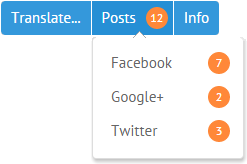
view:"menu",
data:[
    { id:"1",value:"Translations", badge:"1"},
    { id:"2",value:"Posts", badge:"12" },
    { id:"3",value:"Info", badge:"24" }
]
Related sample: Menu with Badges
Separators in Menu
To separate one group of items from another one in vertical menu, use the property $template with one the possible values:
- "Spacer" - adds horizontal space between menu items;
- "Separator" - add a horizontal gray line between menu items.
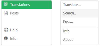
Spacer in vertical menu
view:"menu",
layout:"y",
data:[
    { id:"1", value:"Translations", icon:"qrcode", badge:20 },
    { id:"2", value:"Posts", icon:"file-word-o", badge:3 },
    { $template:"Spacer" },
    { id:"3", value:"Help", icon:"support"},
]
Separator in vertical menu
view:"menu",
layout:"y",
data:[
    { value:"Translate..." },
    { value:"Post...", submenu:[ "Facebook", "Google+", "Twitter" ]},
    { $template:"Separator" },
    { value:"Info" }
]
Customizing Submenus
Submenu items can be set as an array of values:
{ id:"2",value:"Translate...", submenu:[ "English", "Slavic", "German" ]},
Or, as an array of menu objects:
{ id: "1.2", value:"Slavic...", submenu:[
    {id: "1.2.1", value:"Belarusian"},
    {id: "1.2.2", value:"Russian"},
    {id: "1.2.3", value:"Ukrainian"}
]}
Any nested submenu (a popup) can be configured separately with the help of a config attribute of its parent:
view:"menu",
submenuConfig:{
    width:400
},
data:[
    { id:"2",value:"Custom...",
        config:{
            width:500,
            on:{
                onItemClick:function(id){
                    webix.message("Submenu click: "+id);
                }
            }
        },
        submenu:[ "Facebook", "Google+", "Twitter" ]
     }
]
This configuration overrides common configuration for sub-menus defined by submenuConfig.
Related sample: Menu: Configuring Submenus
Automatic setting of Submenus' width
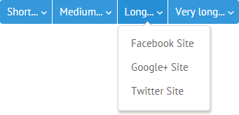
To change the width of Submenus automatically, according to the length of their labels, use the autowidth property with the true value in the menu's configuration:
webix.ui({
    container:"areaA",
    view:"menu",
    autowidth:true,
    data:[
        { id:"1",value:"Short...",
            submenu:[ "FB", "G+", "TW" ]},
        { id:"2",value:"Medium...",
            submenu:[ "Facebook", "Google+", "Twitter" ]},
        ...
    ]
});
Related sample: Autowidth for Submenus
Using Other Widgets as Menu Items
The submenu parameter may point as well to a popup, submenu, context or window widget that has been initialized previously:
webix.ui({
id:"details1",
view:"context", width:300, height:200,
body:{ content:"html1" }
});
webix.ui({
view:"menu",
data:[
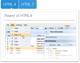
{ value:"HTML 4", submenu:"details1" },
{ value:"HTML 5", submenu:"details2" }
]
});
Related sample: HTML Elements as Menu Items
The same way you can initialize a Webix submenu component separately and then point to it within the submenu property of a menu:
webix.ui({
    view:"submenu", id:"test", data:[
        { id:"1.1", value:"English"},
        { id:"1.3", value:"German"}
    ]
});

webix.ui({
    view:"menu",
    data:[
        { id:"1", value:"Translate...", submenu:"test"},
        { id:"2", value:"Post..."}
    ]
});
Each submenu item can take its own submenu component.
MenuBar
Menu takes after a toolbar in appearance, so the best way to create a menubar is to initialize menu and toolbar in neighboring columns:
webix.ui({
    cols:[ menu, toolbar ]
});
Related sample: Menu in Toolbar
Hiding and Disabling Menu Items
Hiding
To hide and show menu item, you should apply hideMenuItem() and showMenuItem() to the menu component while specifying item ID as function parameter.
The event that triggers function execution can be checkbox state change in the Webix tree populated with the same data as menu, provided that checkbox item ID = related menu item ID.
$$("tree1").attachEvent("onItemCheck",function(id,state){
    if (state) //if checked
        $$("top_menu").hideMenuItem(id);
    else
        $$("top_menu").showMenuItem(id);
});
As a result, only "unchecked" menu items are shown.
Related sample: Hiding Menu Items
Disabling
To disable menu item, you should apply special disableItem() and enableItem() functions to menu passing ID of the necessary item into them. The methods can be triggered by changing the state of a checkbox the ID of which equals the ID of the corresponding menu item.
$$("tree1").attachEvent("onItemCheck",function(id,state){
    if(state) //if checked
        $$("top_menu").disableItem(id);
    else
        $$("top_menu").enableItem(id);
});
Disabling a menu item from JSON
You can also specify an item as disabled in the menu data configuration. For this purpose you should set the disabled:true attribute in the related item object:
webix.ui({
    view:"menu",
    data:[
        { id:"1",value:"Translate...", submenu:[
            {id: "1.1", value:"English"},
            { id: "1.2", value:"Slavic...", submenu:[
                {id: "1.2.1", value:"Belarusian"},
                {id: "1.2.2", value:"Russian", disabled:true },
                {id: "1.2.3", value:"Ukrainian"}
            ]}
        ]}
    ]
});
In essence, disabling and enabling is performed via CSS classes, that's why menu items get a template that helps display normal and disabled item differently:
view:"menu",
template:function(obj){
    if(obj.disabled)
        return "<span class='disabled'>"+obj.value+"</span>";
    return obj.value;
}
Related sample: Disabling Menu Items
Event Handling with Menu and Submenu Items
All menu and submenu items can be accessed by their IDs.
1 . Any item can be accessed directly with the getMenuItem() method that takes item ID as parameter and returns item object:
//getting menu item value by its ID
$$('menu1').getMenuItem(id).value;
2 . At the same time, menu items can be derived through submenu object returned by the getSubMenu() method for an item with the specified ID. If there's no submenu for an item - an object of the calling component will be returned.
var menu = $$("menu1").getSubMenu(id);
var item = menu.getItem(id).value;
Related sample: HTML Elements as Menu Items
Both methods can be used in either of menu inner events, for instance, click events:
- onMenuItemClick - fires on clicking all menu items regardless of hierarchy level. Ignores disabled items;
- onItemClick - standard event that fires on clicking any item of the same hierarchy level. Fires for disabled item as well.
General "onMenuItemClick" handler
view:"menu",
data:[...],
on:{
    onMenuItemClick:function(id){
        webix.message("Click: "+this.getMenuItem(id).value);
    }
}
Submenu specific "onItemClick" handler
view:"menu",
data:[
    { id:"1",value:"Custom...",
        config:{
            width:250,
            on: { onItemClick:function(id){
                webix.message("Submenu click: "+id);
            }}
        },
        submenu:{...}
    }
]
Related sample: Configuring Submenus