Color Selector
Since 8.0
API Reference
Overview
Color Selector allows selecting an arbitrary color. Can be used standalone or as a popup of ColorPicker.
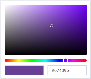
Initialization
webix.ui({
  view:"colorselect",
  value:"#96408b"
});
Related sample: Color Selector: Initialization
Configuration
- button (boolean) - if true, shows Select button under the control. false by default;
- value (string) - initial value of the control(color hex). "#751FE0" by default.
- width (number) - sets the width of the control. 260 by default;
- height (number) - sets the height of the control. 250 by default.
Using with ColorPicker
You can use Color Selector as a popup of the ColorPicker widget.
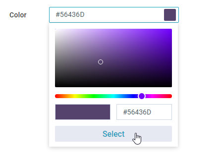
To do so define a colorpicker and inside its suggest property set a colorselect as a value for the type field. To be able to submit the selected color add a button inside the body property of the colorselect by setting the button field to true.
{
  view:"colorpicker",
  label:"Color",
  value:"#751FE0",
  suggest:{
    type:"colorselect",
    body:{
        button:true
    }
  }
}
Related sample: Color Selector: Using with ColorPicker
Back to top