UI Controls
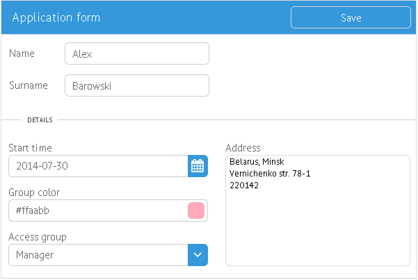
Webix delivers a variety of controls that can be placed in the form. These controls can be used for entering text, selecting an option, date or color, switching between multiview cells, etc.
List of Controls
Main controls
(can be used standalone)
Helper controls
(are used to build other controls, can be configured within them to add extra customization):
- Suggest - a popup with options for select controls. May include:
- list - select options for Combo, RichSelect and MultiSelect;
- colorboard - a color palette for ColorPicker;
- calendar - a date selector for DatePicker.
Suggest has several variations to serve the needs of various controls:
Shared Functionality
Form controls have much in common, namely:
- feature name property to indicate data name within form values;
- have label, value, width/inputWidth and height/inputHeight properties;
- can be hidden and shown;
- feature getValue() and setValue();
- ..etc.
For further details check the Controls Guide article.