Textarea
API Reference
Overview
UI-related textarea control is a multi-line input field with a label.
Initialization
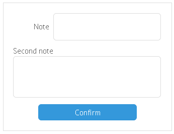
{
    view: "textarea",
    label: "Note",
    labelAlign: "right",
    height: 200,
    value: "type here"
}
Related sample: Multiline Text Input('textarea')
Main properties
- label (string) - text label of a control. It can be customized by:
- labelAlign (string) - label alignment towards its container. Possible values are "left" and "right". In any way, it's placed to the left of the control;
- labelWidth (number) - width of the label container;
- labelPosition (string) - defines label position related to the input field. There are two possible values: "left" (the default one) and "top".
- width, height (integer) - defines the dimension of the text field;
- value (string) - sets the initial text in the field (replaced by input text later)
- placeholder (string) - the initial text in the textarea field, disappears as you start typing in it;
- attributes (object) - a hash of properties. See Text description for details.