Calendar
API Reference
Overview
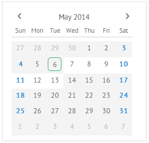
UI-related Calendar inherits from view and allows you to include the Date and Time picker calendar into an app. It is a handy and fully interactive tool to pick the necessary time and date when filling a form. The dedicated timepicker allows setting the necessary time that will be displayed below the calendar area.
Initialization
You can initialize Webix Calendar using the following code:
webix.ui({
    view:"calendar",
    id:"my_calendar",
    date:new Date(2012,3,16),
    weekHeader:true,
    events:webix.Date.isHoliday,
    width:300,
    height:250
});
Related sample: Calendar Initialization
Main properties:
- weekHeader (boolean) - if true shows weekday above;
- events (function) - sets an additional CSS class that will be applied to days, e.g. webix.Date.isHoliday highlights days off;
- date (string,object) - specifies the start date in the "year, month, day" format with months starting from 0;
- dayTemplate (function) - specifies a function that sets a template for each day cell. By default the date is displayed without any styling;
- icons (boolean) - specifies whether to show "Today" and "Clear" icons and allows redefining their configuration;
- multiselect (boolean,string) - enables multiselect in a calendar. Can be set to the "touch" value to switch on multiple selection on touch devices.
To see the full list of Calendar properties, refer to the corresponding chapter of the documentation.
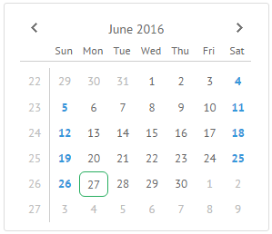
Setting Start Day of the Week
By default the calendar starts a week on Sunday. However, you can also set Monday as a start day. For this purpose, use the startOnMonday property with the value true:
webix.Date.startOnMonday = true;

webix.ui({
    view:"calendar"
    // the calendar configuration
});
Related sample: Calendar: Setting Start Date
Working with Calendar
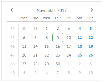
Setting and Getting Dates
Setting dates means their selection. Dates can be set after calendar initialization with the help of the following methods:
- setValue(new Date(2012,3,30)); - common method for setting values to the controls;
- selectDate(new Date(2012,3,30)); - calendar specific method equal to the above mentioned one;
- showCalendar(new Date(2012,3,30)); - makes the calendar show the specified date, but doesn't select it.
To get dates make use of the methods below:
- getValue(); - common method for getting the control's value.
- getSelectedDate(); - calendar specific method.
- getVisibleDate(); - gets the date even with no selection applied. Date is defined according to the specified rules.
$$("calendar1").selectDate(new Date(2012,3,30));

$$("calendar1").getValue(); // returns the non-formatted date object
                            // -> Mon Apr 30 2012 00:00:00 GMT+0300 (EEST)
Selecting Multiple Dates
Webix Calendar provides the possibility to select multiple dates in a calendar at once. To enable this feature, set the multiselect property to true:
webix.ui({
    view:"calendar",
    date:new Date(2016,1,16),
    multiselect:true
});
To select several dates at a time, use the CTRL+mouse click combination.
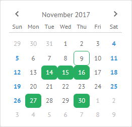
The widget also supports multiple selection on touch devices. To enable this mode, you need to set the multiselect property to the "touch" value:
webix.ui({
    view:"calendar",
    date:new Date(2016,1,16),
    multiselect:"touch"
});
Related sample: Multiselect in the Calendar
Month and Year Types
You can specify the modes in which Calendar will display either only months or only years:
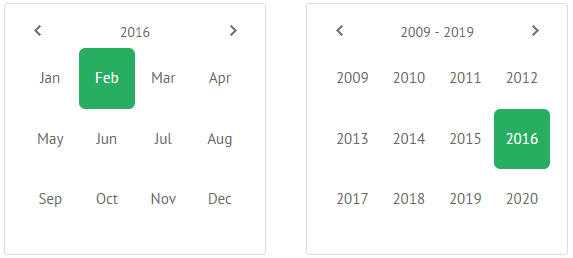
To set one of these modes, use the type property:
webix.ui({
    date:new Date(2016,1,16),
    view:"calendar",
    type: "month"
});

webix.ui({
    date:new Date(2016,3,16, 8, 10),
    view:"calendar",
    type:"year"
});
Related sample: "Month" and "Year" Types
Datepicker
Calendar can be displayed on a customer request, for instance when a user wants to pick a date and time to fill the form. For these needs a datepicker control is used.
Note that here you needn't initialize Calendar. It will appear as soon as you click the datepicker icon. In this case a calendar comes with the current date displayed.
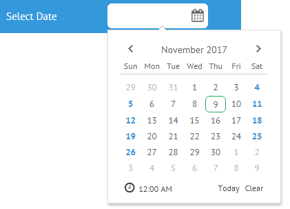
webix.ui({
    view:"toolbar",
    type:"MainBar",
    elements:[
        {view:"datepicker",  name: "select_date",  label: 'Select Date' }
    ]
});
Related sample: Date Picker in Calendar
Time Selector in Calendar
Webix calendar offers two ways of time selection:
- built-in timepicker;
- separate time view.
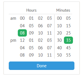
Time slots in selector are multiple of 5.
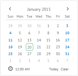
Timepicker inside Calendar
The timepicker is hidden by default. To enable it you should set the property to true. Then a timepicker is accessed by clicking the "clock" icon below the calendar grid.
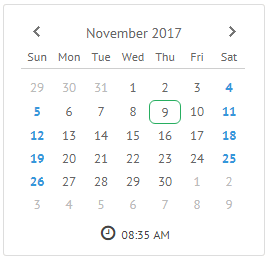
webix.ui({
    view:"calendar",
    date: new Date(2012, 3, 16, 8, 35),
    timepicker:true,
    timepickerHeight:50 //optional, default is 30
});
With a timepicker is enabled, time is shown below the month view within the calendar body. There are three options for the clock:
- If the time is defined in the new Date(YYYY, MM, DD, HH, mm) constructor, it's shown according to the specified values;
- If a date is set with no time specified (new Date(2012, 3, 16)), the clock shows midnight;
- If the new Date function comes with no parameters, the current date and time are shown.
Related sample: Timepicker in Calendar
Time view
The time view of the calendar is detached from the date selector and is shown separately. To initialize such a control, you should set calendar to the time mode.
webix.ui({
    view:"calendar",
    type:"time"
});
Related sample: Timepicker in Calendar
Like a standard calendar, the time view accepts values as strings or date objects.
Localization
How do we turn a standard calendar into the one with "foreign" month and day names? Here localization can help you.
A locale is a set of rules that tell us how to display months and days. It's a kind of internal "translator" for UI components.
First of all you should specify a locale or a set of needed locales (en-US, fr-FR, ru-RU) and then apply them to the calendar. By default en-US locale is used.
webix.i18n.setLocale("fr-FR");
Afterwards the calendar will look like this:
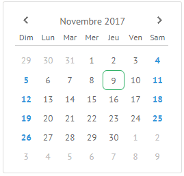
Related sample: Localized Calendar
You can alter the current working locale as well, e.g. change the text of the "Today" and "Clear" icons:
webix.i18n.calendar.clear: "Clear New";
webix.i18n.calendar.today: "Today New";
webix.i18n.setLocale();
You need to call the setLocale method to make changes come into force.
Disabling Dates and Time Slots in Calendar
The whole calendar can be disabled by a common property:
{view:"calendar", disabled:true}
Related sample: Calendar: Disabled Dates
Disabling dates
To disable a certain period in the calendar, which presupposes specific CSS and blocking of click events, you can go by the two ways:
Defining "active" period
Use the dedicated minDate and maxDate properties to limit the period that will be available for clicking and, hence, selecting:
{ view:"calendar", minDate:'2014-05-07', maxDate:new Date(2014, 4, 13) }
The dates can be defined either as date object or date string formatted under the current locale. Here the default en-US parseFormat is used, "%Y-%m-%d".
Defining blockDates() function for custom logic
The function should return true for the dates that should be disabled in the calendar. Here all dates up to 2014 will be disabled:
webix.ui({
    view:"calendar",
    blockDates:function(date){
        if(date.getFullYear()<=2013)
            return true;
    }
});
The CSS class applied to disabled dates (.webix_cal_day_disabled) can be redefined.
Disabling time slots
Calendar features a time selector where you can disable time slots. Disabled time slots have specific CSS and don't respond to click events. They should be multiple of 5.
Defining blocked time periods
Use the dedicated minTime and maxTime properties to set the time period that will be available for selecting:
webix.ui({
    view:"calendar",
    timepicker:true,
    minTime:"8:00",
    maxTime:"18:30"
});
Defining blockTime() function for custom logic
The function takes a date object as a parameter and should return true for disabled time slots.
var disabledTime = [
    new Date(2015,6,1,8,40),
    new Date(2015,6,1,9,10),
    new Date(2015,6,1,10,30)
];

webix.ui({
    view:"calendar",
    blockTime:function(date){
        for(var i =0; i< disabledTime.length; i++){
            if(disabledTime[i].valueOf() == date.valueOf())
                return true
        }
        return false;
    }
});
The CSS class applied to disabled time slots (.webix_minutes .webix_cal_day_disabled) can be redefined.
"Today" and "Clear" Icons
You can add and customize the Calendar icons with the help of the icons parameter. The default icons are "Today" and "Clear".
The Today icon allows selecting the current date. The Clear icon removes date selection.
These icons are optional and specified in the icons array. The code below renders a calendar with a timepicker and Today and Clear icons:
webix.ui({
  rows:[
    { view:"calendar", timepicker:true, icons:true }
  ]
});
To hide the icons, you should set the icons property to false.
Default Icons Config
The default icons configuration is specified as follows:
webix.ui({
    view:"calendar",
    icons: [
        //default "today" icon
        {
            template: function(){
                return "<span class='webix_cal_icon_today webix_cal_icon'>"
                    +webix.i18n.calendar.today
                    +"</span>";
            },
            on_click:{
                "webix_cal_icon_today": function(){
                    this.setValue(new Date());
                    this.callEvent("onTodaySet",[this.getSelectedDate()]);
                }
            }
        },
        //default "clear" icon
        {
            template: function(){
                return "<span class='webix_cal_icon_clear webix_cal_icon'>"
                    +webix.i18n.calendar.clear
                        +"</span>";
            },
            on_click:{
                "webix_cal_icon_clear": function(){
                    this.setValue("");
                    this.callEvent("onDateClear",[this.getSelectedDate()]);
                }
            }
        }
    ]
});
Redefining Icons
As an object the icons parameter redefines icons:
webix.ui({
    view: "calendar",
    icons: [
        {
            template: function(){
                return "<span class='my_button'>My Button</span>";
            },
            on_click:{
                "my_button": function(){
                    alert("Button is clicked")
                }
            }
        }
    ]
});
Related sample: 'Today' and 'Clear' buttons
Related Articles
- Date Formatting Methods
- Number Formatting Methods
- Working with Dates
- Date and Number Localization
- Calendar CSS Image Map