Popup
API Reference
Overview
Popup is a variant of a UI-related Window. Unlike it, the popup disappears as you click somewhere outside it. Popup is used to alert some info. Besides, it can form a popup menu.
Initialization
Popup contains a body (that can include either a view or a text template) without the head section.
The component should be made visible with the show() method you call during the component initialization (if, of course, you want the popup to appear on page loading).
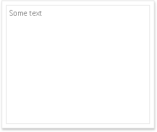
webix.ui({
    view:"popup",
    id:"my_popup",
    body:{
        template:"Some text"
    }
}).show();
Popup Sizing and Positioning
For adequate work, you need to specify the dimensions of your popup as well as its offsets (top and left). Otherwise, the component occupies the whole screen or sticks to its top left corner respectively.
webix.ui({
    view:"popup",
    width: 400, height:300,
    top:200, left: 300
}).show();
There exist more positioning options. All of them are described in a separate documentation article.
Creating Popup Menu
To create a popup menu that will appear on a button click, you should create a button with the popup property that takes the ID of popup as its value.
The popup is hidden initially. Toolbar and popup are initialized within different webix.ui containers.
Popup Menu
webix.ui({
    view:"toolbar",
    elements:[
        {view:"button", label: "Menu", popup:"my_pop"},
         ...
    ]
});

webix.ui({
    view:"popup",
    id:"my_pop",
    body:{
        view:"list",
        ...
    }
}).hide();
Related Articles
- Window
- Window and Popup Positioning
- Control Guide
- Toolbar
- Changing Visibility of Components
- Popup CSS Image Map