Template
API Reference
Overview
UI-related template looks like a non-editable area for rendering plain text or a single data record. Its content is set with the help of the same-name template parameter.
Initialization
This is how you can create a simple template:
var template = webix.ui({
  view: "template",
  template: "Default template with some text inside"
});
Specifying the view type as "template" is optional. The following code works as well.
var template = webix.ui({
  template: "Default template with some text inside"
});
Main properties
- template - (string/function) the template of a widget.
- content - (id|HTMLElement) the id or node, the content of which will be moved to the view.
- height - (number) sets the height of the scrollview.
- width - (number) sets the width of a widget.
- autoheight - (boolean) lets the component autosize to its contents.
- scroll - (boolean/string) enables/disables the scroll bar. The property can have the following values:
- "y" (or true) - enables vertical scroll (the default value);
- "x" - enables horizontal scroll;
- "xy" - enables both scrolls;
- false - disables both scrolls.
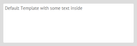
Simple template
The template property of the component sets its content:
webix.ui({
  view: "template",
  template: "Default template with some text inside" // text content
});
Related sample: Default Template
External Template
Template's content can as well be taken from an HTML node pointed to by:
- the content property that links to a visible container:
<div id="myDiv">Default Template with some text inside</div>
webix.ui({
  view: "template",
  content: "myDiv"
});
Related sample: Default Template
- the template property that points to the container ID prefixed by "html->". The container should be invisible initially:
<div id="my_box1" style='display:none;'>Some text here</div>
{ template: "html->my_box1", autoheight: true },
Related sample: Autosizing to Content
As a result, contents from HTML are placed inside the view.
Loaded Template
{ view: "template", src: "loadtext.php" }
The same-name property of the component, template, is also used by Webix data components. It allows setting pattern to display texts and render data items from multiple datasets alongside with adding styling to them. The Data Templates article covers all the rules of templating.
Template Content
The template content is set with the template property, which can be:
- plain text:
{ template: "Plain text" }
- text with HTML markup:
{template: "Text with <b>HTML</b> markup" }
- an individual data item specified by the data property:
{ template: "#title#", data: { title: "Image One", src: "imgs/image001.jpg" } }
// shows "Image One"
If a template is used as an individual data item (as shown above) the data fields should be interpolated in either of the two ways:
- using a string template containing data keys between hash signs to define which fields from the data record should be displayed;
- using a template function that takes the data record (
obj) as parameter:
{
  data: {title: "Image One", src: "imgs/image001.jpg" },
  template: function (obj) {
    // obj is a data record object
    return '<img src="'+obj.src+'"/>'
  }
}
Related sample: Carousel Initialization
The rules of data templating can be studied in detail in the dedicated documentation article.
Changing Template Text Dynamically
Dynamic content setting can be implemented with the help of:
- a setHTML method to change text or HTML content of a template;
- a define method used in lots of the components to reset property values;
- a setValues method that allows to define template data;
- a template-specific setContent method that can set the contents of an existing HTML node as template value.
Template Types
Default
The default template is a white non-editable area with some text or HTML content. It's surrounded by a gray border.
{ view: "template", template: "Text" }
Clean
The clean template looks very much like the default one, but has no borders and no paddings.
{ view: "template", template: "Text", type: "clean"}
Header
Header template is used to set headers for layout rows/columns. Looks like a blue bar above the main contents.
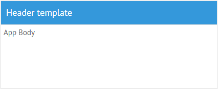
webix.ui({
  rows: [
    { view: "template", template: "Header Template", type: "header" },
    { view: "...", ... }
  ]
});
Note that headers of accordionitems are set in a different way.
Dark theme
You can redefine the default style of Template with the "header" type by applying the dark theme via the css:"webix_header webix_dark" configuration option within the Material or Mini skin:
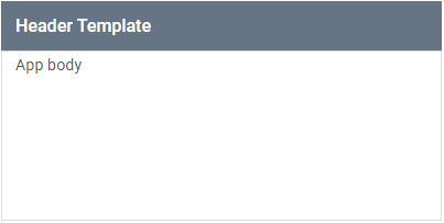
{
    view: "template",
    template: "Header Template",
    css:"webix_header webix_dark"      }
Section
Section template places header within the line, thus making it possible to neatly divide the web page into blocks. As there's a line in this template type, it would be nice to resort to borderless layout design.
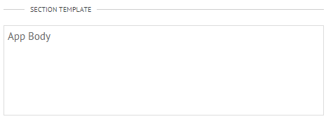
{view: "template", template: "Header template", type: "section" }
Related sample: Template Types
Back to top