Available only in PRO Edition
Filter
Since 7.1
The widget is available in the Webix Pro edition.
API Reference
Overview
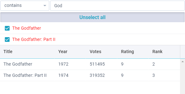
Webix Filter is a handy interactive tool for filtering complex datasets. The Filter widget allows you to filter data, set the list of rules (depending on data type) or exclude some data from filtering.
Initialization
webix.ui({
  view:"filter",
  mode:"text",
  field:"title",
  data: data,
  on:{
    onChange(){
      const filter = this.getFilterFunction();
      data.filter(obj => filter(obj));
    }
  }
});
Main properties:
- mode (string) - defines the type of data to which the filter will be applied to (
"number"by default); - field (string) - defines the data field for filtering;
- template (string,function) - an optional parameter, can be used to change the look of the multiselect items (by default, displays the values from the field);
- conditions (array) - optional, an customized array of filtering rules;
- inputs (array) - optional, an customized array of inputs for entering filtering criteria.
Related sample: Filter: Basic Initialization
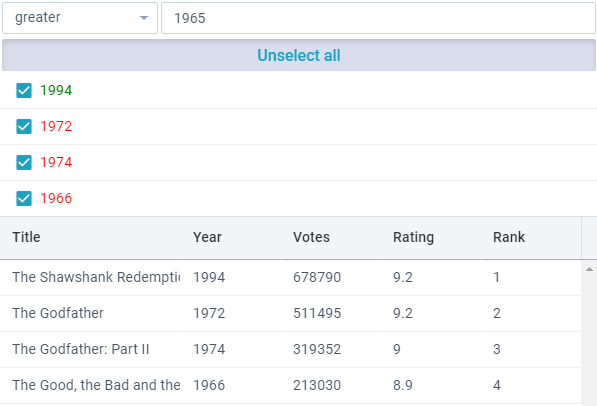
Filter Structure
The Filter widget contains three main UI-related elements:
- The "rule" field. It is used for setting filtering rules. The list of rules depends on the mode value.
- The input field. It is intended for entering the value for the filtering rule, or displaying some static value.
- The multiselect list. It is used to narrow down filtered data by exact-match filtering.
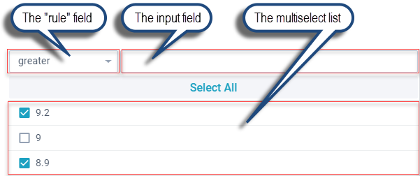
The "rule" Field
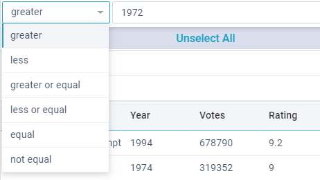
The filtering rules are displayed in a combo box. Their list depends on the mode value:
the rules for the "number" mode
- "greater"
- "less"
- "greater or equal"
- "less or equal"
- "equal"
- "not equal"
- "contains"
- "not сontains"
the rules for the "text" mode
- "equal"
- "not equal"
- "contains"
- "not contains"
- "begins with"
- "not begins with"
- "ends with"
- "not ends with"
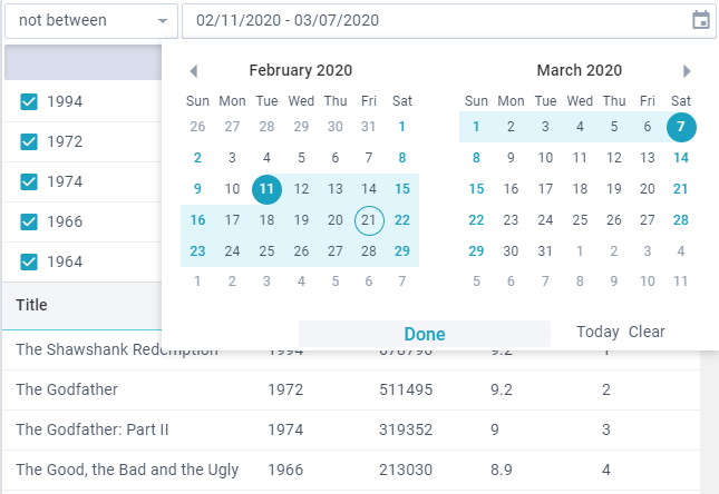
for the "date" mode (displays datepicker or daterangepicker depending on the selected rule)
- "greater"
- "less"
- "greater or equal"
- "less or equal"
- "equal"
- "not equal"
- "between"
- "not between"
The "between"/"not between" filtering rules with its "daterangepicker" input will have the following UI:
The Input Field
The type of the entered value is defined by the field property and corresponds to the related item of the dataset. Filtering is performed according to the selected rule:
{
    view:"filter",
    mode:"number",
    field:"year",

    // ...
}
The Multiselect List
You can configure the look of items inside the multiselect list using the template property:
{
    view:"filter",
    mode:"number",
    field:"year",
    template:function(obj){
        var value = obj.year;
        var color = value >= 1980 ? "green" : "red";
        return "<span style='color:"+color+"'>"+value+"</span>";
    },
    // ...
}
Related sample: Filter: Templates
Customizing Filter
Custom Filtering Rules
To define your own set of filtering rules for the rule field, set the conditions property. You can change the existing set of rules or completely redefine them.
When changing filtering rules you can:
- use a restricted number of preset rules (e.g.
"greater", "less", etc);
Preset rules depend on the defined mode. Find the full list of rules for each mode here. - define your own rules;
- if needed, provide custom inputs for your rules (described below) .
{
    view:"filter",
    mode:"number",
    field:"rating",
    conditions:[
        // preset conditions and inputs
        "equal", "contains",
        // custom condition and input
        { id:"between", value:"Between", batch:"rangeslider", handler:function(a, b){
            return a >= b[0] && a <= b[1];
        }},
        // label with static value - use view:"template"
        { id:"above", value:"Above", batch:"template", handler:function(a){
            return a > 50;
        }},
        { id:"below", value:"Below", batch:"template", handler:function(a){
            return a <= 50;
        }},
        // no input - use batch:"none"
        { id:"top", value:"Top rated", batch:"none", handler:function(a){
            return a <= 80;
        }}
    ]
    // ...
}
A custom filtering rule should contain the following properties:
- id (number, string) - the rule ID, should be unique and not coincide with any of the preset rules
- value (string) - text label for the rule
- handler (function) - a comparison function with two parameters:
- a - date filed value
- b - input value
- batch (string) - name of the required input, which can be either one of the built-in ones or a custom one (see below).
Custom Inputs
The default inputs array can contain the following items:
inputs: [ "text", "datepicker", "daterangepicker", "none"];
- text - standard input field for text and number modes;
- datepicker - datepicker control, used in the date mode;
- daterangepicker - daterangepicker control, used in the date mode for "between" and "notBetween" rules;
- none - the absence of input.
If the above inputs are not enough, you can create custom ones and append them the array of preset inputs.
To create a custom input, you should:
- set an object with the desired configuration and define the name of the new input as a batch parameter;
- if needed, attach the related event handler to apply filtering when data in the input is changed;
- and call the applyFilter method to start filtering the related multiselect list.
view:"filter",
  inputs: [
    //preset inputs
    "text", "none",
    //custom input
    { view:"rangeslider", max:100, min:0, step:1, moveTitle:false, batch:"rangeslider",
     on:{
       onChange:function(){
         const filter = this.queryView("filter", "parent");
         filter.applyFilter();
       }
     }}
  ]
If you want a static label rather than an input control, use view:"template":
{
    template:"some average value e.g. 50",
    batch:"template",
    borderless:true,
    css:{"line-height":"28px"}

}
In the case when input is not needed, define input as "none".
Related sample: Filter: Custom Inputs
Localization
You can localize Filter according to the peculiarities of a certain language. By default en-US locale is used. Name of button and the rules of used filters are stored in the webix.i18n.filter object:
webix.i18n.filter = {
    less: "less",
    lessOrEqual: "less or equal",
    greater: "greater",
    greaterOrEqual: "greater or equal",
    contains: "contains",
    notContains: "not contains",
    equal: "equal",
    notEqual: "not equal",
    beginsWith: "begins with",
    notBeginsWith: "not begins with",
    endsWith: "ends with",
    notEndsWith: "not ends with",
    between: "between",
    notBetween: "not between"
};
There are 2 ways of applying a custom locale:
- alter the current working locale directly in the webix.i18n.filter object;
- set a certain locale (e.g. fr-FR, ru-RU).
Apply the created locale with the help of the setLocale method.
More information about widget localization read in the related article.