Available only in PRO Edition
Dashboard
Since 5.1
The widget is available in the Webix Pro edition.
API Reference
Overview
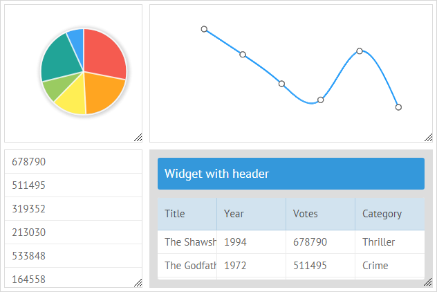
Webix Dashboard is a precise but flexible widget that will help you to build an easily configurable web application. Using this component, you can place various widgets into any place on a page, change their positions with the drag-n-drop feature, and save the state of an application to restore it whenever you need it.
The Dashboard widget is based on Grid Layout, that's why it locates its inner elements in cells which are aligned into rows and columns. Besides, Dashboard adds mobility to views by equipping cells with the possibility to drag them to the desired place and change their size right in the interface.
Initialization
To initialize Dashboard, you need to apply the code below:
webix.ui({
    view:"dashboard",
    gridColumns:4, gridRows:3,
    cellHeight: 200, cellWidth: 200,
    cells:[
        { view:"panel", x:0, y:0, dx:1, dy:1, body:{ template:"Single"}},
        { view:"panel", x:1, y:0, dx:2, dy:1, body:{ template:"Wide"}},
        { view:"panel", x:1, y:1, dx:2, dy:2, header:"Widget with header",
            body:{ template:"Square"}}
        // more cells
    ]
});
Main properties
The Dashboard widget has the following properties:
- gridColumns - (number) the number of columns for the grid
- gridRows - (number) the number of rows for the grid
- cellHeight - (number) the height of a cell in pixels
- cellWidth - (number) the width of a cell in pixels
- margin - (number) defines the space around elements
- padding - (number) defines the space between the layout borders and content
- paddingX - (number) sets the right and left padding
- paddingY - (number) sets the top and bottom padding
A Dashboard cell inherits its attributes from a GridLayout cell, namely:
- x - (number) the x-index of a grid cell starting point
- y - (number) the y-index of a grid cell starting point
- dx - (number) the width of a view defined as a number of grid cells
- dy - (number) the height of a view defined as a number of grid cells
The Panel view
Each cell of Dashboard contains a special panel view which serves as a container for other widgets. The panel view gets a set of coordinates that define its position, as well as its width and height. It contains a body, where you can place another view or a template. Optionally, it may have a header that takes the role of a handle, if specified. Here is the list of the view:"panel" attributes:
- body - (object) the body of a "panel" view to place a template of a view inside;
- icon - (string,boolean) adds an icon into a panel of Dashboard. The default value is false. To set an icon, set its full name as a string, e.g. "mdi mdi-menu". You can use the default or custom icons;
- resize - (boolean) defines whether a view is resizable (has a resize handle), false by default;
- header - (string) sets a header with the specified text for a view.
Related sample: Grid Dashboard
See the full list of properties as well as methods and events available for the panel view in the API reference.
Configuring Dashboard
Dashboard allows you to adjust its configuration settings in order to get the needed appearance and behavior.
Configuring the grid
You can configure the grid of Dashboard by specifying the number of rows and columns via the related properties - the gridRows and gridColumns. By default, the Dashboard grid contains 2 rows and 2 columns.
webix.ui({
    view:"dashboard",
    gridColumns:4, gridRows:3,
    cells:[
        { view:"panel", x:0, y:0, dx:1, dy:1, body:{template:"Single"}},
        { view:"panel", x:1, y:0, dx:2, dy:1, body:{template:"Wide 1"}}
        // more cells
    ]
});
Setting the size of a cell
You can specify the width and height of a grid cell in pixels via the cellHeight and cellWidth options:
After that you can define relative sizes for each cell separately via the dx and dy properties, correspondingly.
webix.ui({
    view:"dashboard",
    gridColumns:4, gridRows:3,
    cellHeight: 150, cellWidth: 200,
    cells:[
        { view:"panel", id:"a", x:0, y:0, dx:1, dy:1, body:{template:"Single"}},
        { view:"panel", id:"b", x:1, y:0, dx:2, dy:1, body:{template:"Wide 1"}}
        // more cells
    ]
});
In the above example, the width and height of the cell "a" are default. The cell "b" takes the width of two default cells.
Setting margin and padding for cells
You can define the necessary alignment of a view by setting the appropriate margin and padding values. By default, the values of both margin and padding are 10.
It is also possible to change the horizontal and vertical padding separately with the help of the paddingX and paddingY properties.
webix.ui({
    view:"dashboard",
    gridColumns:4, gridRows:3,
    margin:20,
    // paddingY:20
    padding 20,
    cells:[
        { view:"panel", x:0, y:0, dx:1, dy:1, body:{template:"Single"}},
        { view:"panel", x:1, y:0, dx:2, dy:1, body:{template:"Wide 1"}}
        // more cells
    ]
});
Working with Panels
Adding/removing views
You can add a new view into a dashboard via the addView method. It may take two parameters:
- view - (object) the configuration of the new view
- index - (number) optional, the index a new view will be added at
$$("grid").addView({ view:"panel", body:{template:"New"}, x:1, y:1, dx:1, dy:1 });
To remove an unnecessary view, apply the removeView method. It takes either a child view object or its id as an argument:
webix.ui({
    view:"dashboard",
    id:"grid",
    cells:[
        { view:"panel", id:"a", x:0, y:0, dx:1, dy:1, body:{template:"Single"}},
        { view:"panel", id:"b", x:1, y:0, dx:2, dy:1, body:{template:"Wide 1"}}
        // more cells
    ]
});

$$("grid").removeView("a");
Setting a header
You can add a header for each panel. Headers can contain some text or a complex view object, e.g. a toolbar with buttons. See the examples below:
- a panel with text header
webix.ui({
view:"dashboard",
// dashboard config
cells:[
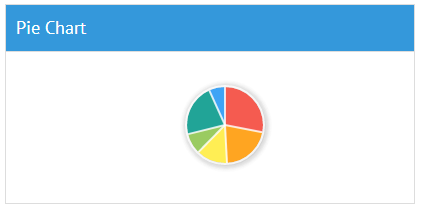
{ view:"panel", x:0, y:1, dx:2, dy:1, header:"Pie Chart", body:{
view:"chart", type:"pie", value:"#votes#", data:small_film_set
}},
// other panels
]
});
- a panel with toolbar in the header
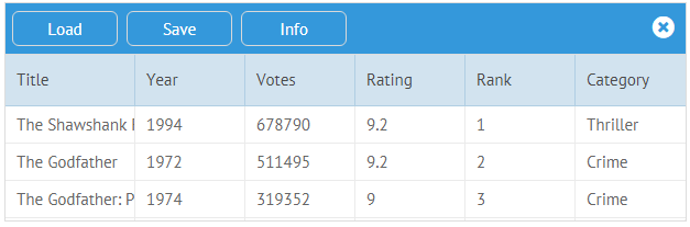
webix.ui({
    view:"dashboard",
    // dashboard config
    cells:[
        { view:"panel", x:0, y:0, dx:3, dy:1, body:{
            view:"datatable", autoConfig:true, data: small_film_set, scroll:false
        },
        header:{
            view:"toolbar", id:"myToolbar",
            cols:[
                { view:"button", value:"Load", width:100, align:"left" },
                { view:"button", value:"Save", width:100, align:"center" },
                { view:"button", value:"Info", width:100, align:"right" },
                {},
                { view:"icon", icon:"fas fa-times-circle"}
            ]
        }},
     // other panels
    ]
});
Moving panels
You can move cells with panel views to any position in a dashboard. Possible positions for dropping a dragged cell are defined by highlighting. By default the whole view is moved when you drag it. The "panel_drag" CSS class is responsible for dragging.
Drag-N-Drop Events
Dashboard has DND events that can be used to catch the necessary moment and control dran-n-drop for panels. For example, to prevent some panels from being dragged, you can use the onBeforeDrag or onBeforeDrop events:
webix.ui({
    view:"dashboard", id:"dashboard",
    cells:[
        { view:"panel", x:0, y:0, dx:1, dy:1,
          body:{ template:"Draggable"}, drag:true },
        { view:"panel", x:1, y:0, dx:2, dy:1,
          body:{ template:"Non-draggable"}, drag:false }
    ]
});
$$("dashboard").attachEvent("onBeforeDrag", function(context){
    // returning false will block dragging for some panels
    // context.source is the panel that is about to be dragged
    return context.source.config.drag;
});
Moving a panel programmatically
You can define a new location for a view and specify new sizes for it on the fly with the help of the moveView method. You need to pass two parameters to it:
- id - (string|number) the id of a view
- view - (object) a configuration object of a view
webix.ui({
    view:"dashboard",
    id:"grid",
    cells:[
        { view:"panel", id:"a", x:0, y:0, dx:1, dy:1, body:{template:"Single"}},
        { view:"panel", id:"b", x:1, y:0, dx:2, dy:1, body:{template:"Wide 1"}}
        // more cells
    ]
});

$$("grid").moveView("a", { x:0, y:0, dx:2, dy:2 });
Placing views inside panels
In order to put views into the cells of Dashboard, you need to specify a view name, the related data source and any other necessary properties of the widget in the body of the "panel" view:
webix.ui({
  view:"dashboard",
  gridColumns:4, gridRows:3,
  cellHeight: 200, cellWidth: 200,
  cells:[
    { view:"panel", x:0, y:0, dx:1, dy:1, resize:true, body:{
        view:"chart", type:"pie", value:"#votes#", data:dataset
    }},
    { view:"panel", x:1, y:0, dx:2, dy:1, resize:true, body:{
        view:"chart", type:"spline", value:"#votes#", data:dataset}},
    { view:"panel", x:0, y:1, dx:1, dy:2, resize:true,body:{
        view:"list", template:"#votes#", data:dataset, scroll:false}
    },
    { view:"panel", type:"space", header:"Widget with header",
      x:1, y:1, dx:3, dy:2, resize:true, body:{
        view:"datatable", autoConfig:true, data:dataset, scroll:false
      }
    }
    // more cells
  ]
});
Adding actions menu
It is possible to add an actions menu into a panel of the Dashboard. You need to specify a related menu icon (e.g. "mdi mdi-menu" or any default or custom icon) and define the menu and the logic of interacting with it by a click on the icon.
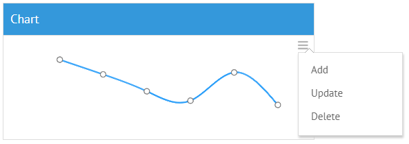
webix.ui({
  view:"dashboard", id:"grid",
    gridColumns:4, gridRows:4,
    cellHeight: 200,
    cells:[
        { view:"panel", icon:"mdi mdi-menu", header:"Chart", x:0, y:0, dx:2, dy:1,
            body:{
                view:"chart", type:"spline", value:"#votes#", data:small_film_set
            }
        }
    ]
});

var menu = webix.ui({
    view:"contextmenu",
    data:[
        { id:"add", value:"Add" },
        { id:"update", value:"Update" },
        { id:"delete", value:"Delete" }
    ]
});

webix.event(document.body, "click", function(ev){
    var css = ev.target.className;
    if (css && css.toString().indexOf("panel_icon") != -1){
        menu.setContext(webix.$$(ev.target));
        menu.show(ev.target);
    }
});
Related sample: Grid Dashboard - Action Menu
Saving and Restoring State
Webix Dashboard enables you to store/restore the state of a dashboard to a cookie, a local or session storage.
For these needs you should store the configurations of all widgets withing dashboard panels to recreate them multiple times.
var widgets = {
   view:"list", id:"list",
   width:200,
   drag:true,
   template:"#value# - (#dx#x#dy#)",
   data:[
      { id:"a", value:"Widget A", dx:1, dy:1 },
      { id:"b", value:"Widget B", dx:1, dy:2 },
      { id:"c", value:"Widget C", dx:2, dy:1 },
      // other panels
   ]
};

webix.ui({
    type:"space", cols:[
        { view:"scrollview", body:grid },
        widgets
    ]
});
Then you can initialize dashboard panels using these configuration objects with the help of the function defined by the factory configuration option. It takes one parameter:
- obj - (object) the configuration object of the view
webix.ui({
    view:"dashboard",
    id:"grid",
    gridColumns:4, gridRows:4,
    factory:function(obj){
        obj.view = "panel";
        obj.resize = true;
        obj.body = { template: $$("list").getItem(obj.name).value };
        return obj;
    }
});
After that you are ready to work with the dashboard state.
Saving the current state
To save the current state of a dashboard to the local storage, you should call the serialize method as in:
var state = $$("grid").serialize(serializer);
webix.storage.local.put("grid-dashboard-state", state);
As a parameter the serialize() method may take the serializer function that contains the serialization logic of each particular component within a dashboard body.
Restoring the saved state
To recreate the panels content, you need to get the state object by its name from the storage and call the restore method of Dashboard. It takes two parameters:
- state - (object) a state object
- factory - (function) a function that implements the logic of creating inner dashboard views
var state = webix.storage.local.get("grid-dashboard-state");
$$("grid").restore(state,factory);
The factory function declared above implements the logic of creating panels. It will return a panel from the existing configuration (here configurations are stored in the widgets object) to which it will point by the id.
Related sample: Grid Dashboard - Saving State
Catching Views Changing
You can catch changes made in a dashboard, such as adding, deleting or moving of views and handle them with the help of the onChange event handler.
$$("grid").attachEvent("onChange",function(){
    // webix.message("A view has been moved")
});
Related sample: Grid Dashboard - Saving State
Back to top