Intermediate
Icons with UI Widgets
Icons can be nested into all components and their items. You can put an icon on the Toolbar in the form of buttons, decorate Tabbar tabs and Accordion panes as well as List and DataView items with them, etc.
Icons can be initialized in the following ways:
- as separate views;
- as button types;
- as CSS classes.
Default Icons
Check the related sample to see the list of available default icons:
Related sample: Icons Cheatsheet
Webix provides two predefined sets of icons depending on the used skin:
1. Webix Awesome Icons for Flat, Compact and Contrast skins - based on Font Awesome 5 collection
2. Webix Material Icons for Material, Mini, Willow, and Dark skins - based on Material Design Icons collection
The default Webix icons can be set in two ways:
- via the view config as icon:"wxi-name"
// using a default icon
{
    view:"icon",
    icon:"wxi-pencil"  }
- via HTML as span class="webix_icon wxi-name"
<span class='webix_icon wxi-pencil'></span>Custom Icons
You can also use any custom font icon pack in your Webix-based application. For this, you need to:
1. include the desired font icon pack into your HTML page;
2. set the full name of the icon you want to use:
// using a Font Awesome icon
{ view:"icon", icon:"fas fa-envelope"}
// using a Material Design icon
{ view:"icon", icon:"mdi mdi-email"}
For example, you can use:
- Material Design Icons collection
- Font Awesome 5 collection
View Icon
A UI-related icon looks like a button with a border. A text label isn't supposed for this icon type.
// using a default icon
{ view:"icon", icon:"wxi-pencil"}
// using a Font Awesome icon
{ view:"icon", icon:"fas fa-pencil"}
// using a Material Design icon
{ view:"icon", icon:"mdi mdi-pencil"}
The value of the icon property is the name of the needed icon.
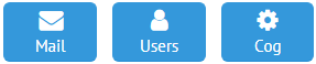
Button with Icon
type:"icon" |
 |
type:"iconTop" |
 |
// using a default icon
{ view:"button", type:"icon", icon:"wxi-pencil", label:"Edit" }
// using a Font Awesome icon
{ view:"button", type:"icon", icon:"fas fa-pencil", label:"Edit"}
// using a Material Design icon
{ view:"button", type:"icon", icon:"mdi mdi-pencil", label:"Edit"}
- type - the property that turns a standard button into an icon button:
- icon - an icon button without a distinct border;
- iconTop - an big borderless icon button with a text label below an icon;
- iconButton - a small icon button with a label right of the icon;
- iconButtonTop - a big icon button with a label below the icon;
- icon - the name of an icon (if you use a custom icon pack, looks for it on the related site);
- label - a text label for an icon button;
- width - the width of a button with a label and an icon;
- badge - an orange circle that notifies about new messages.
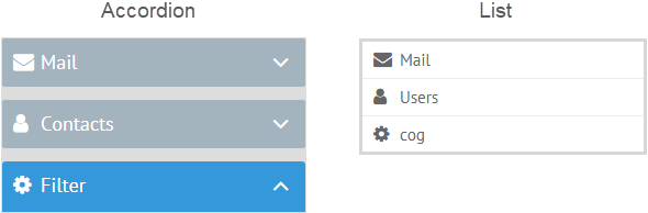
'webix_icon' CSS Class
This method of icon initialization fits the widgets and items that normally have not buttons, but: tabs (they are buttons themselves), panes, list and dataview items, datatable cells. In this case, icons are not buttons and used as decoration.
Possible CSS classes are as follows:
- 'webix_icon wxi-name' - a standard icon (white or black depending on the current skin);
- 'webix_input_icon wxi-name' - a light grey icon adjusted for use in input fields.
For custom icons use 'webix_icon full icon name' and 'webix_input_icon full icon name', correspondingly.
Both classes include an icon name that can be checked in the list of default icons or at the site of the used font icon pack.
Through CSS property
Multiview tabs
{ view:"tabbar", options:[
    // a default icon
    { value:"pencil", label:"Edit", css:"webix_icon wxi-pencil"}
    // a Material Design icon
    { value:"mail",  label:"Mail",  css:"webix_icon mdi mdi-email"},
    // a Font Awesome icon
    { value:"users", label:"User", css:"webix_icon fas fa-user"}
]}
By adding extra HTML
An additional HTML element with an 'icon' class can be added to the text value of any widget's item:
AccordionItem pane with an icon
{ header:"<span class='webix_icon wxi-pencil'></span>Edit"}
List item with an icon
{ template:"<span class='webix_icon wxi-#icon#'></span> #name#"}
Here the icon's name is in the hash signs, since it comes from a dataset, e.g. in JSON it looks like:
var data=[
    {id:1, name:"item1", icon:"wxi-pencil"},
    {id:2, name:"item2", icon:"wxi-trash"}
]
Changing Default Icons
The default icons that are used for various controls can be changed to custom ones in several ways.
Setting Other FontAwesome Icon
If you'd like to use a different icon instead of the default one, specify its name as a value of the icon property:
{view:"richselect", label: "Other", options:options, icon:"mdi mdi-arrow-down"}
As a result, the default RichSelect icon, "wxi-menu-down", is replaced with the "mdi mdi-arrow-down" icon from the Material Design collection.
Setting a Custom Icon
To set a custom icon that you can provide as a background image, write a new CSS rule that redefines the default one. Nothing is changed in the control configuration:
{view:"combo", label: "Fruit", options:[...] }
The same as RichSelect, the Combo control uses the "wxi-menu-down" icon, the CSS of which should be modified:
.webix_input_icon.wxi-menu-down:before{
    content:""; // removes the default icon
    background-image: url("search.png");
    width:20px;
    height:20px;
    display:block;
}
As a result, the "wxi-angle-down" icon is redefined by the custom icon - "search.png".
Related sample: Styling Combo Icons
If you want to style one combo on the page while leaving another one unchanged, define a separate css class for the one in question:
{view:"combo", label: "Fruit", options:[...], css:"custom" }
Then the necessary CSS will look like this:
.custom .webix_input_icon.wxi-menu-down:before{
    // attributes of the custom CSS class
}
Styling of widgets is described in detail in the corresponding article of the documentation.
Back to top