Intermediate
Styling of Widgets
Basic Principles of Styling
All the library components are styled with the help of an external style sheet "webix.css" / "webix.min.css". You must include it in the document head area alongside with the "webix.js" lib file.
After that, the styling can be customized in two modes:
- With embedded styles you define in the document head between <style> tags.
<style>
.my_style {
font-style: italic;
}
</style>
<script>
webix.ui({
view:"dataview",
css:"my_style",
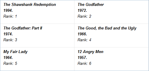
template: "#title#<br/> Year: #year#, rank: #rank#",
});
</script>
Related sample: Dataview Italic
- By means of inline styling where you insert CSS into HTML tags during defining an appropriate template for data rendering.
Setting CSS class:
webix.ui({
    view:"dataview",
    template:"<div class='my_style'>#title#<br/> Year: #year#, rank: #rank#</div>",
    data:"..."
});
The result will be the same as above.
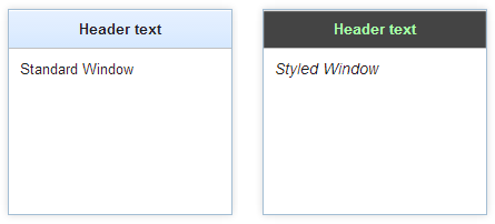
Adding Style
view:"window",
body:{
    template:"<span style='font-size:14px;font-style:italic'>Styled Window</span>"
}
Where CSS Can and Cannot be Applied
While CSS opens a lot of opportunities to change the look of widgets, there are some things you must not do with CSS.
What you can do with CSS
With CSS, you can change colors, fonts, inner paddings of data items, etc. You can see some common cases in this article below.
What you cannot do with CSS
Most sizes and positioning in Webix is controlled with JS, not CSS. Margin, padding, width and height are used by Webix JS code to calculate app sizes and it cannot read these values from stylesheets. That is why you must set the following parameters with JS, not CSS:
- width and height of components
webix.ui({
    view:"button", value:"Button",
    width:70, height:50
});
- paddings and margins in layouts
webix.ui({
    rows:[
        { padding:10, margin:2, cols:[
            { template:"Column 1" },
            { template:"Column 2" }
        ]}
    ]
});
- the sizes of data items in data components
webix.ui({
    view:"list", data:grid_data,
    type:{
        height:70,
        template:"#rank#. #title#<br>#votes#"
    }
});
If you try to set these parameters in CSS, they will either be ignored or most probably will break the component positioning.
Dynamic Styles
A CSS class can be added to the component on the go, by either using the standard pattern of property redefinition:
.mycss{
   color:red;
}
//"datatable" - component ID
$$("datatable").define("css", "mycss");
or by using webix.html helper:
//getNode() returns the component's topmost node
webix.html.addCss( $$("datatable").getNode(), "mycss");
The advantage of the addCss method is that it is supplied with the opposite one, the removeCss that can be used to remove the CSS class from the component:
webix.html.removeCss( $$("datatable").getNode(), "mycss");
Styling inside Type Parameter
When you set dimensions of component items, you use the type property that contains an object with an item's width and height. There you can as well put other parameters including template and CSS.
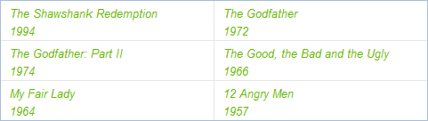
webix.ui ({
    view:"dataview",
    type:{
        height: 45,
        width: 300,
        template:"<span style='color:#67B802; font-style:italic'>#name#</span>"
    }
    ...
})
Type can also be created separately through the webix.type class.
webix.type(webix.ui.dataview,{
    name:"custom",
    template:"<span style='color:#67B802; font-style:italic'>#name#</span>",
    height: 45,
    width: 300
});

webix.ui ({
    view:"dataview",
    type: "custom",
    // ...
})
Related sample: Dataview Type Styling
Adding Predefined Webix CSS Classes
You can either apply predefined CSS as it is:
webix.ui({
    view:"dataview",
    template:"<div class='webix_strong'>#title#</div> Year: #year#, rank: #rank#",
    // ...
});
Related sample: Controlling a Number of Displayed Items
Or redefine default CSS for this document:
.mywin .webix_win_head>.webix_view>.webix_template{
    background: #444; color:#AFA;
}
As far as you've noticed, Webix default CSS classes are marked by a "webix_" prefix. Moreover, each component part has its peculiar CSS class, you can redefine. Read below to learn more about it.
Styling Separate Items in the Component
Instead of defining CSS class for the whole component you can define CSS class for single items. To do so you need to place $css property in the data object. This property can contain the name of the CSS class or a hash of CSS rules.
Setting item's style directly in the dataset
<style>
    .my_style{
        background-color:#FFAAAA;
    }
</style>

<script>
webix.ui({
    view:"list",
    data:[
        { id:1,
          value:"The Shawshank Redemption",
          $css:"highlight"
        },
        { id:2,
          value:"The Godfather",
          $css:{ "text-align":"right" }
        }
    ]
});
</script>
If you want to change styles dynamically, after page loading you can use the addCss and removeCss API.
Styling of a Specific Part of a Component (CSS maps)
CSS maps help stylize a specific part of a component. You should refer to its CSS map, pick the CSS class to the needed part and define the style in the document head.
Below a style is applied to the header of the UnitList:
<style>.webix_unit_header{
    color:#cb4c26;
    font-style:italic;
}
</style>
CSS classes for each component are described in CSS Image Maps Section.
Styling Instances of One and the Same Object
Controls are most frequently used components so one and the same control type, e.g. button, occurs more than once on the page, as a rule.

Take, for instance, buttons. If you want to style each button differently, you should define a separate CSS class for each button, like this:
.bt_1 input{
    border-radius:12px; -moz-border-radius:12px; -webkit-border-radius:12px;
    background: #396D9E;
    ...
}
.bt_2 input{
    border-radius: 4px; -webkit-border-radius: 4px;-moz-border-radius: 4px;
    border: 1px solid #3D7113;
    ...
}
Here .bt1 and bt2 are class names for two different buttons while input specifies that the button's input area should be styled as well.
Related sample: Buttons: Styling
Changing Default Icons
The default icons that are used for various controls can be changed to custom ones, which is described in detail in a separate documentation article.
Back to top