TabView
API Reference
Overview
TabView is a hybrid component that is made of a multiview and a tabbar. You can configure each subcomponent separately using the corresponding APIs. TabView allows quickly initializing a MultiView with a built-in ability to switch between the views. It also features dedicated methods to add and remove views together with the corresponding tabs.
Initialization
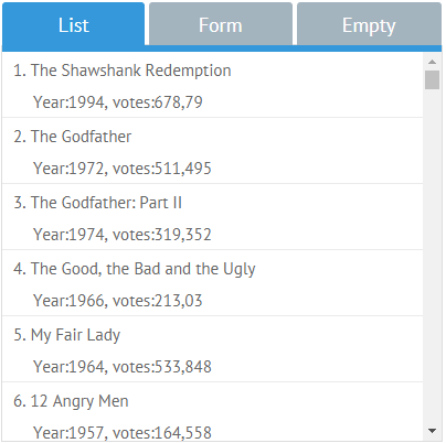
There's no need to create a MultiView and add switching buttons for it. Everything lies within one and the same TabView widget with the cells property that contains collections of views.
TabView
webix.ui({
  view: "tabview",
  cells: [
    {
      header: "List",
      body: {
        id: "listView",
        view: "list",
        // list config
      }
    },
    {
      header: "Form",
      body: {
        id: "formView",
        view: "form",
        // form config
      }
    }
  ]
});
Related sample: Tabview Initialization
Each TabView cell features:
- header - a string with a heading for the cell, displayed as a tab title;
- body - a configuration object for the widget that is placed in this cell.
Note that switching between views is enabled automatically via the Tabbar control. For more customization, use the Multiview widget and choose the needed switching method.
Working with Tabview
The hybrid nature of a TabView allows configuring each of its parts separately:
1.Through the same-name object properties in the initial configuration.
These configuration objects may contain native properties of multiview and tabbar that need to be redefined. If the configurations are omitted, default values will be used:
webix.ui({
    view: "tabview",
    id: "my_tabview",
    cells: [],
    tabbar: {
        on: {
            onAfterTabClick: (id, ev) => {
                webix.message("OnAfterTabClick");
            },
        }
    },
    multiview: {
        // multiview config
    }
});
2.By accessing multiview and tabbar objects to work with them dynamically:
var tabbarObj = $$("my_tabview").getTabbar();
var multiviewObj = $$("my_tabview").getMultiview();
All the API methods, events and properties of ui.tabbar and ui.multiview respectively are applicable to these objects.
Enabling animation
By default switching of TabView tabs is not animated. Since animation is a multiview feature, it can be enabled within the multiview configuration.
view:"tabview",
cells:[],
multiview:{
    animate:true
}
The animate property may take an object with advanced animation settings.
Setting icons for tabs
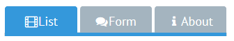
Icons for the tabbar tabs are set via additional HTML in the tab header:
view: "tabview",
cells: [
  {
    header: "<span class='webix_icon fa-film'></span>List",
    body:{}
  }
]
Related sample: Multiview Tabbar with Icons
You can learn more about different types of defining icons in Webix in the Icons with UI Widgets article.
Defining tabs that can be closed
Closing functionality is a tabbar feature.
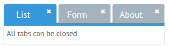
To make all tabs closable, the close property should be set to true in the tabbar configuration:
view: "tabview",
tabbar: {
  close:true
}
To make a separate tab closable, use the close property in its configuration:
view: "tabview",
cells: [
  {
    header:"List",
    close:true,
    body:{...}
  }
]
Related sample: Tabview: Close Tab Button
Responsive tabbar
It's the Tabbar default feature. If the tabs are wider than the available space, some of them are pushed to a popup list and can be reached through the related menu.
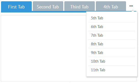
Everything is done fully automatically, though customization options for tab and popup width, icons, etc. are available through the tabbar configuration:
view: "tabview",
tabbar: {
  popupWidth: 300,
  tabMinWidth: 120
}
More details are given in the dedicated documentation article.
Adjusting tab dimensions
The width of each tab can be set separately:
webix.ui({
  view: "tabview",
  cells: [
    {
      header: "List",
      body: {
        id: "listView",
        view: "list",
        width:150          }
    },
    {
      header: "Form",
      body: {
        id: "formView",
        view: "form",
        width:250          }
    }
  ]
});
If tabs are of different width and height, Tabview takes the size of the active tab.
To avoid this behavior, you should use the fitBiggest property in the multiview configuration object:
view: "tabview",
multiview: {
  fitBiggest:true
}
Related sample: Tabview: Fit Active vs Fit Biggest
Adding and removing cells dynamically
The functionality is described in detail in the Adding and Deleting MultiView Cells Dynamically article.
Related Articles
- MultiView
- Common Functions to Switch Between Views
- Controls to Switch Between View Cells
- Adding and Deleting MultiView Cells Dynamically