Dynamic Tabbar
Tabbar can take the following modifications:
- Tabbar may have non-static tab width and quantity that are both changed dynamically on window resizing
- Tabs can be pushed to a related popup while retaining their default behavior.
Related sample: Dynamic Tabbar in Multiview
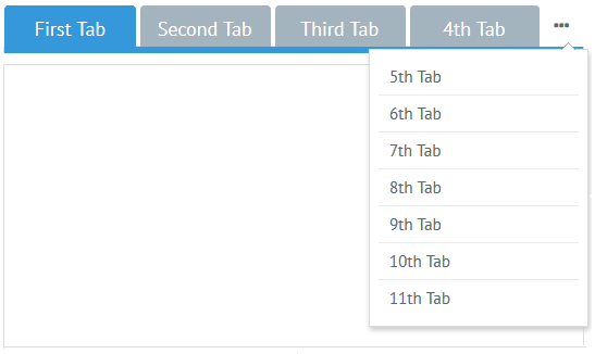
Everything is done fully automatically: when the size of a window changes, tabs are minimized and then pushed to a popup. So the following code is enough:
Default tabbar
{ view:"tabbar", options:["First tab", "Second Tab"] }
Customization
Tabbar
- The minimal width of each tab is 100px by default. It is common for all the tabs of this tabbar and can be changed with the help of tabMinWidth property
- The minimal width of an area to the right that triggers a popup is 40px. By default an ellipsis icon is used. Both parameters can be changed:
- tabMoreWidth sets the width of this area
- moreTemplate sets other icon/text/HTML of this area. Either function or string can be used;
Popup
The width of the popup is 200px by default. It contains 7 items and displays them via the "#value#" template. You can change it by the tabbarPopup property that can include:
- settings for the popup itself e.g. width and css
- settings for the inner list within the body object e.g yCount and template.
Customized tabbar
webix.ui({
  view:"tabbar",
  options: [
    {id:1, value:"First Tab", text:"Some text for first tab"},
    {id:2, value:"Second Tab", text:"Some text for second tab"},
    // other options
  ],
  moreTemplate:"Show more",
  tabbarPopup:{
    // custom styles for popup
    css:"more_popup",
    body:{
      yCount:10,
      template: obj => `
        <span webix_tooltip="${obj.value}" class="content">
          Hidden: ${obj.value}
        </span>`,
      tooltip:{
        template:"",
        overflow: true
      }
    }
  }
});
Related sample: Tabbar: Custom Popup
More info about Webix data templates can be found in the dedicated documentation article.
Back to top