Toolbar
API Reference
Overview
UI-related Toolbar inherits from layout. It is the place to nest all the possible controls including buttons, labels, icons, checkboxes, combos, etc. For the full list of controls please refer to the library's Controls Guide.

Initialization
Toolbar controls are put into the elements array and are arranged into a horizontal line.
To distinguish between horizontal and vertical control arrangement, use cols and rows arrays respectively.
A three-button toolbar
webix.ui({
    view:"toolbar",
    id:"myToolbar",
    cols:[
        { view:"button", id:"LoadBut", value:"Load", width:100, align:"left" },
        { view:"button", value:"Save", width:100, align:"center" },
        { view:"button", value:"Info", width:100, align:"right" }]
});
Related sample: Buttons: Alignment
Specify the ID of a toolbar as well as ID-s of all the necessary controls if you want to work with them later.
There exists a possibility to specify common configuration for all controls included into this or that toolbar.
Working with Toolbar
Image Buttons
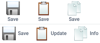
Related sample: Buttons: Type 'image'
Differently-sized buttons can be included into the Toolbar with the help of a custom function:
webix.ui({
    container:"areaD",
    view:"toolbar",
    cols: buttons(48) /*here you specify the parameter you want to
                        pass to the function defined later*/
});

function buttons(size){
    return  [
    { view:"button", type:"image"+size,
        image:"../common/imgs/"+size+"/save.gif", width:size+7},
    { view:"button", type:"image"+size,
        image:"../common/imgs/"+size+"/copy.gif", width:size+7}
    ];
}
More info about how to manipulate button groups.
Icon Buttons
Icons can be nested into all the library components within a Toolbar. Icon buttons look definitely stylish.
Related sample: Buttons: Type 'icon'
Learn more about icon types in the dedicated chapter of the manual.
Dark Theme
You can redefine the default style of Toolbar and apply the dark theme via the css:"webix_dark" configuration option within the Material or Mini skin:

webix.ui({
    view:"toolbar",
    css:"webix_dark",      cols:[//buttons objects]
});
Related sample: Toolbar: Dark Theme