Sidebar
Since 5.2
API Reference
Overview
Webix Sidebar is a Tree-based component which is used for creating menus with hierarchical structure.
Sidebar can be collapsed into a navigation bar with only icons of the menu items visible. On hovering an icon, a popup with the related item is shown with its sub-items. On clicking a Sidebar item, either the related content is shown in the right part of the screen or selectable sub-items are displayed.

Initialization
To initialize Sidebar and load it with data, you need to use the code as in:
//webix.ready() function ensures that the code will be executed when the page is loaded
webix.ready(function(){
    // object constructor
    webix.ui({
        view: "sidebar",
        // setting the data source
        data: menu_data
    });
});
Related sample: Sidebar: Basic
Main properties
- position - (string) sets the position mode for Sidebar, "left" by default; depending on this setting the popup that is shown in the collapsed mode appears either on the right (default) or on the left side of Sidebar;
- collapsed - (boolean) defines, whether the sidebar will be rendered in the collapsed or expanded state. false by default;
- collapsedWidth - (number) sets the width of the sidebar in the collapsed state. 41 by default;
- activeTitle - (boolean) defines whether the first-level menu items are expandable. true by default;
- titleHeight - (number) sets the height of the first-level menu items in the popups. 40 by default.
Check the details; - multipleOpen - (boolean) allows expanding several menu items at a time.
Configuration
The Sidebar widget provides a set of predefined options that allow you to achieve the desired Sidebar configuration.
Collapsed Sidebar
You can decide whether to render Sidebar in the collapsed state or in the expanded one. To show a collapsed Sidebar, use the collapsed property with the true value:
webix.ui({
    view: "sidebar",
    collapsed:true
});
Width of collapsed Sidebar
To define the width of the Sidebar in the collapsed state, make use of the collapsedWidth property. It's set to 41 by default
webix.ui({
    view: "sidebar",
    collapsed:true,
    collapsedWidth:43
});
Sidebar position
You can place the sidebar to the right or the left of the main area. If you place Sidebar on the right, you need to set the position property to "right". This way popups with Sidebar items will appear on the left.
webix.ui({
    view: "sidebar",
    position:"right"
});
Related sample: Sidebar: Right position
Control of sub-items opening
You can control the activity of the first-level menu items by enabling/disabling sub-items opening. For this, change the boolean value of the activeTitle property. It's true by default:
webix.ui({
    view: "sidebar",
    // disabling activity of the first-level menu items
    activeTitle:false
});
Height of first-level items in popups
It's possible to adjust the height of the first-level menu items in the popups that appear when you hover icons in a collapsed sidebar. Use the titleHeight property for this purpose. The default value is 40.
webix.ui({
    view: "sidebar",
    titleHeight:60
});

Multiple expanding of menu items
By default you can expand only one menu item at a time to make its sub-items visible. To allow simultaneous opening of several menu items, apply the multipleOpen config option:
webix.ui({
    view: "sidebar",
    multipleOpen:true
});
Data Loading
Sidebar can load data from various sources in different formats. You can find more information in the Loading Data into Tree article.
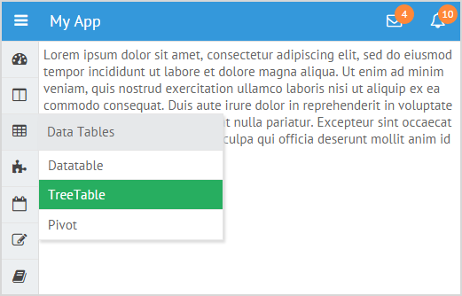
The Sidebar data configuration contains the description of menu items, corresponding icons and sub-items. It can look like this:
var menu_data = [
{id: "dashboard", icon: "dashboard", value: "Dashboards", data:[
{ id: "dashboard1", value: "Dashboard 1"},
{ id: "dashboard2", value: "Dashboard 2"}
]},
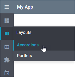
{id: "layouts", icon: "columns", value:"Layouts", data:[
{ id: "accordions", value: "Accordions"},
{ id: "portlets", value: "Portlets"}
]},
{id: "tables", icon: "table", value:"Data Tables", data:[
{ id: "tables1", value: "Datatable"},
{ id: "tables2", value: "TreeTable"},
{ id: "tables3", value: "Pivot"}
]},
...
];
Loading multi-level data
The Sidebar widget can have as many nested levels as you need. The number and configuration of levels depends on the loaded data set.

Let's create a multi-level sidebar by populating it with an appropriate data set:
webix.ui({
    view: "sidebar",
    width:300,
    data: menu_data_multi
});
Each data object in the data set can have nested objects that will create items of the next level:
var menu_data_multi  = [
  // previous elements
    // first-level item
    {id: "forms", icon: "pencil-square-o", value:"Forms",  data:[
        // second-level item
        {id: "buttons", icon:"circle", value: "Buttons", data:[
            // third-level items
            {id: "button", icon:"circle-o", value: "Buttons"},
            // more items
        ]},
        // second-level item
        { id:"texts", icon:"circle", value:"Text Fields", data:[
            // third-level items
        ]},
        // second-level item
        { id:"selects", icon:"circle", value:"Selectors", data:[
            // third-level item
            { id:"single", icon:"circle-o", value:"Single value", data:[
                // fourth-level items
                { id: "combo", icon:"circle-o", value: "Combo"},
                // more items
            ]},
            // third-level items
            { id:"multi", icon:"circle-o", value:"Multiple values", data:[
                // fourth-level items
            ]}
        ]}
    ]},
    // next elements
]
Related sample: Sidebar: Multi level
The Menu Button
The Menu button allows collapsing the menu items into a vertical navigation bar with icons. In this state menu items will be shown by hovering the mouse pointer over the icons.
Let's create a layout with a toolbar and two columns. We'll place a button on the toolbar and put a sidebar in the left column, the right column will serve as a template for some content that could be shown on an item's click.
webix.ui({
    rows: [
        { view: "toolbar", elements: [
            {
                view: "button", type: "icon", icon: "mdi mdi-menu",
                width: 37,
                align: "left",
                css: "app_button",
                click: function(){
                    $$("$sidebar1").toggle()
                }
            },
        ]},
        {
          cols:[
                {
                    view: "sidebar",
                    data: menu_data
                },
                {
                    template: ""
                }
            ]
        }
    ]
});
The applied button uses the "menu" icon from the Material Design Icons collection. Check the Icons with UI Widgets article to learn common rules on the usage of icons.
You can set the button's position using the align property and specifying a CSS style, like this one:
.app_button button{
    padding:0;
    text-align: center;
}
To collapse/expand the menu on the button click, we define the click handler in which we put the toggle method.
The image below shows how an expanded Sidebar menu collapses on the Menu button click:
Adding the Menu button for the right sidebar
While placing the sidebar in the right position, you may have little space to put the Menu button on the toolbar. In this case you may set it in a form right above the sidebar icons as follows:
{ rows:[
   {
      css: "menu",
      padding: 2,
      view: "form",
      cols:[
         {
            view: "button", type: "icon", icon: "bars", inputWidth: 37, align: "left",
            css: "app_button menu",
            click: function(){
                $$("$sidebar1").toggle()
            }
         }
      ]
   },
   {
      view: "sidebar",
      collapsed: true,
      position: "right",
      data: menu_data
   }
  ]
}
Related sample: Sidebar: Right position
Data Visualization
Sidebar allows configuring the templates of its items. The Data Templates are described in the Type Implementation of Sidebar:
webix.type(webix.ui.tree, {
    name:"sideBar",
    height: "auto"
});
name
defines the Sidebar name
{
    name:"sideBar"
}
height
specifies the height of an item in the Sidebar
{
    height: "auto"
}
css
specifies the CSS class applied to the Sidebar
{
    css: "webix_sidebar"
}
template
defines the appearance of the Sidebar in the collapsed and expanded states
template: function(obj, common){
  if(common.collapsed)
    return common.icon(obj, common);
  return common.arrow(obj,common)+common.icon(obj,common)+"<span>"+obj.value+"</span>";
}
arrow
defines the presentation of arrows, depending on the level of the related Sidebar items
arrow: function(obj) {
    var html = "";
    for (var i=1; i<=obj.$level; i++) {
        if (i==obj.$level && obj.$count) {
            var icon = "wxi-angle-"+(obj.open?"down":"left");
            var className = "webix_sidebar_dir_icon webix_icon "+ icon;
            html+="<span class='"+className+"'></span>";
        }
    }
    return html;
}
icon
specifies a template for rendering icons next to the items of Sidebar
icon: function(obj) {
 var style = "";
 if (obj.$level > 2) {
   style = "style=\"padding-left:"+ (40 * (obj.$level - 2))+"px\"";
 }
 if (obj.icon)
  return "<span class='webix_icon webix_sidebar_icon "+obj.icon+"' "+style+ "></span>";
 return "<span "+style+"></span>";
}
Dark Theme
You can redefine the default style of Sidebar by applying the dark theme via the css:"webix_dark" configuration option within the Material or Mini skin:
webix.ui({
    view: "sidebar",
    css:"webix_dark",     data: menu_data
});
Related sample: Inverted Sidebar
Related sample: Sidebar: Inverted Multi Level
Back to topIf you have not checked yet, be sure to visit site of our main product Webix html5 library and page of sidebar js product.