Carousel
API Reference
Overview
UI-related carousel is designed to present Webix components in one view with the ability to switch between them by clicking on the dedicated buttons or sliding (on touch devices).

Related sample: Carousel Initialization
Initialization
Carousel items are arranged into either rows to scroll through them vertically or in cols to scroll horizontally. Each row/column includes Webix component, e.g:
- simple or data template for showing texts and images;
- any data component like dataview, chart, datatable;
- layout of any complexity.
webix.ui({
    view:"carousel",
    id:"carousel",
    cols:[
        { view:"template" },
        { view:"chart" },
        { view:"datatable" },
        { rows:[...]} //layout
    ]
});
Related sample: Carousel Initialization
Normally, the configuration of a component is stored separately, while cols/rows contain an array of corresponding variables. It makes code clear and easy to read.
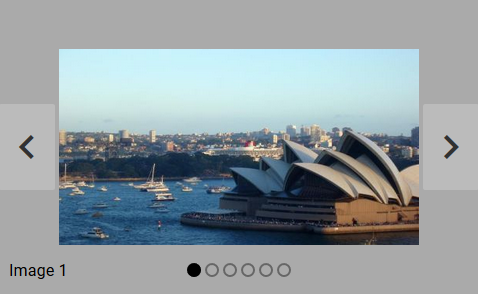
Navigation Area
Carousel comes equipped with a navigation panel that contains:
- navigation items (circles) that show the number of carousel views and highlight the opened one;
- navigation buttons (right/left) placed together to the right of the circles.
You can either click buttons or items to get to the needed view. On touch devices views are switched by swipe movements.
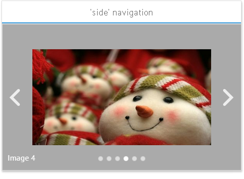
Redefining Navigation
Related sample: Navigation Types
Navigation area is controlled via the navigation object property of the Carousel component. From there you can:
- separate navigation buttons and place them on the right and left sides of the view, define "side" type;
- remove navigation items (circles) or buttons by setting false value to the corresponding property.
view:"carousel",
cols:[...],
navigation:{
    type: "side",
    items:false,
    // buttons:false
}
Custom Navigation Area
Any Webix component can be used to navigate through the carousel by using its API.
For instance, you can use one-row dataview with thumbnails of carousel views.

Related sample: List Navigation
In layout carousel and the component used for navigation are stored in different rows or cols:
rows:[
    {
        view: "carousel",
        id:"carousel",
        cols: []
    },
    {
        view: "dataview",
        id: "imageList",
        yCount: 1, // one row
        select: true, // item selection enabled
        scroll: false, // non-scrollable
        data: [...]
    }
]
Switching is enabled by catching carousel onShow and dataview onItemClick events:
// when dataview item is clicked, the needed view is shown
$$("imageList").attachEvent("onItemClick",function(id){
    $$(id).show();
});

// when carousel item is shown, its thumbnail in dataview is selected
$$("carousel").attachEvent("onShow",function(id){
    $$("imageList").select(id);
});
Learn more about how to show and hide Webix components and study selection pattern of data components.
Scrolling Speed
The default scrolling speed of the carousel is 300ms. To change it use the following:
webix.ui({
    view:"carousel",
    scrollSpeed: "500ms"
});
However, in case of significantly slower scrolling speed smoothness may degrade.
Changing Carousel Views Dynamically
You can add new cells to Carousel, remove existing ones and reconfigure the widget's structure by using common layout techniques.
Adding views to Carousel
In order to add a new view into Carousel, you can use the addView method. For this, you need to specify the view object and position to insert it at:
webix.ui({
    id:"mycarousel",
    cols:[...]
});
// adds template as a third cell to some existing carousel
$$("mycarousel").addView({ template:"New one" }, 2);
Removing views from Carousel
To remove a view from Carousel, you can make use of the removeView method and pass the view id to it:
webix.ui({
    id:"mycarousel"
    cols:[
      { id:"mytemplate1" },
      { id:"mytemplate2" },
      { id:"mytemplate3" }
   ]
})
...
$$("mycarousel").removeView("mytemplate2");
Rebuilding the Carousel structure
You can reconfigure the Carousel widget by passing an array of new children views to it. For this purpose you need to apply the webix.ui() constructor with the required parameters. They are described in detail in the article Dynamic UI Modifications.
webix.ui({
    view:"carousel", id:"mycarousel", elements:[...]
});

// redraw carousel with new elements
webix.ui([..new elements..], $$("mycarousel"));
Working with Carousel
1. You can navigate through the carousel with the help of the following switching functions:
- showPrev() - takes to the previous view;
- showNext() - takes to the next view.
These functions can be attached to custom buttons or any on-page and application events:
{ view:"button", value:"Previous View", click:function(){ $$('carousel').showPrev(); }}
2. With touch-based devices initial scrolling pattern can be changed depending on the screen orientation. Scrolling is adjusted by the dedicated method:
$$("carousel").adjustScroll();
Setting the Active Element for the Carousel
3. Active carousel item is a view that is currently shown. Carousel views can be treated either by their IDs or by their position in the cols/rows array (zero-based numbering).
- setActive(id) - shows a view with the specified ID;
- setActiveIndex(index) - shows a view with the specified index;.
4. The same way you can get the currently shown (active) item:
- getActiveId(); - returns ID of the active view;
- getActiveIdIndex(); - returns index of the active view.
$$("carousel").getActiveIndex();
Dark Theme
You can redefine the default style of Carousel and apply the dark theme via the css:"webix_dark" configuration option within the Material or Mini skin. It will darken the navigation controls:
webix.ui({
    view:"carousel",
    css:"webix_dark",      cols:[// columns with items]
});
Related sample: Carousel Dark Style
Related Articles
- Adding Headers to Components
- Event Handling
- Sizing Components
- Resizing
- Redefinition of Components
- Layout
- Multiview
- Scrollview
- Carousel CSS Image Map
If you have not checked yet, be sure to visit site of our main product Webix mvc library and page of javascript image slideshow product.