Intermediate
Adding Headers to Components
Header is a blue section above the main contents of a component or layout row/column.
Depending on the context, a header is defined in two ways:
- as the type of a template;
- as the property of a component.
Related sample: Window with a Component Inside
Header as Template Type
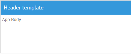
This way of header initialization is used within layout rows and columns. Here the header is just one of the template types.
If you want to make a header for, say, DataView, make two rows and place the header in the first row, while the DataView should be in the second one.
Type:"header"
webix.ui({
    rows:[
        { view:"template", template:"some text", type:"header" }, // 1st row
        { ....} //2nd row
    ]
});
BTW, another template type, namely section, allows setting a specific header, that looks like a thin line which encircles the component and has a heading above.
Type:"section"
{ view:"template", template:"some text", type:"section" }
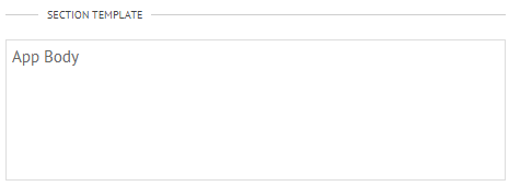
During header initialization the view:template line is optional.
Related sample: Template Types
Header as Component Property
Still, some components have built-in means of header building.
Accordion item is divided into body and header
{ view:"accordionitem", header:"Pane ", body:"text" }
Headers of TabView tabs are defined as header properties of TabView cells:
{ view:"tabview",
  cells:[
    {
      header:"List",
      body:{
        view:"list", ...
      }
    }
  ]
}
Related sample: Tabview: Basic Initialization
Property sheet looks like a grid with sections separated by blue headers. In essence, any line without data becomes a header, the text of which is defined by the label property.
 { label:"Layout" }, // the header
 { label:"Width", type:"text", id:"width"}, // the line with data
Related sample: Property Sheet: Basic Initialization
UI-related window features header defined by its head property.
Adding Buttons into the Header
Since a header is a template, only HTML-buttons can be added into it. If you want to add some buttons into the header of a component, the best solution is to use the Toolbar component:
webix.ui({
  view:"toolbar",
  cols:[
    { view:"label", label:"Projects", width:400,},
    { view:"button", value:"Load" },
    { view:"button", value:"Save" },
    { view:"button", value:"Info" }
  ]
});
Related sample: Toolbar with Buttons in the Header
Back to top