Available only in PRO Edition
DateRange
Since 4.0
The widget is available in the Webix Pro edition.
API Reference
Overview
DateRange is a UI-related widget based on Calendar and inherited from Layout.
This interactive tool includes several calendars and allows selecting a date range. You can also pick the time by using the timepicker at the bottom of the widget.
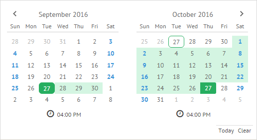
Related sample: DateRange: Basic
Initialization
The code below will create the DateRange widget on the page:
webix.ui({
    view:"daterange",
    calendarCount:4,
    icons:true,
    timepicker:true,
    value:{
        start: new Date(),
        end: webix.Date.add(new Date(), 2, "month")
    }
});
Main properties
- calendarCount - (number) sets the amount of calendars to be displayed
- icons - (boolean,object) specifies whether the "Today" and "Clear" icons will be shown or redefines their configuration
- timepicker - (boolean) sets a time selector below the calendars' grids
- value - (object) initial range that should be selected in the DateRange
Working with DateRange
Setting and getting selected range
- setValue(object) - selects a date range in the calendars
As a parameter, takes an object with the start and end properties that contain the start and end Date object of the range.
$$("daterange1").setValue({start:new Date(2016,9,30), end:new Date(2016,10,2)});
- getValue() - returns an object with currently selected range
The returned object is non-formatted and consists of the start and end properties for start and end dates correspondingly.
$$("daterange1").getValue();
// -> {start: Sun Oct 30 2016 00:00:00 GMT+0300 (Russia Standard Time),
// end: Wed Nov 02 2016 00:00:00 GMT+0300 (Russia Standard Time)}
Configuring DateRange Calendars
You can set specific configuration for all calendars of the DateRange widget. You should use the calendar property for this purpose.
It is an object that can contain the available Calendar properties:
webix.ui({
    view:"daterange",
    //calendar properties
    calendar:{
        weekNumber:true
    }
});
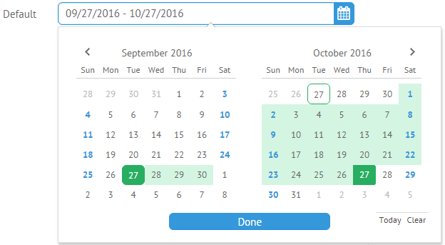
DateRangePicker
DateRange can be shown by user request, e.g. when a user wants to pick a date range and time to fill the form. In this case, you can make use of the DateRangePicker control.
Thus, you won't have to initialize DateRange, as it will appear when you click the DateRangePicker icon.
webix.ui({
    view:"form",
    elements:[
        {view:"daterangepicker", name: "default", label: 'Default'}
    ]
});
Related sample: DateRange Picker
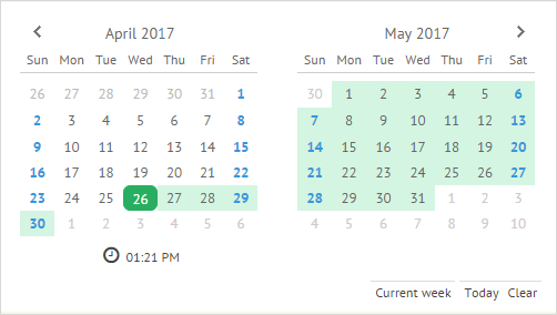
"Today" and "Clear" Icons
You can add and customize the DateRange icons with the help of the icons parameter. The default icons are "Today" and "Clear".
The Today icon allows selecting the current date. The Clear icon removes date selection.
These icons are optional and specified in the icons array. The code below renders a daterange with "Today" and "Clear" icons:
webix.ui({
  cols:[
    {
      view: 'daterange',
      icons: true,
    }
  ]
});
To hide the icons, you should set the icons property to false.
Default Icons Config
The default icons configuration is specified as follows:
webix.ui({
  cols:[{
    view:"daterange",
    icons:[
        //default "today" icon
        {
            template:function(){
             return "<span class='webix_cal_icon_today webix_cal_icon'>"
                +webix.i18n.calendar.today
                +"</span>"
            },
            on_click:{
                "webix_cal_icon_today":function(){
                    this.addToRange(new Date());
                    this.callEvent("onTodaySet",[this.getValue()]);
                }
            }
        },
        //default "clear" icon
        {
            template:function(){
            return "<span class='webix_cal_icon_clear webix_cal_icon'>"
                +webix.i18n.calendar.clear
                +"</span>"
            },
            on_click:{
                "webix_cal_icon_clear":function(){
                    this.setValue("");
                    this.callEvent("onDateClear", []);
                }
            }
        }
    ]
  }]
});
Adding a Custom Icon
You can also redefine the default icons or add custom ones. For example, let's add the "Custom week" icon as shown below:
To add a custom icon, you need to specify it in the icons array. For our icon, the code can be as follows:
webix.ui({
 cols:[
  {
    view:"daterange",
    icons:[
      {
      template:function(){
         return "<span class='webix_cal_icon_week webix_cal_icon'>Current week</span>"
      },
         on_click:{
            "webix_cal_icon_week":function(){
                this.setValue({
                    start:new Date(),
                    end:webix.Date.add(new Date(), 1, "week")
                });
            }
         }
      }]
   }]
});
Related sample: DateRange: Custom Icons
Back to top