Intermediate
Type Implementation
Type property allows treating each of the component's items separately - specify its dimensions, set CSS class, define data template and include elements that will be common for all the items.
Type is applicable to the following data components:
- dataview;
- list;
- grouplist;
- unitlist;
- menu;
- tree;
- datatable and treetable to define common properties for cells;
Webix item type is an object that is constructed of parameters you'd like to apply to each item of the component. These parameters can be native properties of Webix components or user-defined ones.
Native properties are described in the component API and may differ from component to component. They may include:
- template - the template of data visualization of each item;
- templateStart and templateEnd - wrappers for each data item, are not redefined, as a rule. More Info.
- width and height - width and height of each data item;
- css - item styling;
- headerHeight (unitlist specific) - the height of unit headers.
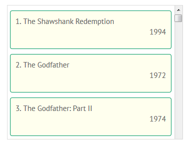
In the sample below it is shown how you size the dataview itself and how the dimensions of dataview cells are sized.
webix.ui({
    view: dataview,
    width: 550,
    data: ... ,
    type:{
        template: "<div class='rank'>#rank#.</div><div class='title'>#title#</div>",
        width: 261,
        height: 90,
        css: "movie"
    }
});
Related sample: Template as a String
At the same time you can define the type separately by using webix.type constructor and then apply it to the necessary component:
webix.type(webix.ui.dataview,{
    name:"typeA",
    template: "<div class=''>#rank#.</div><div class='title'>#title#</div>",
    width: 261,
    height: 90,
    css: "movie"
});

webix.ui({
    view: "dataview",
    type: "typeA", //name of the new object created in the first step
    ...
});
Related sample: Named Templates
Defining Common Elements
Common elements can be included in either of the two ways:
- {common.property} - allows including a constant value for all the items into the template:
webix.ui({
    view:"list",
    template:"{common.itemIcon} #rank#. #title#",
    type:{
        itemIcon:"<span class='webix-icon fa-film'></span>"
    }
});
- {common.method()} - allows including result of a function call into the template:
webix.ui({
    view:"list",
    template:"#rank#. #title# {common.itemYear()}",
    type:{
        itemYear:function(obj, common){
            if(obj.year>=2000){
                return "<span class='newtime'>"+obj.year+"</span>";
            } else if(obj.year<1970){
                return "<span class='oldtime'>"+obj.year+"</span>";
            } else
                return obj.year;
        }
    }
});
Related sample: List: Advanced Template
The type function takes an item object as a parameter, so all its properties are accessible in it.
Redefining Default Template Elements
You can completely change the component's look and feel inside the type by altering HTML for the items. Type properties subject to altering are as follows:
- template - standard item template, can be used outside the type configuration with the same result. Includes data properties in #hash# signs and optionally, HTML content;
- templateStart - container element for data item, wraps the elements defined by template. Opening element. It should contain the webix_l_id attribute that allows detecting the item by its ID;
- templateEnd - closing element for templateStart.
In other words, each data item HTML content includes templateStart - template - templateEnd. TemplateStart and templateEnd are not normally changed, but still the possibility exists.
This is how standard list can be redefined:
webix.ui({
   view:"list",
   type:{
      templateStart:"<div webix_l_id='#id#' class='custom_item'>",
      template:"#rank#. #title#<br><div style='text-align:right;'>#year#</div>",
      templateEnd:"</div>"
   }
});
Related sample: List: Advanced Template
Redefining Loading Placeholder in Dataview
Placeholder is shown on each Dataview card while its data are being loaded. By default it is a plain text as it is shown on the picture.
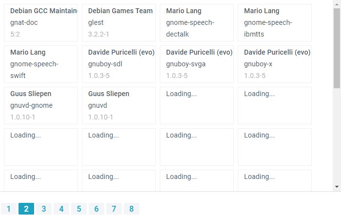
You can redefine the default placeholder via the templateLoading property. A custom placeholder can be any string (plain text or HTML):
{
  view:"dataview",
  template:"<span class='webix_strong'>#maintainer#</span><br/>#package#<br/><span class='webix_light'>#version#</span>",
  type: {
    type:"tiles",
    templateLoading: `<div class="lds-dual-ring"></div>`,
  },
  // config
}
Related sample: Dataview: Data Loading Placeholder
Back to top