Node Templates
To customize data in the node titles, you can use templates. A data template for the tree is set by the template property.
With templates, you can present almost any content in the tree: images, links, numbers, strings, dates, etc.
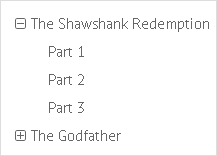
By default, Tree uses the following template for its items:
Default tree template
webix.ui({
    view:"tree",
    template:"{common.icon()} {common.folder()} <span>#value#</span>"
});
It means that each item has:
- the icon for expanding/collapsing tree branches;
- a folder/file icon that will automatically change depending on whether a node has children or not;
- data value from the datasource.
You can find more info about the Webix pattern of data interpolation in Data templates.
Predefined Templates
Webix tree and treetable offer a set of predefined helpers for item rendering. They are tree-specific elements like item icons, expand/collapse icons, and checkboxes.
- {common.icon()} - the icons for collapsed/expanded nodes (the type of icons depends on the skin)
- {common.folder()} - an icon of a folder or a file. The folder can be closed or open depending on a node state;
- {common.treetable()} - (treetable only) - a combination of common.icon() and common.folder() in one line.
- {common.checkbox()} - a checkbox;
- {common.treecheckbox()} - a 3-state checkbox (treetable only). This type has three states: checked, unchecked, and indeterminate. If there are no checkboxes in an indeterminate state, the standard checkboxes are displayed. To provide 3-state behavior you should set the threeState property to true.
All of the templates are the methods of the common object that is accessible by all of the tree items and defined within tree/treetable Type mixin.
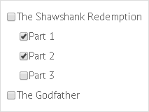
String definition
You can set a template as a string:
Specifying the template parameter as a string
webix.ui({
    view:"tree",
    template:"{common.icon()} {common.checkbox()} {common.folder()}" +
       "<span>#value#</span>"
});
Related sample: 2-state Checkboxes
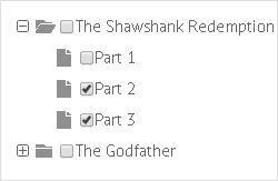
The tree above will render items featuring an expand-collapse icon, checkbox and file/folder icon.
Function definition
You can define a template as a function:
Specifying the template parameter as a function
webix.ui({
    view:"tree",
    template:function(obj, common){
        return common.icon(obj, common) + common.checkbox(obj, common)
            +common.folder(obj, common)+"<span>"+obj.value+"</span>",
    }
});
The input parameters of the function are:
- the item object with the following properties:
- item properties from the dataset;
- helper properties that are added to tree items during data loading and exist only on client-side to maintain tree integrity:
- $level - (number) the level of nesting (one-based numbering);
- $parent - (string) the ID of the item's parent;
- $count - (number) the number of children;
- open - (boolean) defines whether the node is collapsed or expanded (only for parent nodes);
- disabled - (boolean) defines whether the node is disabled or enabled (false by default)
- common object that provides 4 functions:
- icon(obj, common) - renders the '+'/'-' icons for collapsed/expanded states of nodes
- folder(obj, common) - renders an icon of the folder
- checkbox(obj, common) - renders a checkbox
- treetable(obj, common) (treetable only) - combines common.icon() and common.folder().
Benefits of function definition
Template functions add more freedom (e.g. you can define templates depending on some conditions).
Let's assume that you want to show items that have the nesting level greater than 2 in italic font. In this case you can specify the data template as in:
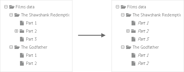
webix.ui({
    view:"tree",
    template: function(obj, common){
        if (obj.$level > 2) {
            return common.icon(obj,common)
            + common.folder(obj,common) + "<i>" + obj.value + "</i>";
        } else {
            return common.icon(obj,common)
            + common.folder(obj,common) + obj.value;
        }
    }
});
You can also define additional common elements within the component type.
Predefined Templates: Use Cases
{common.icon()}
webix.ui({
    view:"tree",
    template:"{common.icon()} #value#"
});
{common.folder()}

webix.ui({
    view:"tree",
    template:"{common.folder()} #value#"
});
{common.checkbox()}
webix.ui({
    view:"tree",
    template:"{common.checkbox()} #value#"
});
{common.icon()} {common.checkbox()}
webix.ui({
    view:"tree",
    template:"{common.icon()}{common.checkbox()} #value#"
});
{common.icon()}{common.folder()} or {common.treetable()}

webix.ui({
    view:"tree",
    template:"{common.icon()}{common.folder()} #value#"
});
The same for treetable can be rendered via:
webix.ui({
    view:"treetable",
    columns:[
        { id:"value",
            template:"{common.treetable()} #value#"
        },
        {...}
    ]
});
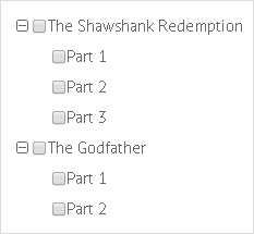
{common.icon()}{common.folder()}{common.checkbox()}
webix.ui({
    view:"tree",
    template:"{common.icon()}{common.folder()}{common.checkbox()} #value#"
});
Changing Predefined Templates
The above mentioned template methods are parts of the tree type, a set of methods used for rendering tree items.
Tree type can be extended or altered:
webix.ui({
    view:"tree",
    type:{
        folder:function(obj){
            if(obj.$level == 1)
                return "<span class='webix_icon mdi mdi-folder-open'></span>";
            if (obj.$level == 2)
                return "<span class='webix_icon mdi mdi-video'></span>";
            return  "<span class='webix_icon mdi mdi-file-video'></span>";
        }
    }
});

webix.ui({
    view:"tree",
    type:{
        my_folder:function(obj){
            //code
        }
    }
});
If you need to apply this type to several trees, you can define the type object separately and then refer to it by its name:
webix.type(webix.ui.tree, {
    name:"awesome",
    folder:function(obj){
        //code
    }
});

var tree2 = webix.ui({
    view:"tree",
    type:"awesome",
});
More about type implementation for data components can be found in the Type implementation article.
Back to top