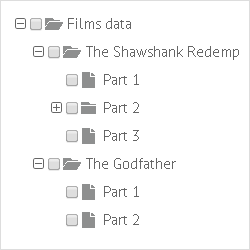
Checkboxes in Tree
In this chapter we will talk about checkboxes in tree nodes: how to add, customize them or provide the 3-state behavior.
Adding Checkboxes to Nodes
Tree provides a predefined template for checkboxes, which is - {common.checkbox()}
(read more about templates in chapter Node Templates).

So, to add checkboxes to tree nodes, you should specify the template property like this:
Adding checkboxes to tree nodes
webix.ui({
    view:"tree",
    template:"{common.icon()} {common.checkbox()} {common.folder()} #value#"
    ...
});
{common.icon()} template adds '+'/'-' icons to the nodes, {common.folder()} - adds folder icons.
A data item object can have an additional property called checked (boolean). It defines whether the checkbox for the corresponding item will be initially checked.
var data = [
    { id:"1", open:true, value:"The Shawshank Redemption", checked:true, data:[
        { id:"1.1", value:"Part 1" },
        { id:"1.2", value:"Part 2" },
        { id:"1.3", value:"Part 3" }
    ]},
 ...
];
Related sample: 2-state Checkboxes
3-state Checkboxes
In addition to the standard 2-state behavior, Webix Tree supports 3-state checkboxes.
| Behavior | Description |
|---|---|
| 2-state (standard) |
|
| 3-state |
|
To provide 3-state behavior for tree checkboxes you should set the threeState property to true:
Activating 3-state behavior for checkboxes
var tree = webix.ui({
    view:"tree",
    template:"{common.icon()} {common.checkbox()} {common.folder()} #value#",
    threeState: true
    ...
});
Related sample: 3-state Checkboxes
Manipulations with Checkboxes
Checkboxes can be checked and unchecked with special API methods. It is possible to get checked items and define whether the item is currently checked or not.
- checkItem(id) / uncheckItem(id) - checks/unchecks tree node with the specified ID;
- getChecked() - returns an array of IDs of the checked items;
- isChecked(id) - helps find out whether the specified node is checked at the moment.
tree.checkItem(tree.getSelectedId());

tree.uncheckItem(tree.getSelectedId());
Checkboxes can be used for component refreshing only from a browser.
Generally, components are refreshed by applying the refresh() method to them, yet it can be called each time tree checkbox changes. The item with this checkbox will be refreshed:
webix.ui({
    view:"datatable",
    checkboxRefresh:true
});