Tabbar
API Reference
Overview
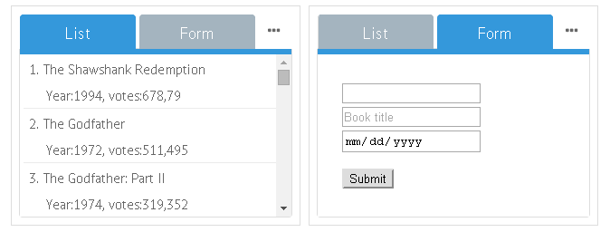
UI-related tabbar is an integral button that allows for changing between views in a multiview layout. Its tabs can be nested with images and icons.
Initialization
rows:[
    {
        view: "tabbar",
        id: "tabbar",
        value: "listView",
        multiview: true, options: [
            { value: "List", id: "listView"},
            { value: "Form", id: "formView"},
            { value: "Empty", id: "emptyView"}
        ]
    },
    //and then multiview goes
    {cells:[...]}
]
Main properties
- multiview (boolean)- if true, it links tabs to multiview cells;
- options (array, object) - defines buttons for switching between views. Details;
- value (string) -
- within options array it sets titles for tabs;
- within Tabbar constructor it defines the tab that will be shown initially on page loading.
- type (string) - if set to "bottom", the tabbar gets other styling, more suitable for tabs placed under the multiview. It can be done by changing the order of layout rows;
- close (boolean) - if true, the "close" functionality for each tab is provided. Each tab can be closed by clicking a dedicated icon on it.
Compare top and bottom tabbar in a sample:
Related sample: Panel with Clickable Items ('tabbar')
'Close' Button for Tabs
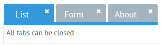
Tabs featuring the close property in the tab configuration gain the ability to be closed by clicking the dedicated "Cross" icon:
// all tabs can be closed
{view:"tabbar", close:true, options:[...]}

// only "Tab1" can be closed
{view:"tabbar", options:[
    {id:1, value:"Tab1", close:true},
    {id:1, value:"Tab2"}
]}
Related sample: Tabview: Close Tab Button
Showing and Hiding Options
There's a possibility to hide and show tabs using Tabbar API. To apply this feature, make use of the showOption and hideOption methods correspondingly. Both methods take the view id as a parameter.
For example, you can hide a form view placed into one of the tabs:
webix.ui({
    rows:[
        tabbar,
        data,
        {view: "form", cols:[
            {},
            { view:"toggle", offLabel:"Hide Form", onLabel:"Show Form", on:{
                onChange: function(value){
                    if(value)
                        $$("tabbar").hideOption("formView");
                    else
                        $$("tabbar").showOption("formView");
                }
            }}
        ]}
    ]
});
Tab Icons
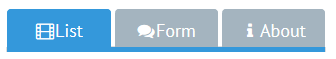
Icons are defined through additional HTML provided within the tab value:
 { view:"tabbar", options: [
    { value: "<span class='webix_icon fa-film'></span>List", id: 'listView' }
 ]}
Related sample: Multiview Tabbar with Icons
You can learn more about different types of defining icons in Webix in the Icons with UI Widgets article.