Tabbar CSS
| CSS class | Element |
|---|---|
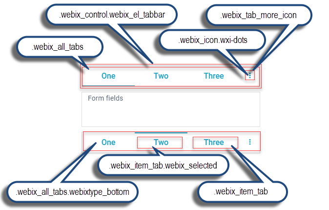
| .webix_control.webix_el_tabbar | The whole Tabbar. Since most of the time a number of ".webix_item_tabs" will be rendered on top of it, the most often visible part of ".webix_el_tabbar" is the ".webix_tab_more_icon" at the end of the tab strip. |
| .webix_icon.wxi-dots | Icon at the end of the tab strip when there are more tabs to display than fit horizontally. |
| .webix_tab_more_icon | The icon area |
| .webix_item_tab | A tab in the Tabbar. |
| .webix_item_tab.webix_selected | The selected tab. |
| .webix_all_tabs | All tabs in the Tabbar. Displayed on top of the ".webix_el_tabbar" and under ".webix_item_tab" and ".webix_tab_filler". |
| .webix_all_tabs.webixtype_bottom | All tabs in the Tabbar of the "bottom" type |
| .webix_tab_filler | Space between ".webix_item_tab"s and on the right and left ends of a top Tabbar. |
| .webix_before_all_tabs | A div before ".webix_el_tabbar". By default 100% wide and 1px tall. |
| .webix_after_all_tabs | A div after ".webix_el_tabbar", separating it from the content below. By default 100% wide and 6px tall. |
All the classes are applicable for both top and bottom Tabbar except for:
- .webix_all_tabs.webixtype_bottom - class specific to bottom Tabbar only;
- .webix_tab_filler - appears in the top Tabbar only if total width of all tabs is less than available space;
- .webix_before_all_tabs, .webix_after_all_tabs - absent in the Material and Mini skins.
Read more about Tabbar control.
Back to top