Available only in PRO Edition
Multiselect
The control is available only in Webix Pro edition.
API Reference
Overview
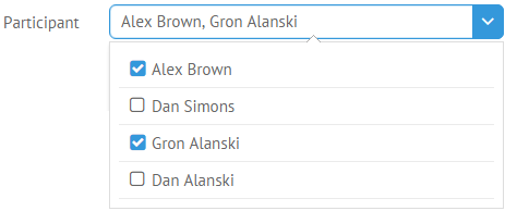
UI-related Multiselect is a non-editable select control that allows selecting multiple options at a time while displaying them in the dedicated input field.
Multiselect inherits from a standard richselect and has the following features:
- Each option is equipped with a checkbox (can be configured, see below);
- To select an option, check it or click the corresponding list item. A selected option will be added to the input;
- To remove an option from selection, uncheck it in the list.
Initialization
{ view:"multiselect", id:"multi", label:"Participant", options:[
    { id:1, value:"Alex Brown" },
    { id:2, value:"Dan Simons" },
    { ... }
], value:"1,3" }
Related sample: Multi-select input
Main properties
- value (string) - the initial value to display in the input field, its ID. The string can be separated by a comma (",") to define multiple values;
- label (string) - text label of a control. It can be customized by:
- labelAlign (string) - label alignment towards its container. Possible values are "left" and "right". In any way, it's placed left to the control;
- labelWidth (number) - width of the label container;
- labelPosition (string) - defines label position related to the input field. The only possible value is "top";
- placeholder (string) - the initial text in the text field, disappears as you start typing in it;
- options or suggest (array, object) - defines a set of items to select from, or the data source, or advanced popup configuration;
- optionWidth (number) - defines the width of a popup list. By default, it is adjusted to the control width;
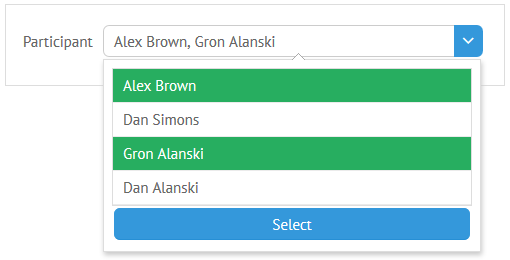
- button (boolean) - if set to true, defines that Multiselect popup will be closed by click on the Select button. The details on the button's configuration are given below.
Configuring Suggest List
Webix API allows for using another suggest list for the Multiselect - Multisuggest:
webix.ui({
  view:"multiselect", suggest:{
    view:"multisuggest", data:[
      {id:1, value:"one"},
      {id:2, value:"two"}
      ]
    }
});
The control's popup is supplied with a "select" button out of box, but it can be changed in two ways:
- changing the buttonText property for a particular Multisuggest list:
{view:"multiselect", label:"Participant",options:{
     buttonText:"Done",
     data:[]
}}
- modify the locale to change button text for all the Multisuggests in the application (if other is not stated by buttonText, as shown above):
webix.i18n.controls.select = "Done";
webix.i18n.setLocale(); //apply the locale
Then all the Multiselect instances in the app will be supplied with the "Done" word.
You can read more about advanced configuration options for popup selectors in the corresponding documentation article.
Accessing Suggest List
Multiselect API allows getting a popup object for further working:
multiselect.getPopup().getBody();
//or
multiselect.getPopup().getList();
If you use multisuggest, then its constituent parts (list and button) are accessed as:
//button object
multiselect.getPopup().getButton();
//list object
multiselect.getPopup().getList();
Selecting/Unselecting All Options
There is a possibility to select/unselect all options of the Multiselect control.
To enable it, you need to define the selectAll property with the true value in the dedicated suggest object and the corresponding field will be shown on the top of multiselect options:
webix.ui({
    view:"multiselect",
    options:{
        data:[
            { id:1, value:"Alex Brown" },
            { id:2, value:"Dan Simons" },
            { id:3, value:"Gron Alanski" },
            { id:4, value:"Dan Alanski" }
        ],
        selectAll:true
    },
    value:"1,3"
});
When you click "Select All", all the options are selected and the label changes to Unselect All, which allows you to unselect all the options.
Back to top