Search
API Reference
Overview
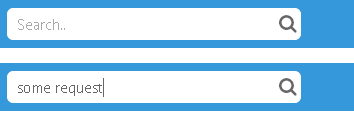
UI-related search looks like an input text field with a 'search icon' to indicate that it can be used for filtering data in a data-presenting component to get to the necessary item.
Filtering function should be written by a developer. See the attached sample for details.
Initialization
{ view:"search", placeholder:"Search..", width: 300 }
Main Properties:
- placeholder (string) - a prompt text displayed in the search field;
- label (string) - text label of a control. It can be customized by:
- labelAlign (string) - label alignment towards its container. Possible values are "left" and "right". In any way, it's placed left to the control;
- labelWidth (number) - width of the label container.