Select
API Reference
Overview
Select is a control that allows selection from several items. It is based on HTML < select > tag and looks like a dropdown list.
Initialization
// full form
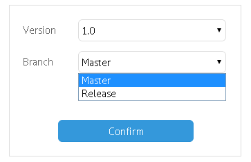
{view:"select", label:"Branch", value:1, options:[
{id:1, value:"Master" }, // the initially selected value
{id:2, value:"Release" }
], labelAlign:"right"
}
// short form
{ view:"select", options:["Master", "Release"]}
// server-side options
{ view:"select", options:"server/data.json"}
Related sample: Select Box ('select')
Main properties
- label (string) - text label of a control. It can be customized by:
- labelAlign (string) - label alignment towards its container. Possible values are "left" and "right". In any way, it's placed left to the control;
- labelWidth (number) - width of the label container;
- options (array, object, string) - defines a set of items to select from;
- value (string, number)
- within options array it sets text values for select items;
- within Select constructor it defines the initially selected item of the control (option ID in case of a full form, option text in case of a short form);