Segmented Button
API Reference
Overview
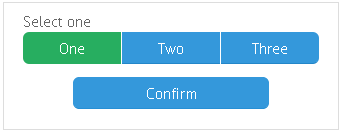
Segmented is an integral button with as many segments as you like. Can be used for switching between MultiView cells.
Initialization
{view:"segmented", multiview:true, value:1, options:[
    { id:"1", value:"Section A" }, // the initially selected segment
    { id:"2", value:"Section B" },
    { id:"3", value:"Section C" }]
}

//short form for options array
{ view:"segmented", options:["Section A", "Section B", "Section C"]}
Related sample: Holistic Panel with Multiple Buttons ('segmented')
Main properties
- multiview (boolean) - connects the control to the MultiView cells, enables switching between these cells;
- options (array, object) - defines the buttons (segments) within the control. Details;
- value (string, number)
- within options array it sets titles for button segments;
- within Segmented constructor it defines the initially selected item for the control;
- label (string) - text label of a control. It can be customized by:
- labelAlign (string) - label alignment towards its container. Possible values are "left" and "right". In any way, it's placed left to the control;
- labelWidth (number) - width of the label container.
Showing and Hiding Options
Segmented Button provides the possibility to hide and show segments with the help of the corresponding methods: showOption and hideOption.
You need to pass the id of the view that should be hidden as a parameter.
// hiding view
$$("segmented").hideOption("viewId");

// showing view
$$("segmented").showOption("viewId");
Working with Segmented Button
Adding and Deleting Segments (Options) on the Go