Suggest List
API Reference
- Suggest List API
- MultiSuggest API
- CheckSuggest API
- GridSuggest API
- DataSuggest API
- DateRangeSuggest API
- MentionSuggest API
Overview
Suggest is a list of options for input controls. Suggests aid form filling by suggesting the necessary value on the base of already typed text. It is based on Webix list component.
Related sample: Suggest List for Input: Populating with Server-side Data
A Suggest list can be used with the following components (should be configured separately):
- a standard HTML input;
- a Webix JS text field;
- a text editor within a component item.
A Suggest list is already implemented in the following Webix components (and can be customized):
- combo and richselect form controls;
- combo and richselect component editors.
How does it work?
A popup window with a suggest list control appears each time you interact with the control or editor:
- type something into an HTML input, Webix text, or a combo control.
- click the richselect control;
Suggest list and Text input
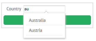
When suggest list is combined with the text control (editor) or HTML input, its values are automatically filtered according to the characters you have already typed. You can select an item from the list to fill the input or ignore the suggest list and type any text.
Suggest list and Combo
When suggest list is combined with the combo control (editor), its values are automatically filtered according to the characters you have already typed. You can either select an option from the list or type the text to match any of the options. You cannot ignore the suggest list and enter any text.
Suggest list and Richselect
When suggest list is combined with the richselect control (editor), a popup appears the moment you click its non-editable input. You must choose some value from the list.
Suggest list values can be stored
- on client side;
- on server side.
Default timeout between key pressing and filtering equals to 1 ms, still it can be modified by the dedicated property.
{
    view:"suggest",
    data:[/* ... */] //or url:"some.php",
    keyPressTimeout:100
}
Initialization
The Suggest list can be initialized as:
1. A separate view attached to an input with the help of the input property that points to the input ID:
webix.ui({
    view: "suggest",
    input: "country4", // will be linked to 'country4' input
    data: [
        {id:1, value: "Albania"},
        {id:2, value: "Bhutan"},
    //... list of suggest values can be as long as you wish
    ]
});

<input type="text" id="country4" value="Sweden" />
2. The same-name property of a JS text input, combo and richselect, where suggest can be declared as a simple array of options:
webix.ui({
    view:"richselect",
    id:"rselect_1",
    suggest:option_data
});
3. The same-name property of combo and richselect, can contain extended configuration (with properties of view:"suggest"):
webix.ui({
    view:"richselect",
    id:"rselect_2",
    suggest:{
      data:option_data,
      fitMaster:false,
      width:200
    }
})
Related sample: Suggest for Richselect and Combo
Note that you must select any value from the suggest list, since it's required for combo and richselect.
Loading Data to Suggest List
Normally, a dataset for suggest items contains an array of objects, each of which may have the following properties:
- id - the item ID (if not set, will be generated automatically);
- value - the text that will be displayed in suggest items (if another template is not set);
- $empty - indicates that the item contains no data (empty item);
- any other properties.
Suggest list with client-side data
On the client side, the list with suggestions can be stored in any of the supported formats. It may be put directly into the data property (as shown above) or in a variable declared beforehand.
Suggest List with JSON data
var countries = [
    {id:1, value: "Albania"},
    {id:2, value: "Bhutan"}
];

{
    view:"text",
    label:"Country",
    value:"Belarus",
    suggest:countries
}
Related sample: Suggest List for Input: Populating with Client-side Data
Suggest list with server-side data
At the same time, data can come from the server side. You need to specify the script file that will get the data from the database. Suggest list is connected with an input field by suggest property included into the text constructor.
If you choose dataFeed property to load the data, note that the options are not loaded immediately, but only when the user starts typing. It is also possible to specify the initial data source via data or url properties.
As a value of the dataFeed property of the Suggest component
webix.ui({
    view: "suggest",
    input: document.getElementById("country4"),
    body:{
        data: dataArr,
        dataFeed:"https://docs.webix.com/samples/server/countries"
    }
});
Related sample: Suggest List for Input: Getting Server-side Data using dataFeed
On the other hand, if you use URL as a value of suggest property, the options will be loaded immediately and the same URL will be used to filter requests.
As a value of the suggest property
{
    view:"text",
    name:"country",
    label:"Country",
    value:"Albania",
    suggest:"https://docs.webix.com/samples/server/countries"
}
Related sample: Suggest List for Input: Populating with Server-side Data
When a user initiates the auto-suggest functionality by typing a query, a request is made to the specified URL with a query string appended to it.
The query string has the following format: "?filter[value]=x", where x is the user's input query.
If there is a need to change the query string, use the dataFeed property:
suggest: {
 body: {
  dataFeed: function(value, obj) {
    const queryString = `?filter[value]=${value}`;
    return webix.ajax(`https://docs.webix.com/samples/server/countries${queryString}`);
  }
 }
}
Suggest List for Component Editors
Component editors duplicate editing controls, yet they are initialized within the component body.
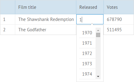
Suggest can be initialized for the combo and text editors. To do this, make the following steps:
- create a suggest list as a separate view or define its configuration in a JSON object and set options for it,
- create a component, specify the text editor type for it and link it to the suggest.
var year_suggest_a = webix.ui({
    view: "suggest",
    data:[/* ... */]
});

//or
var year_suggest_a = {
    view: "suggest",
    data:[/* ... */]
};

webix.ui({
    view:"datatable",
    columns:[
        {id:"year", editor:"text", suggest:year_suggest_a}
    ]
});
Related sample: Datatable: Autosuggest
At the same time, you can provide all the logic by the API, which allows customizing suggest behavior:
- create a suggest list as a separate view and set options for it:
- link the suggest list to the input field of the editor object with the linkInput method:
- provide handlers for edit events.
var year_suggest_b = webix.ui({
    view: "suggest",
    data:[...]
});

var gridb = webix.ui({
    view:"datatable",
    columns:[
        {id:"year", editor:"text"}
    ]
});


gridb.attachEvent("onAfterEditStart", function(object){
    if (object.column == "year") { //only for editors in this column
        var editor = this.getEditor(object);
        year_suggest_b.linkInput(editor.getInput());
    }
});

gridb.attachEvent("onAfterEditStop", function(object){
    year_suggest_b.hide();
});
Related sample: Datatable: Autosuggest
A Suggest list can also be attached to the combo and richselect editors, yet then selection from it becomes compulsory.
webix.ui({
    view:"datatable",
    columns:[
        {id:"year", editor:"combo", suggest:{
            data:[/* ... */], //or url:""
            on:{
                //events
            }
        }}
    ]
});
Related sample: Advanced Combo Editor
Customizing Suggest List
The Suggest list allows defining lots of custom settings in the case of a long initialization pattern.
It works for a suggest defined as a standalone view:
{view:"suggest",
    //popup settings
    //...,
    body:{
        //list settings
    }
}
And for a suggest defined as a control/editor property:
{view:"combo", options:{
    //popup settings
    // ...,
    body:{
        //list settings
    }
}}
- Popup settings include typical popup properties and suggest-specific ones, like fitMaster, or url and data;
- List settings include typical list properties.
Note that an suggest list configuration can be set via either suggest or options property for richselect, combo, multiselect and multicombo controls.
Where can the customization be useful?
Sizing and Positioning
Popup height
The Suggest list is tuned to show maximum 10 items at a time. If there are more items, a scrollbar appears. If there are fewer items in the list, its height shrinks.
The number of items in the suggest list can be controlled by the yCount property of the list object:
{view:"combo", suggest: {
    body:{
        yCount:5,
        data:[/* ... */]
    }
}}
Popup width
By default, a popup is adjusted to the width of a master control. To change it, set the fitMaster property to false, then define any desirable width or use the default 300px:
{view:"combo", suggest: {
    fitMaster:false,
    width:400,
    data:[/* ... */]
}}
Popup position
The Suggest API offers the following variants of popup positioning in relation to the text field it is initialized for:
- "bottom" (default). Doesn't require direct initialization;
- "top";
- "left";
- "right".
Since we speak here about a relative position, the property to set it has the same name:
{ view:"text", suggest:{ data:countries, relative:"left" }}
Related sample: Attaching Suggest List to Input
Advanced Suggest Lists
- MentionSuggest - a suggest control with mentioning functionality;
MentionSuggest
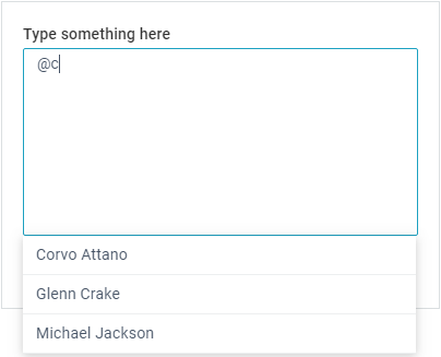
MentionSuggest is a list of options for inputs. It can be combined with the Webix text field, the textarea control or a standard HTML input.
The functionality is available in the Webix Pro edition only.
- CheckSuggest - a suggest control based on Webix List. Features checkboxes that enable multiple choice;
- MultiSuggest - a suggest control based on Webix List with the ability to select multiple items at a time;
- GridSuggest - a suggest control based on Webix DataTable;
- DataSuggest - a suggest control based on Webix DataView;
- DateRangeSuggest - a suggest control based on Webix DateRangePicker.
CheckSuggest
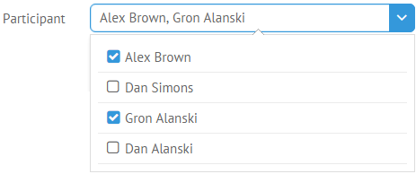
The CheckSuggest control is used in several PRO controls. You can find its implementations in:
- multiselect form control;
- multicombo form control;
- multiselect datatable filter;
- multicombo datatable filter;
MultiSuggest
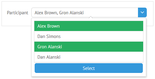
The MultiSuggest control is used in the multiselect component editor.
If needed, it can substitute CheckSuggest for the above-mentioned use cases. See Advanced Configuration of Popup Selectors for details.
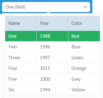
GridSuggest
GridSuggest can be used with form controls and component editors. You can read more about its configuration in the related article.
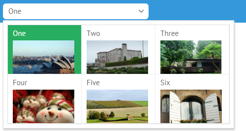
DataSuggest
DataSuggest can be used with form controls and with component editors. You can read more about its configuration in the related article.
DateRangeSuggest
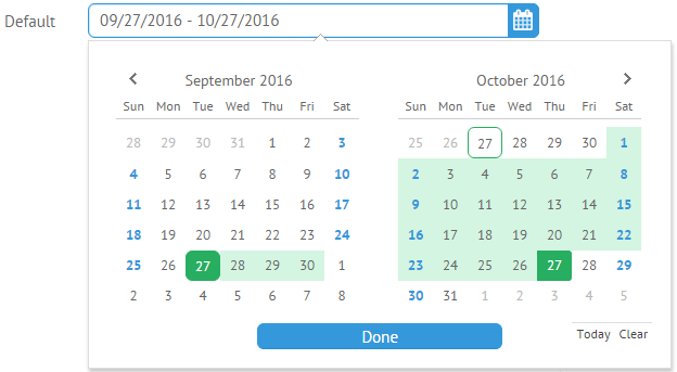
Related sample: DateRange Picker
The DateRangeSuggest control is used in the DateRangePicker widget. You can read more about it in the related section.
Back to top