Available only in PRO Edition
GridSuggest
The functionality is a feature of Webix Pro edition.
The extension is based on Webix suggest list. It redefines the default dropdown menu for RichSelect, Multiselect, Combo, Multicombo controls as well as similar editors.
GridSuggest extension makes it possible to use Webix datatable in a dropdown menu while by default Webix list is used.
Using GridSuggest for Form Controls
GridSuggest can be used with select controls.
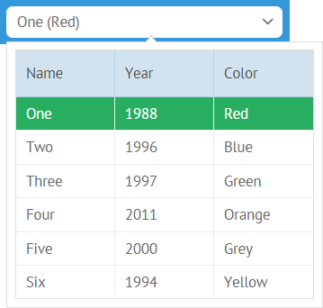
By default combo and richselect are initialized with the following constructor:
{
    view:"combo", //or richselect
    value:1,
    options:[..]//option data
}
With GridSuggest extension you get the possibility to define view used for a dropdown menu as well as set its configuration, both for combo and richselect.
{ view:"richselect", value:1, options:{
    view:"gridsuggest",
    data:options
}}
Possible properties here are as follows:
- view (string) - name of the view acting as a dropdown menu (here - gridsuggest);
- data (array) - data for the options to choose from;
- textValue (string) - data value shown in the input (acts as a string template) and, in case of combo, data value used for filtering. By default, the first data value after the ID field is taken;
- template (function) - allows for setting a complex template for the input field;
- width (number) - width of a dropdown popup;
- body (object) - set of configuration options for a suggest datatable.
{ view:"richselect", options:{
    view:"gridsuggest",
    template:function(item){
        return item.name + " (" + item.color + ")";
    },
    //textColor:#name#
    data:options
}},
Such code will show a datatable with borders while the columns will be generated for all data values from the dataset except for the ID field.
Datatable can be further configured inside body object property and can take the following parameters:
- autoConfig (boolean) - if true, enables default configuration for datatable (described above);
- columns (array) - used instead of autoConfig, allows for setting an array of columns for the datatable.
- header (boolean) - if false, hides datatable header. True by default;
- borderless (boolean) - if true, removes borders around the datatable. False by default;
- data (array) - data for the options to choose from. If you use body property for gridsuggest configuration, data should be defined inside it.
Auto config, no headers, no borders
{ view:"combo", options:{
    view:"gridsuggest",
    body:{
        autoConfig:true,
        header:false,
        borderless:true,
        data: options
    }
}}
Preset Columns
{ view:"combo", options:{
    view:"gridsuggest",
    body:{
        columns:[
            { id:"name" }, { id:"color" }
        ],
        data:options
    }
}}
Using GridSuggest as Editor
GridSuggest can be used as a component editor as part of combo or richselect editor.
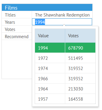
For these needs, a popup should be previously initialized, either with default or with customized settings:
Default - that's enough
var popup = webix.ui({
   view:"gridsuggest"
});
With the custom configuration all the above-mentioned settings can be used:
Customized
var popup = webix.ui({
    view:"gridsuggest",
    body:{
        columns:[
            {id:"value", header:"Value", width:250},
            {id:"year", header:"Year", width:100}
        ]
    }
});
Then, this popup should be attached to the column in question with the help of its popup property:
{ id:"title", editor:"combo", collection:options, popup:popup }
Related sample: Grid Suggest:Editor
Enabling Scrolling
In order to enable scrolling functionality in a GridSuggest extension, you should make 2 steps:
- Set the scroll property to true
- Disable the autoheight parameter
var form = { view:"form", elements: [
    { view:"combo", name:"names", label:"Code", options:{
        view:"gridsuggest",
        data: ["A", "B", "C", "D", "E", "F", "G", "H", "J"],
        body: {
            scroll:true,
            autoheight:false,
            autofocus:true,
            yCount:5
        }
    }}
  ]
};

webix.ui(form);