Combo
API Reference
Overview
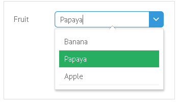
UI-related combo is a text-like field with a popup window that appears as you click the field. A popup displays options for users to select. At the same time, you can edit the text field and the items will be filtered according to the input values.
Related sample: Editable Combo Box ('combo')
Initialization
// short form
{
    view:"combo",
    id:"field_m",
    label:"Combo",
    value:"One",
    options:["One", "Two", "Three"]
}

// full form
{
    view:"combo",
    id:"field_t",
    label:"Combo",
    value:"1",
    options:[
        {id:1, value:"One"},
        {id:2, value:"Two"},
        {id:3, value:"Three"}
    ]
}

// server options
{ view:"combo", options:"server/data.json"}
Main properties
- value (string, number)
- within options array it sets text value for selectable items;
- within Combo constructor it defines the initially selected item of the control (option ID in case of a full form, option text in case of a short form);
- placeholder (string) - defines placeholder for combo input. The control should be initialized without an initial value;
- options (array, object, string) - sets the options to choose from. Details;
- label (string) - text label of a control. It can be customized by:
- labelAlign (string) - label alignment towards its container. Possible values are "left" and "right". In any way, it's placed left to the control;
- labelWidth (number) - width of the label container.
Accessing Suggest List
Combo API allows getting an object of a popup and a list inside it for further usage:
var popup = combo.getPopup();
var list = popup.getBody();
//or
var list = popup.getList();
Configuring Suggest List
Combo box control can be customized in a number of ways, e.g.:
- options can be defined dynamically;
- options can be loaded from the server side;
- template can be changed;
- filtering rule can be changed.
You can customize the default suggest list configuration, learn more in the Advanced Combo and Richselect Settings article.
Pro Extensions for Combo
In the Webix Pro edition the control can be extended to show either a dataview or datatable in the popup:
Getting Current Value
In case of a full initialization form, the getValue method for combo will return ID of selected option rather than text. Use getInputNode to get to input object and, hence, the text value.
$$("field_t").getValue(); // -> returns 1
$$("field_t").getInputNode().value // -> returns "One"
Related sample: Working with UnitList Items
Alternatives to Combo Box
- richselect - identical to combo in look, but text field is non-editable.
- text coupled with suggest list. Identical to combo in look, but while combo requires selection from a popup list, suggest offers values that can be either chosen or ignored.