Radio
API Reference
Overview
UI-related radio is a block of several items with the possibility to check only one of them at a time.
Initialization
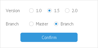
{view:"radio", label:"Branch", value:1, options:[
    { id:1, value:"Master" }, // the initially selected item
    { id:2, value:"Branch" }
]}
// short form for options array
{view:"radio", options:["Master", "Branch"]}
Related sample: Radio Button ('radio')
Main properties
- value (string, number)
- within options array it sets titles of radio buttons;
- within Radio constructor it defines the initially selected radio button;
- id (string, number) - used with the radio block as well as with each of its items;
- options (array, object) - defines the set of items to select from. Details.
- label (string) - text label of a control. It can be customized by:
- labelAlign (string) - label alignment towards its container. Possible values are "left" and "right". In any way, it's placed left to the control;
- labelWidth (number) - width of the label container;
- align (string)- positions button with relation to a parent view;
- vertical (boolean) - defines vertical arrangement of radio buttons.
Webix radio control is based on standard HTML radio, yet some skins use either a Font Awesome or Material Design icon to render it. To switch to a standard HTML radio, use the customRadio property:
{view:"radio", customRadio:false}