Intermediate
Controls Guide
Controls are the most important components for event handling, since they enable interaction with users. They can be used separately as well as nested into toolbar, form, and other components. All UI-related controls inherit from input.
List of Available Controls
Button, Checkbox, ColorPicker, Combo, Counter, DatePicker, DateRangePicker, DoubleList,
Fieldset, FormInput,
Icon, Label, Multicombo, Multiselect, Multitext, Radio, RangeSlider,
RichSelect, RichText, Search,
Select, Segmented Button, Slider, Suggest List and
its advanced variations, Switch Button, Tabbar, Text, Textarea, Toggle Button.
Form controls share a lot of features that work the same way with most of them or with very little difference.
Control Initialization
Control constructor includes its name and properties defining its look-and-feel and behavior.
Some properties duplicate HTML attributes, some are typical Webix control properties. In addition, you can set necessary HTML attributes to your control within the attributes object property:
{ view:"text", width:200, attributes:{ maxlength:10 }, click: function(){ ... }}
Defining Text Label
The label property sets a caption for a control. It is placed by the control.
- names the control and explains its purpose
- you can omit a label as label:"null" or by excluding the property from the control constructor
- horizontal position of the label is defined by the labelAlign property. Its possible values are:
- "left" (default)
- "right" (except for button and toggle that takes only left alignment).
- vertical position of the label is defined by the labelPosition property. The only possible value is "top"
- width of the label is defined by the labelWidth property
- text of the button is set by the value property, not label.
Please, do not mix it up with the standalone view label.
Related sample: Positioning Labels
Defining Special Modes
You can disable any control or set it to be readonly with the help of the dedicated properties:
elements:[
    { view:"text", readonly:true},
    { view:"datepicker", disabled:true}
]
Control Positioning
Here we make use of the align property that defines horizontal position of the control and its label with respect to the parent container (e.g. form):
- "right"
- "left" (default)
- "center".
Related sample: Aligning Inputs and Labels
Setting Dimensions
Each time control is initialized, required space is reserved for it. It is either equal to parent (form, toolbar) dimensions or corresponds to the control width.
In case several controls are in the same row/column, the available space is allocated equally among them.
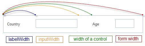
Specifying the width of a control
The total width of the control is calculated from the inputWidth and labelWidth (study the picture).
Do not specify the value of inputWidth or labelWidth larger than the value of width, otherwise a part of the control will not be visible. At the same time, you can make the control wider. In this case a spacing will appear.
There are three groups of sizing options:
The options that define the size of a control
- height/width - dimensions of space reserved for this control including its label
- maxHeight/maxWidth - maximum dimensions of the whole control. During resizing, the control cannot be bigger, but can be smaller
- minHeight/minWidth - minimal dimensions of the whole control. During resizing, the control cannot be smaller, but can be bigger
- gravity - relative sizing functor for controls placed in the same row/column.
// text2 is 3 times bigger than text1
rows:[
    { view:"text", name:"text1", gravity:1},
    { view:"text", name:"text2", gravity:3}
]
The options that define the label and the input area size
- inputHeight/inputWidth - dimensions of the input area/button body
- labelWidth - width of the text label by the control. It cannot be bigger than inputWidth and, thereby, than width. If it is, the control will be incorrectly displayed. By default, it features static width of 80 px.
The option specific for a segmented button and a tabbar
- optionWidth - defines the width of an option (segment of tab) for segmented and tabbar. Hence, for such controls inputWidth = optionWidth * N options. If this value is smaller than width, a part of the control will disappear.
Attaching Event Handlers
Controls can trigger any function for any component in the application. Study Event Handling for details.
Inner events of controls include:
- clicking
- changing their state (selection made, switching to another tab, adding new data into inputs).
Two major possibilities here include:
1 . Attaching event inside the control constructor.
With the click property. It equals to the "onItemClick" event.
{view:"button", click:function(){
    $$("my_form").validate();
}}
With the on property that allows attaching custom handlers to specified inner events of the control:
//clicking
{ view:"button", on:{
    onItemClick: function(){...}
}}

//state changing
{view:"text",  on:{
    onChange: function(){...}
}}
2 . The same using the attachEvent() method.
//clicking
$$("my_button").attachEvent("onItemClick", function(){...});

//state changing
$$("my_text").attachEvent("onChange", function(){...});
The implementation of an onChange() handler is described in the Form documentation.
Automatic Showing and Enabling of Related Form Fields
Each form field can have one related field defined by its relatedView property.
This field can react on changes in master field and change its state:
- from hidden to visible and vice versa
- from disabled to enabled and vice versa.
This behavior is also defined by the master field with the relatedAction property:
Enabling a form field by changes in another
elements:[
    { view:"text", id:"master", relatedView:"slave", relatedAction:"enable"},
    { view:"text", id:"slave", disabled:true}
]
The following conditions should be observed:
- the functionality allows for watching various value changes (empty/not empty, selected/not selected, checked/unchecked) for different controls
- relatedView property takes ID of the needed control as a parameter (if you do not define ID manually, it will be created automatically and can be derived as view.config.id)
- relatedAction offers two possibilities for now:
- "enable"
- "show".
- Slave field can have initial values to match with the master relatedAction - hidden:true for "show" and disabled:true for "enable".
Related sample: Automatic Form Reconfiguration
Defining Initial Values
Single-value controls
For such controls as text and textarea value property is not normally set beforehand, as they are intended for user filling.
So there are different variants of value treating:
- omit this property at all
- make the property empty ({view:"text", value:""})
- set default value that can be deleted or changed by users ({view:"text", value:"My text"})
- still it is better to use placeholder (a hint for user. Disappears as you start typing.)
- for two-state controls like checkbox, radio and toggle possible values are:
- true or 1 - for a "checked" state
- false or 0 - for "unchecked" state.
- for counter, slider and range slider initial value is normally set as a possible number or the one in the middle of the predefined range.
Multiple-value controls
Such controls fall into two groups:
- those presupposing the choice from a pull-down or popup list of predefined values (select, combo, multicombo, richselect and multiselect)
- those offering the choice between tabs (segments) of integral buttons, namely tabbar and segmented.
These values are set within options property either as an array or as a collections of objects.
Array of options for Combo box
{ view:"combo", id:"field_m", label: "Combo", value:"One", yCount:"3",
    options:["One", "Two", "Three"]
}
The initial value is specified by the value property and corresponds to any value from the predefined ones:
Collection of objects
{
    view:"radio", label:"Branch", value:1, options:[
     { value:"Master",  id:1 },
     { value:"Branch",  id:2 }
    ]
}
Server-side options for multiple-value controls
Such controls as select, combo, multicombo, richselect and multiselect can get values from the server side. The script that returns the needed data, can be defined directly in the options property:
{ view:"combo", options:"server/data.json"}
Related sample: Advanced Options for Select Controls ("combo" and "richselect")
Note that the getValue() method will return the id of the currently selected tab/segment/option.
Setting Values Dynamically
Values can be also set after initialization via the dedicated setValue() method for a single control or setValues() for controls within the form. Find the latter in the related article.
Both methods take a desired value (or object with "ID-value" pair(s)) as a parameter and are called from the necessary control or the form:
$$("text1").setValue("Anna"); //for a single text field with "text1" ID

$$("form1").setValues({ //for several text fields in the form
    text1:"Anna",
    text2:"Brown"
});
Values of two-state controls (checkbox and radio) can be changed in different ways:
- setValue() - with either 0 (false) to uncheck or 1 (true) to check
- toggle() - to change the initial value (the toggle control has this method as well).
//check the control if it is unchecked and vice versa
$$("mycheckbox").toggle();
Getting Values
Within the library we have two methods for getting values:
- getValue() - for a component that has one value (any control)
- getValues() - for a component that stores a number of controls (form / htmlform).
If you want to get value of a separate control, call the getValue method from it:
{view:"select", id:"my_sel", value:1, options:[
    { id:1, value:"Master" },
    { id:2, value:"Release" }
]}

var value = $$("my_sel").getValue(); // returns 1
If controls are embedded into a form, call the getValues() method from this form and access name or ID of the dedicated control.
webix.ui({
    view:"form", elements:[
        {view:"text", id:"title", value:""},
        //other controls
    ]
})

var title = $$("myform").getValues().title, //-> returns value of text input
Control Value can be various:
- text string in the text or textarea control
- state (boolean) in two-state controls (checkbox, radio and toggle)
- ID of selected tab in integral buttons (tabbar and segmented)
- ID of selected option in selection controls (select, combo and richselect)
- string with selected option IDs in the multiselect and multicombo controls
- text in button
- selected date or color item in (datepicker, colorpicker).
If the getValue() method returns object (e.g. date object) and you would like to see the string result, you can include the stringResult property into the control constructor:
webix.ui({
    view:"datepicker",
    stringResult:true, // false by default
    // other properties
});
Clearing Values
You can add an ability to clear control value via the dedicated icon/button to the following controls:
- Text
- Search
- Combo
- Richselect
- Datepicker
- Multiselect
- Colorpicker
- Colorboard
- TextHighlight (with type: "text")
- Daterangepicker
To enable the ability set the clear property to true:
webix.ui({
  width:400,
  rows:[
    { view:"search", label:"Search", clear:"hover"},
    { view:"text", label:"Text", clear:true},
    { view:"combo", label:"Combo", options: list_data, clear:"replace"},
    ]
});
Related sample: Controls: Clear Value
Visibility of Controls
All controls can be shown and hidden on demand:
- one by one applying show() and hide() methods to each of the needed controls or setting the hidden property
- in groups by implementing batches functionality. More info.
For hidden inputs within the form the library offers peculiar API that actually eliminates the need of creating hidden fields. Here you manipulate the values only.
Styling
Controls can be styled to your taste. More info in the dedicated article.
Adding Tooltips to Controls
You can add Webix tooltips to all controls. For details, go to Tooltip Implementation.
Common Configuration within Form and Toolbar
If you have several instances of one and the same control within a form or a toolbar (a lot of text fields in the form or several buttons on a toolbar) and want them to have the same properties, you can define these properties only once in an elementsConfig object.
Find more info in the corresponding article of our documentation.
Back to top