Intermediate
Tooltip Implementation
Tooltip appears above other UI-related components, which makes it similar to window and popup.
Tooltip is connected with a component or its item and becomes visible when the user hovers a mouse pointer over it and disappears when the pointer leaves the area.
General Principles
You can add Webix tooltips for any widget, control and HTML element inside or outside a Webix view.
Tooltips can be set in several ways:
- true enables the default tooltip that displays value of a data item or control
- template string adds a tooltip with text, HTML and any values from a data item or control configuration
- template function adds a more advanced tooltip. The function receives the data item object or the configuration object of a control
- tooltip object adds a tooltip and allows setting tooltip properties, such as:
- template - template set as a string or function as described above
- dx - X coordinate relative to the mouse pointer
- dy - Y coordinate relative to the mouse pointer
- css - CSS class applied to the tooltip.
Tooltip templates follows Webix general templating rules.
You will find specific information for every group of components and HTML elements below.
Tooltips for Data Components
To add a tooltip to a data component (List, DataView, Chart, etc.), use the tooltip setting of the component.
A default tooltip displays the value field of a data item:
webix.ui({
    view:"list",
    tooltip:true
    // ...data and other config
});
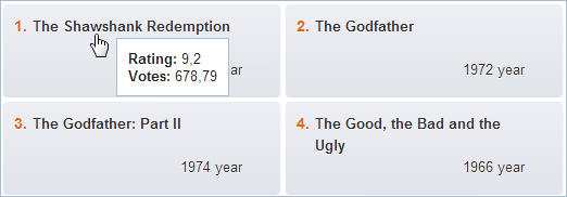
Tooltip may include text as well as items from the dataset.
webix.ui({
    view:"dataview",
    tooltip:"<span class='webix_strong'>Rating: </span> #rating#<br/>" +
        "<span class='webix_strong'>Votes: </span> #votes#"
    // ...data and other config
});
Tooltip can also be defined as a function that receives the data item object:
webix.ui({
    view:"dataview",
    tooltip:function(obj){
        return "<span class='webix_strong'>Rating: </span>" + obj.rating + "<br/>" +
        "<span class='webix_strong'>Votes: </span>" + obj.votes;
    }
    // ...data and other config
});
You can also provide a full tooltip configuration object and specify template, mouse offset and css for it:
webix.ui({
    view:"dataview",
    tooltip:{
        template:"<span class='webix_strong'>Rating: </span> #rating#<br/>" +
            "<span class='webix_strong'>Votes: </span> #votes#",
        dx:10,  //20 by default
        dy:5    // 0 by default
    }
    // ...data and other config
});
Related sample: Template of Tooltips
DataTable Tooltip
DataTable Tooltip is defined in a similar way, yet it has its own peculiarities.
A default tooltip shows the value of a cell, over which the cursor hovers at the moment, but you can customize Tooltip template for each column:
webix.ui({
    view:"datatable",
    tooltip:true, //enable tooltips for all columns
    columns:[
        {
            id:"name", header:"Name",
            tooltip:"My name is #name#." //customize tooltip for a particular column
        },
        { id:"age", header:"Age" }
    ],
    data:[
        { id:1, name:"Ann", age:25 },
        { id:2, name:"Tom", age:27 }
    ]
});
Column tooltips can also be defined as functions that receive the data item object and the tooltip type object. Via the type object you can access configuration of the column being hovered over:
webix.ui({
    view:"datatable",
    tooltip:true,
    columns:[
        {
            id:"name", header:"Name",
            tooltip:function(obj, type){
                return "My name is " + obj.name + ". I'm " + obj.age + ".";
            }
        },
        { id:"age", header:"Age", tooltip:"" }
    ]
});
You can cancel tooltips for some columns by setting tooltip:false in their configuration:
webix.ui({
    view:"datatable",
    tooltip:true,
    columns:[
        { id:"name", header:"Name" },
        { id:"age", header:"Age", tooltip:false } // will not be shown
    ]
});
You can also set Webix tooltips for Datatable:
- header,
- footer,
- sparklines.
For details, go to DataTable Tooltip.
Tooltips for Controls
Starting from Webix 6.2, icons, checkboxes, buttons, switches, sliders, etc. can have Webix tooltips. Tooltips can be set as the tooltip configuration setting as:
- a boolean true that will show the controls value:
webix.ui({
    view:"button", value:"Click me", tooltip:true //shows "Click me"
});
- a string:
webix.ui({
    view:"text", tooltip:"First and last name"
});
- a template string that accesses the configuration object of the control:
webix.ui({
    view:"counter", value:75, min:60, max:144,
    tooltip:"#min# - #max#"
});
- a function that receives the configuration object of the control:
webix.ui({
    view:"datepicker", value:new Date(), format:"%d %M %Y",
    tooltip:function(obj){
        return webix.i18n.parseFormatStr(obj.value);
    }
});
- an object with tooltip configuration, in which you can change the position of the tooltip and define the tooltip template as either a string or a function:
webix.ui({
    view:"checkbox", value:0,
    tooltip:{ template:"#value#", dx:20, dy:-10 }
});
Related sample: Tooltip: Controls
Tooltips for Radio, Segmented, and Tabbar
Each Radio button, button segment, and Tabbar button can have tooltips as well.
You can enable default tooltips for these controls with tooltip:true. It will show an option value for each option:
var data = [
    { id:"radio", value:"Radio", width:150 },
    { id:"segmented", value:"Segmented", width:150 },
    { id:"template", value:"Template", width:150 }
];

webix.ui({
    view:"tabbar", options:data, tooltip:true
});
To customize tooltips, you can set the tooltip as:
- template string that can display plain text with option properties:
webix.ui({
    view:"radio", options:data, tooltip:"#value# option"
});
- template function that receives option properties. It should return a string to display:
webix.ui({
    view:"radio", options:data, tooltip:function(obj){
        return obj.value + " option";
    }
});
- configuration object with template, mouse offset and css settings:
{
    view:"segmented", value:1, options:data,
    tooltip:{
        dx:40, dy:40, css:"img",
        template:function(obj){
            return obj.value + "<br><img src='/imgs/image00" + obj.id + ".jpg'/>";
        }
    }
}
Related sample: Tooltip: Segmented, tabbar and radio
Tooltips for Templates
Tooltip string or function receives the template configuration object, e.g.:
webix.ui({
    view:"template",
    template:"#value#",
    data:{ id:1, value:"Text" },
    tooltip:function(obj){
        return obj.data.value;
    }
});
Tooltips for HTML Elements
Webix tooltips can be added not only to Webix views, but to any HTML elements.
HTML Areas within Webix Views
You can add tooltips for any HTML areas within Webix views. Enable tooltips for the component and add the webix_tooltip attribute with the tooltip text to the HTML element, e.g.:
{
    view:"list",
    tooltip:"#title#",
    template:"#id#. #title# " +
        "<span webix_tooltip='Delete' class='webix_icon wxi-trash'></span>",
    data:[
        { id:1, title:"The Shawshank Redemption", rating:9.2, rank:1 },
        { id:2, title:"The Godfather", rating:9.2, rank:2 }
    ]
}
If you want to show tooltips only for areas within a component that are marked with webix_tooltip, you need to use the TooltipControl mixin and add the "tooltip-ability" for the whole component HTML:
webix.ui({
    id:"template",
    template:function(){
        return "<span class=\"header\" webix_tooltip=\"written by John Keats\">" +
        "The Human Seasons</span>" +
        "<p>Four Seasons fill the Measure of the year;<br/>" +
        "Four Seasons are there in the mind of Man.</p>";
    }
});
//component.$view points to the topmost HTML element of a component
webix.TooltipControl.addTooltip($$("template").$view);
Related sample: Tooltip: HTML Areas
Arbitrary HTML Elements
To add a tooltip to any HTML element, use the TooltipControl mixin.
Static Tooltips
To add tooltip with static text, call the addTooltip method of the TooltipControl mixin with the following parameters:
- the ID of the HTML element or the element itself
- the text of the tooltip.
webix.TooltipControl.addTooltip("title", "Enter book title");
webix.TooltipControl.addTooltip(document.getElementById("author"), "Enter book author");
You can also add tooltips for HTML elements by adding the "webix_tooltip" attribute with the tooltip text and calling the addTooltip method for a parent container:
webix.TooltipControl.addTooltip("genre");
where genre is the ID of a fieldset like this:
<fieldset id="genre">
    <legend>Genre</legend>
    <div id="genre1" webix_tooltip="Poetry">
        <input type="radio" name="genre" value="poetry" />
        <label for="genre1">Poetry</label>
    </div>
    <div id="genre2" webix_tooltip="Horror is a genre of speculative fiction.">
        <input type="radio" name="genre" value="horror" />
        <label for="genre2">Horror</label>
    </div>
</fieldset>
Dynamic Tooltips
You can create dynamic tooltips by calling the addTooltip method with a different second parameter - the configuration object that will define all three stages of a life-cycle of a tooltip:
- $tooltipIn - (function) defines the appearance of a tooltip when the cursor enters the borders of the HTML element;
- $tooltipMove - (function) defines the behavior of a tooltip while the cursor moves over the HTML element;
- $tooltipOut - (function) defines the behavior of a tooltip when the cursor leaves the HTML element;
webix.TooltipControl.addTooltip("annotation", {
    $tooltipIn:function(node){
        let tooltip = webix.TooltipControl.getTooltip();
        tooltip.define("template", function(){
            return node.value || "Empty field";
        });
        return node;
    }
});
Related sample: Tooltip: HTML support
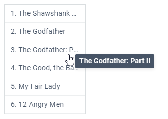
Overflow-Only Tooltips
You can create an auto tooltip for those nodes or data items, where the content is too wide and thus gets cropped. In the configuration object of a data component define a tooltip as an object and set its overflow property to true:
{
  view:"list",  // any data component
  tooltip:{
    overflow: true
  }
}

// or for HTML elements
webix.TooltipControl.addTooltip("areaA", {
  overflow: true
});
There are two things to pay attention to:
- Desired node/data item must have a special webix_tooltip attribute with the value to show. For example you can provide a template for data elements:
// #value# will be tooltip content
template: "<span webix_tooltip='#value#' class='text'>#id#. #value#</span>"
or add the attribute to an HTML element
<div id="film" webix_tooltip="The Shawshank Redemption">
    <input type="radio" name="film" value="poetry" />
    <label for="film">The Shawshank Redemption</label>
</div>
- Node/data item must be styled the way it won't be able to show the whole content e.g. as it's shown below:
.text {
  overflow: hidden; /* clips content */
  white-space: nowrap; /* suppresses line breaks */
}
Related sample: Tooltip: Overflow
Tooltip with the specified value will show up upon hover over the corresponding node/data item:
Delay for Auto Tooltips
You can specify a delay after which a tooltip for the desired node/data item will be shown automatically.
tooltip:{
   template:"#value#",
   // will show up in 100ms after hover over the data item
   delay:100
}
Custom Tooltips
There is also the Tooltip view. You can initialize it and show/hide it by using the Tooltip API
Back to top