Intermediate
Data Validation
All the data from input fields must be validated before being sent to a server. Data validation is implemented with DataProcessor, HTMLForm and Form as well as with all the data management components (DataTable, DataView, Tree, TreeTable, List).
Data validation is activated:
- Generally, validation is started on calling the validate() method. You can call it:
- on form submitting;
- on any inner event (onChange for form, onAfterEditStop for data component);
- With the DataProcessor object, data are validated each time you save it to a server. If validation fails, the data are n't sent to the server;
- With data components data are validated each time changes are made - editing, adding and updating (the moment the add() and update() methods are called);
- By means of on-the-go HTML5 validation that works for Form and HTMLForm.
While the first three are features of this library and work in conjunction with validation rules, the latter is a built-in HTML5 feature.
Validation by API
Data validation can be triggered on any event of any form element. It's possible to validate any number of controls as well as the whole form.
Normally, in form and HTMLForm, data validation is bound to the submit button with the help of the click event handler:
{ view:"button", value: "Submit", click:function(){
    form.validate();
}}
At the same time, you can trigger validation whenever you like, e.g. on the onChange event of a control:
{ view:"text", name: "fname", on:{
    "onChange":function(){
        // either validate the whole form
        this.getParentView().validate();
        // or validate this element only
        this.validate();
    }}
}
Live Validation in Forms
A validation event can be attached to a control in a common way (as the above one) as well as
by the specific validateEvent property that allows attaching two events automatically:
- "blur" - to start validation on the onBlur event, when focus is moved from the control;
- "key" - to start validation on the onKeyPress event, when a user enters a character into the field.
Note, that this method allows defining a validation event only for this control.
In case of data components, validation can be set on data loading to ensure that data came with right values:
 webix.ui({
    view:"datatable",
    // config
    ready:function(){
        this.validate();
    }
});
Related sample: Datatable: Cell Validation
Partial Validation
With the validate() method you can validate:
- the whole form/component
form.validate(); // all fields are validated
list.validate(); // data of the whole list is validated
- a specific item of a component
list.validate(2); // the data item with id=2 will be validated
text.validate(); // validate only this text field
Note that if a separate form field is validated, only its own validation rules will be considered.
webix.ui({
    view:"form", elements:[
        { view:"text",  required:true, name:"text1" },
        { view:"text",  validate:webix.rules.isNumber, name:"text2" }
    ]
});

$$("text1").validate();
Related sample: Per Item Validation with Predefined Rules
Validation Message
If any record or field fails validation, it is marked with embedded red highlighting (true for both in-library and HTML5 validation).
It is also very easy to apply built-in validation messages for form fields.
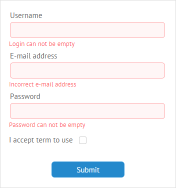
All you need to do is to specify the invalidMessage property and set the necessary text of the message:
{
    view:"text",
    label:"Username",
    name:"login",
    invalidMessage:"Login can not be empty"
}
Validation messages require some space under form fields. You should specify the bottomPadding property and set the appropriate value to define the bottom offset of the input:
var formElements = [
    { view:"text", label:"Username", name:"login",
        invalidMessage: "Login can not be empty" }
];

webix.ui({
    view:"form",
    elementsConfig:{
        labelPosition: "top",
        labelWidth: 140,
        bottomPadding: 18
    },
    elements: formElements
});
Related sample: Validation Message
If the value isn't set, a space for validation messages will automatically adjust to the font size.
Adding input description
There's also a possibility to put some hints on correct filling of form fields for users.
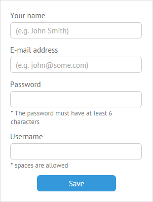
The bottomLabel property will be helpful for this purpose. Don't forget to set the bottomPadding property to specify the size of labels.
{ view:"text", type:"password", label:"Password", bottomPadding: 35,
    bottomLabel: "*The password must have at least 6 characters"},
Related sample: Input Description at the Bottom
Validation Handling
Additionally, a custom message can be set to handle the validation process. It's done in two ways:
- Webix message can be used together with the validate() method within the sumbit_form custom function:
webix.ui({
    view:"form",
    id:"myform",
    elements:[
        {},  //input fields
        { view:"button", inputWidth:300, label:"Submit", click:submit_form }
    ]
});

submit_form = function(){
    if (this.getParentView().validate()) // on success
        webix.message("All is correct");
    else
        webix.message({ type:"error", text:"Form data are invalid" });
};
Webix message can be attached to validation events with the help of its on property. Possible events here are:
- onAfterValidation - triggers on validation process complete;
- onValidationSuccess - triggers if data passes validation successfully;
- onValidationError - triggers in case an error during validation happens.
Here you can see how a message can be formed in case of a validation error:
webix.ui({
    view:"form",
    on:{
        onValidationError:function(key, obj){
            text = "Login can't be empty";
            webix.message({ type:"error", text:text });
        }
    }
});
Related sample: onValidationError' Event
Message boxes of all types are described here.
Validation Rules
The validate() function checks whether data complies with certain rules defined in the rules object that contains a collection of property-rule pairs. Predefined rules are accessed through the webix.rules class.
Form validation
Here you attach rules to inputs by their names. Name is a read-only property that can be assigned to any input of the form/ htmlform.
You can do this either within the rules object property of the form component:
view:"form", elements:[
    {view:"text", name:"field1"},
    {view:"text", name:"field2"}
],
rules:{
    field1:rule1,
    field2:rule2
}
Related sample: Basic Validation
Or, you can attach a rule right in the input constructor as the value of its validate property:
view:"form", elements:[
    {
        view:"text",
        label:"Is a Number",
        validate:webix.rules.isNumber,
        name:"text2"
    },
    {
        view:"text",
        label:"Is an Email",
        validate:webix.rules.isEmail,
        name:"text3"
    }
],
elementsConfig:{
    labelAlign:"right",
    on:{
        'onChange':function(newv, oldv){
            this.validate();
        }
    }
}
Related sample: Per Item Validation with Predefined Rules
Component Data Validation
Here you need to define which data item you'd like to validate, namely specify its template #value# or, in case of datatable, the ID of a column.
rules:{
    "template/ID": rule
}
Validation rules can be of three types:
- Predefined Rules
- Custom Rules
- Rules using Special Validation Keys
Predefined Rules
There are four of them:
- isNotEmpty - checks whether a value is empty;
- isNumber - checks whether a value is a number;
- isEmail - checks whether a value is an e-mail (looks for an @-sign, fullstop, text after it);
- isChecked - checks whether a checkbox is checked.
webix.ui({
    view:"form1",
    elements:[
        { view:"text", label:'Username', name:"login" },
        { view:"text", label:'E-mail address', name:"email"},
        { view:"text", label:'Password', name:"password"},
        { view:"checkbox", labelRight:'I accept terms of use', name:"accept"}

    ],
    rules:{
        login: webix.rules.isNotEmpty,
        email: webix.rules.isEmail,
        password: webix.rules.isNumber,
        accept: webix.rules.isChecked
    }
});
Related sample: Validation with Predefined Rules
In case you are parsing JSON data, you should set the predefined rules as follows:
"rules":{
   "login":"isNotEmpty"
}
It is needed for JSON data to be parsed properly.
Note that in case you define rules within the input constructor, the isNotEmpty rule can be substituted by the required property.
// it's better to use
{ view:"text", label:"Not Empty", required:true }
// instead of
{ view:"text", label:"Not Empty", validate:webix.rules.isNotEmpty }
Related sample: Required Inputs in a Form
Custom Rules
Basically, any custom function can define a rule. Such a function takes the following parameters:
- value - (any) the value in the field
- fields - (object) all form values as an object (the same as those returned by the getValues() method)
- name - (string) the name of the field
A validation function must return true for success and false for failure.
For example, you can define the minimum and maximum values for the form field or check whether the input data complies with a certain criterion.
Validation Criteria for Numbers
webix.ui({
    view:"form",
    rules:{
        text1:function(value){ return value > 100; },  // over 100
        text2:function(value){ return value < 100; }, // below 100
        text3:function(value){ return value > 0;} // positive
    }
});
Related sample: Validation with Custom Rules
Conditional usage of built-in rules
Predefined validation rules can be wrapped by another function to apply them selectively:
Ignoring empty values during validation
rules:{
   city:function(value){
        return !value || webix.rules.isNumber(value)
  }
}
Special Validation Keys
The keys are used with both predefined and custom rules for special cases, for instance:
- if you need to apply the same rule to each property of the data object, use the $all key;
- if you need data from several form fields for validation, use the $obj key.
The $all key
The rules specified by the "$all" key will be applied to each field of the form.
The "$all" key can be used with a predefined rule:
All the fields must be filled
rules:{
    $all:webix.rules.isNotEmpty
}
Related sample: Validation with a Common Rule for All Fields
or with a rule set via a custom function that takes the following parameters:
- value - (any) the value set in the field
- fields - (object) all form values as an object (the same as those returned by the getValues() method)
- name - (string) the name of the field
$all:function(value, fields, name){
   if(name !=="notes") // all fields except the "notes" one
       return webix.rules.isNotEmpty(value);
   else // some other rule or just consider it valid
      return true;
}
The $obj key
The "$obj" key is used with rules set by a custom function that takes the parameters listed below:
- value - (object) all form values as an object
- fields - (object) all form values as an object (just the same as the rule is common for all form fields)
- name - (string) an empty string, as it is a common rule
The function is called once for the whole form. If it returns true, the form is treated as valid, and vice versa.
Since the whole data object is passed into the rule, the field data can be accessed as obj.field_name.
Both votes and rank values must be positive
rules: {
    $obj:function(obj){  // obj = value
        return obj.votes > 0 && obj.rank > 0;}
}
Related sample: Datatable Validation. Complex Rule.
It can be as well used in defining complex rules, e.g. when password confirmation is required.
Passwords must be equal
rules:{
    $obj:function(data){ // data = value
        if (data.pass1 != data.pass2){
            webix.message("Passwords are not the same");
            return false;
        }
        return true;
    }
}
Related sample: Password Confirmation
Alternatively, you can ignore function parameters and work directly with form values derived with the getValues() method.
Complex Rule
webix.ui({
    view:"form",
    rules:{
        $obj:function(){
            var data = this.getValues(); // !getting data object
            if (!webix.rules.isEmail( data.email ))  // checking email
                return false;
            if (data.name == "") //checking name
                return false;
            return true; //success!
        }
    }
});
Related sample: Validation with a Complex Rule
Validation of Hidden and Disabled Fields in Form
By default hidden and disabled fields are not validated. If you want to include them into a validation process, you need to provide the validation mode:
// hidden fields will be validated
$$("$form1").validate({hidden:true});

// both hidden and disabled fields will be validated
$$("$form1").validate({hidden:true, disabled:true});
Related sample: Form with Tabs
Note that if the form itself is hidden, hidden and visible fields are not distinguished.
Data Validation for Components
The same as in the Form, rules are set within the component constructor. With validation enabled, you'll be warned about invalid data in your component on the client side, while avoiding loading wrong data to the server.
The validated data item is defined by its template, rules being the same as with the form elements:
List Data Validation
webix.ui({
    view:"list",
    template:"#rank#. #title#",
    rules:{
        title: webix.rules.isNotEmpty
    },
    // list config
});
As a result, you cannot add an empty record to the list data.
Related sample: List: Validation
Read more about data templates here.
With the datatable component we need a column ID, since it correlates with data items.
Datatable Data Validation
webix.ui({
    view:"datatable",
    columns:[
        { id:"rank", header:""},
        { id:"title", header:""}
    ],
    rules:{
        "rank": positiveNumber, // custom rule
        "votes": positiveNumber
    }
})
Related sample: Datatable: Cell Validation
Invalid data are highlighted within the component and cannot be sent to a server (in case you work with dataprocessor).
Validation during in_Component editing
By default, with rules defined, validation starts each time we finish editing and close the editor for this or that data item.
However, editing events allows validation with an editor opened. The obvious bonus of such a method is that until new data are valid, it can't be changed within the component.
Here the onBeforeEditStop event comes to our help. It's attached to the component you work with:
webix.ui({
    view:"datatable",
    // config
    on:{
        onBeforeEditStop:function(state, editor, ignore){
            var check = ( editor.type.getValue() != "" );
            if (!ignore && !check){
                webix.message(editor.column+" must not be empty");
                return false;
            }
        }
    }
});
Related sample: Datatable. Editing Validation.
The function takes three arguments here:
- state - the object that stores the old and new values of the text editor;
- editor - the editor being used;
- ignore - the flag to indicate a user action after editing, whether they save the new data or escape the saving thus restoring the old data.
For more information about text editors, go to the dedicated article.
HTML5 Data Validation
Here we speak about the client side, in-browser data validation powered by HTML5 means.
In HTML5 layout input tags come in plenty of types and feature a number of attributes that define the validation pattern.
Input types coincide with the type property of the view text, while the other input attributes are listed within the attributes object property:
- HTML
<input type="text" id="text1"
    title="First name is required!"
    maxlength="25"
    placeholder="Your name" required>
<label for="text1">First name</label>
- JavaScript
{
    view:"text",
    type:"text", attributes:{
        maxlength:25,
        required:"true",
        title:"First name is required!"
    },
    value:"",
    label:"First Name"
}
Here validation is defined by the required attribute.
The validation process starts as soon as you type the first character into the field. When the necessary pattern is observed, red highlighting disappears. Furthermore, if you try submitting the form, a validation error message appears for each field that has been incorrectly filled:
- in case of the wrong input: "Please enter an email address/a URL!" - depending on the type property value;
- in case of an empty field: "Please fill out this field!"
HTML5 input types for the library's Form component are as follows::
- text (the default type for this lib);
- password - hides typed characters;
- email - requires the @ symbol for validation;
- url - requires the http:// prefix for validation.
Related sample: HTML5 Data Validation